The Content Panel
The Content Panel is the central hub for building and customizing layouts in Beaver Builder. It provides quick access to everything you need to design pages, including modules, rows, columns, and container modules, as well as templates, reusable content, WordPress Patterns, ACF Blocks, and Beaver Themer modules.
Access the Content Panel
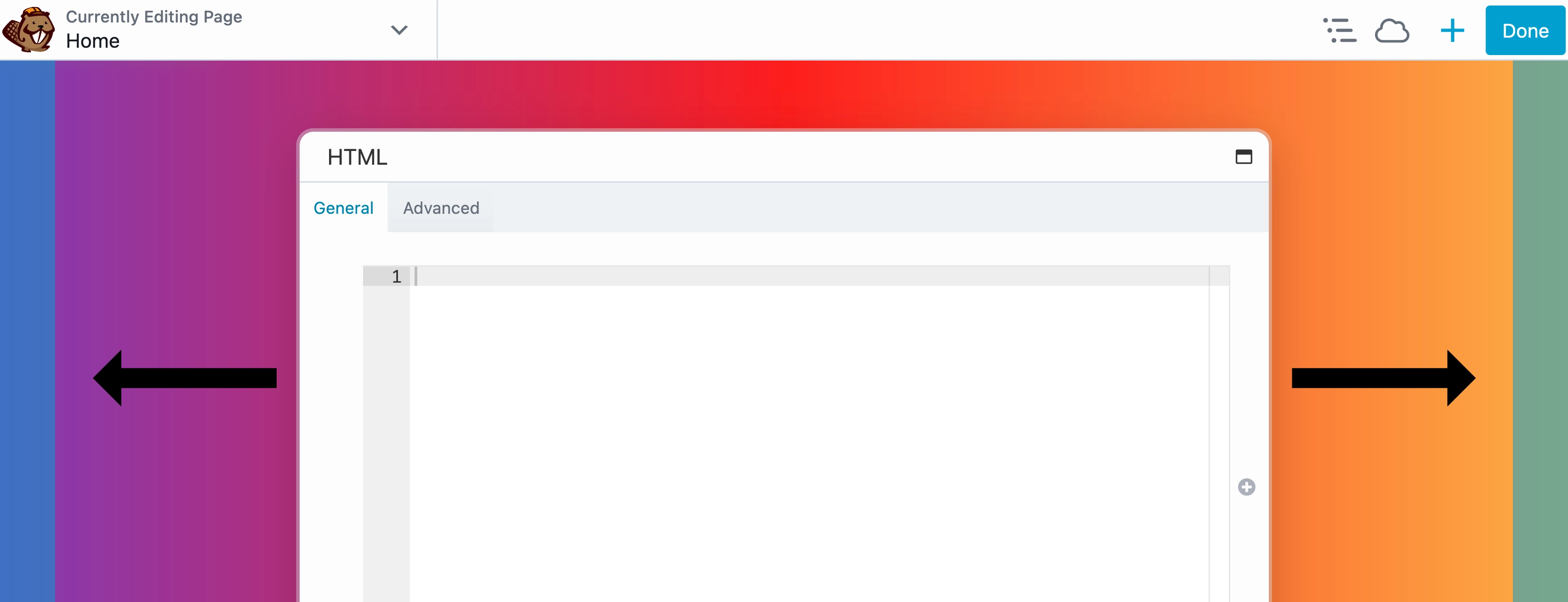
To access the Content Panel, click the (+) icon in the Top Bar to expand it and the (x) icon to close it.

When the panel is pinned to the left or right side of the screen, the (+/x) icons do not appear. Instead, a show/hide icon is available at the bottom of the panel.
Adding Content
You can use the Content Panel to add content to your pages, posts, and custom post types. Open the panel and select the desired content type from the available tabs. To add rows, columns, modules, or reusable content items, simply drag and drop them into your layout where you want them placed. For layout templates, just click the template, and it will be applied directly to the page.
Content Type Tabs
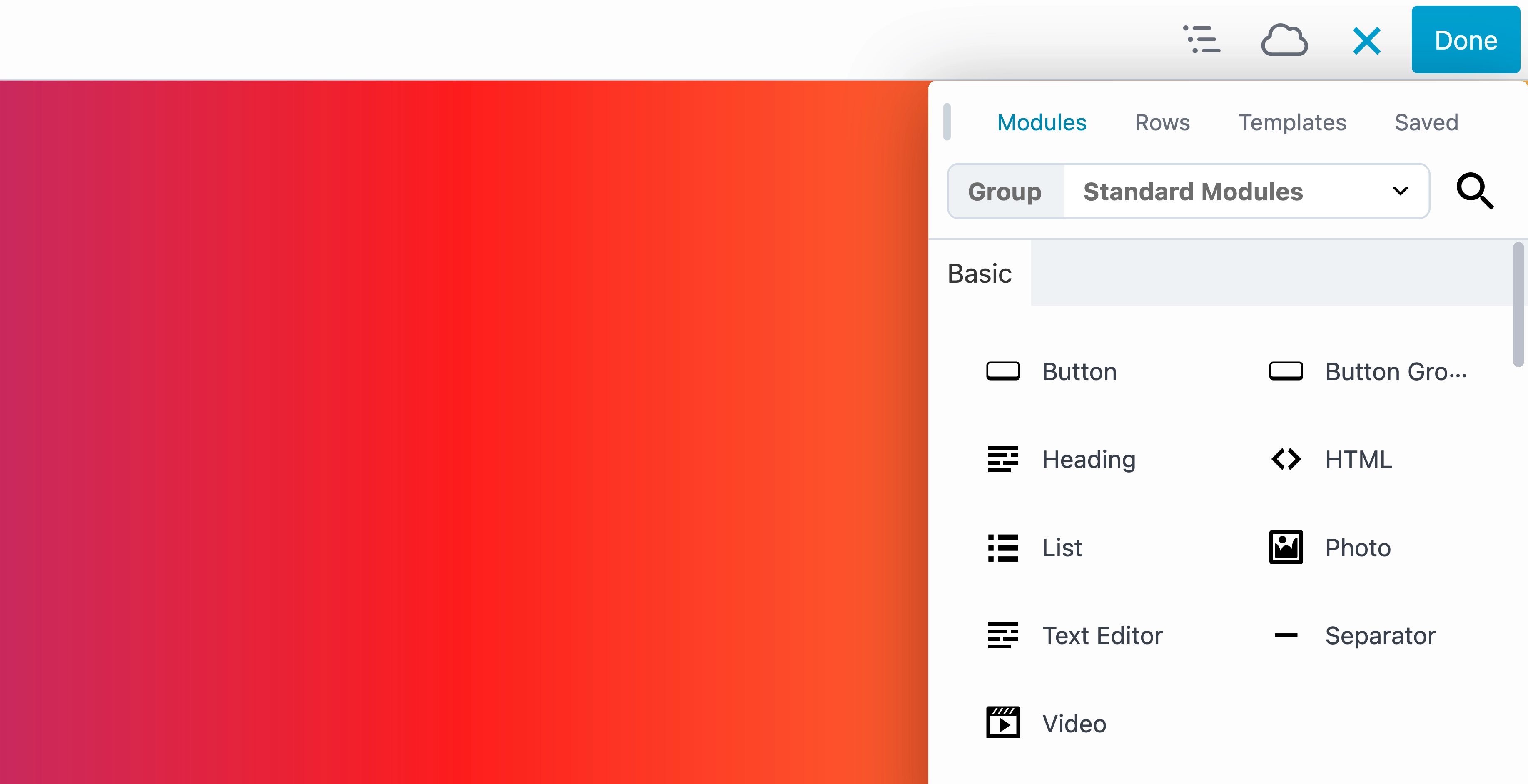
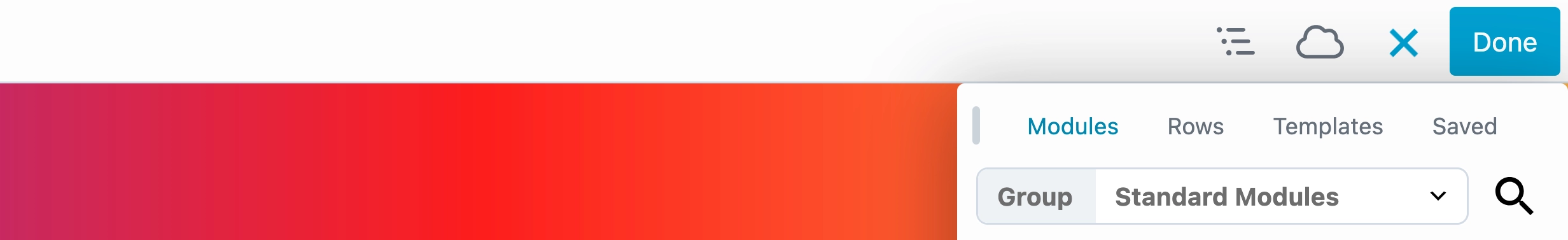
The Content Panel is divided into four main tabs: Modules, Rows, Templates, and Saved. These tabs are displayed at the top of the panel, and selecting one changes the panel’s contents to display items of that type.
Within each tab, content is organized into groups that break the tab into different category types. This makes it easier to find the content you want to use without scrolling through a long list. For example, if you want to add WordPress Patterns to your layout, you would select the Modules tab and then choose the WordPress Patterns group.
This tab-and-group structure keeps the Content Panel organized, efficient, and easy to navigate while giving you direct access to the content you need.
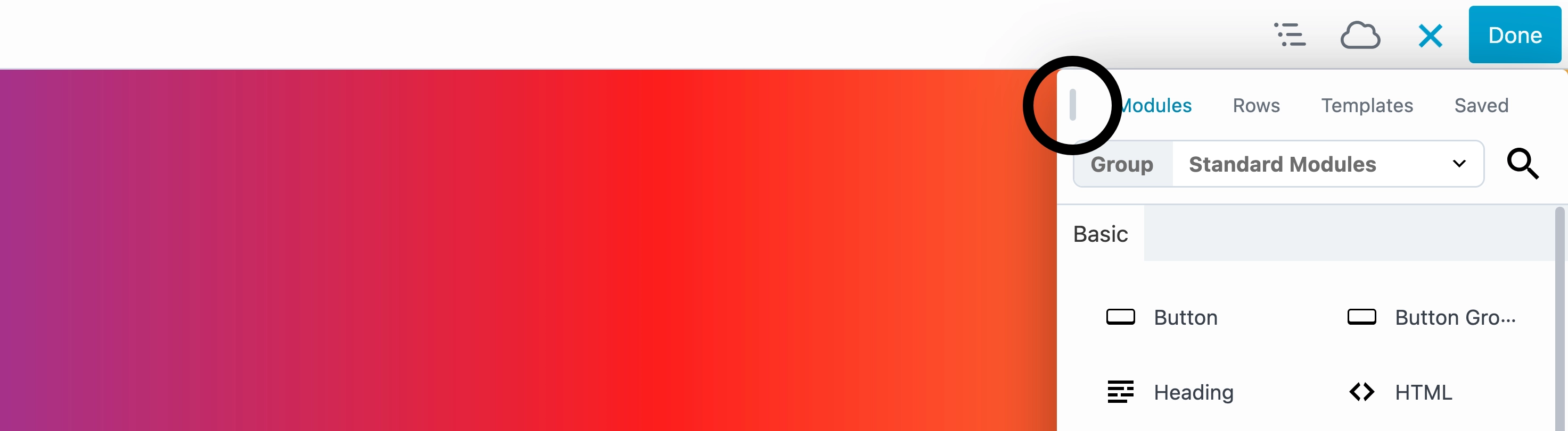
Module Tab
The Modules tab is the default view in the Content Panel, initially set to the Standard Modules group, which displays all core Beaver Builder modules. Modules are organized into categories, making it easier to locate the ones you need.
The Modules tab includes several groups: Standard Modules (default), Prebuilt Modules, ACF Blocks, Beaver Themer Modules, WordPress Patterns, WordPress Widgets, and Saved Modules. If you have third-party add-on plugins installed, their modules will appear as an additional group in the selection menu.
See the Modules Overview article for more information.
Row Tab
The Rows tab is set to the Columns group by default and displays all available prebuilt row structures, including 1 Column, 2 Columns, 3 Columns, 4 Columns, 5 Columns, 6 Columns, Left Sidebar, Right Sidebar, and Left & Right Sidebar. These options let you quickly add predefined row layouts to your design.
The Rows tab also includes several groups: Columns (default), Prebuilt Rows, Saved Columns, and Saved Rows.
Template Tab
The Templates tab contains all prebuilt templates included with Beaver Builder and defaults to the Landing Pages group. Other available groups include Content Pages, Micro Pages, Prebuilt Modules, Prebuilt Rows, and Saved Templates.
You can learn more from the Template tab groups article.
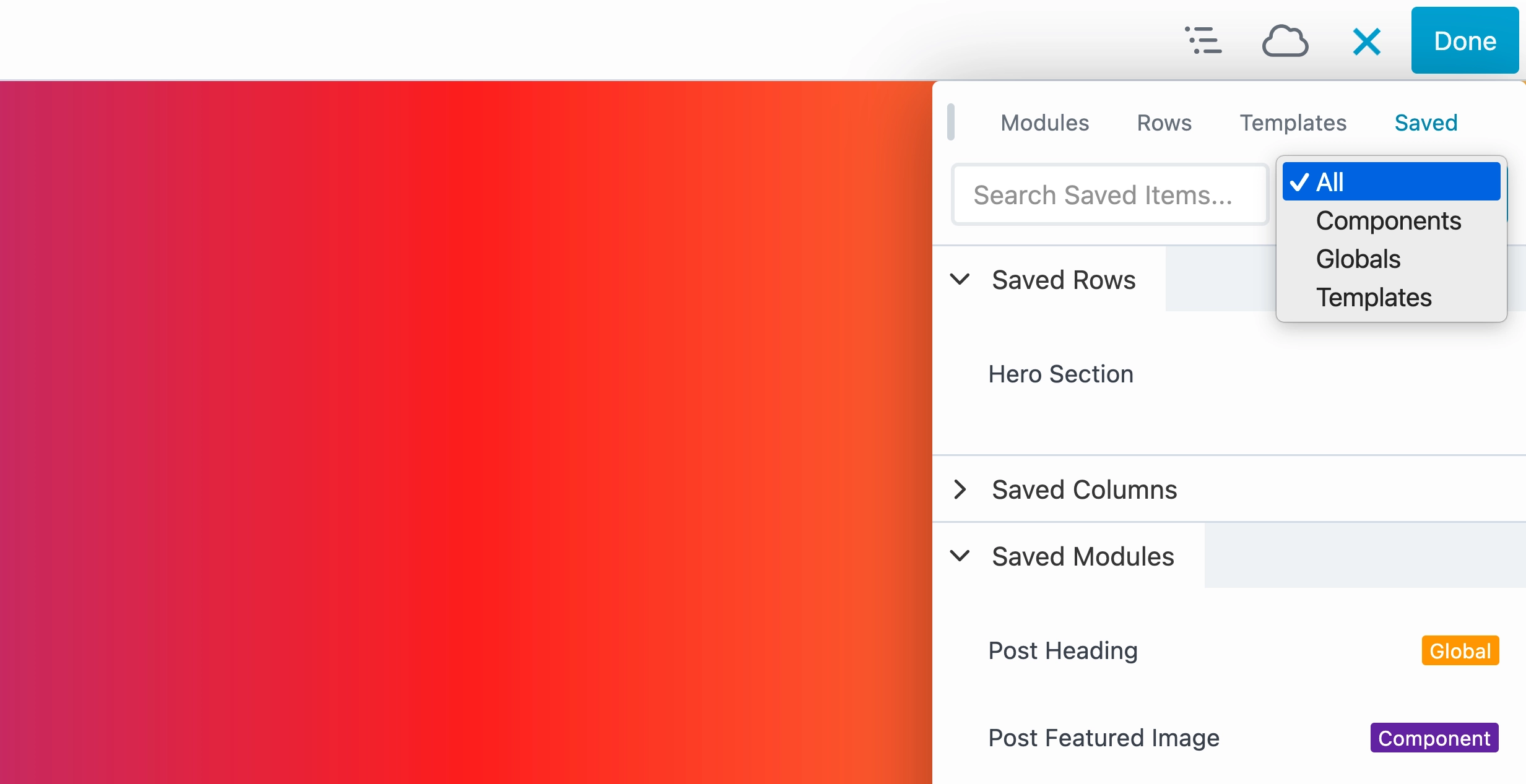
Saved Tab
The Saved tab displays all reusable content you have created, organized into Saved Rows, Saved Columns, and Saved Modules. You can use the search to quickly locate a specific saved item, or the selection menu to filter by reusable content type: Templates, Globals, and Components.
Saved items are also labeled for quick identification, with an orange label for Globals and a purple label for Components.
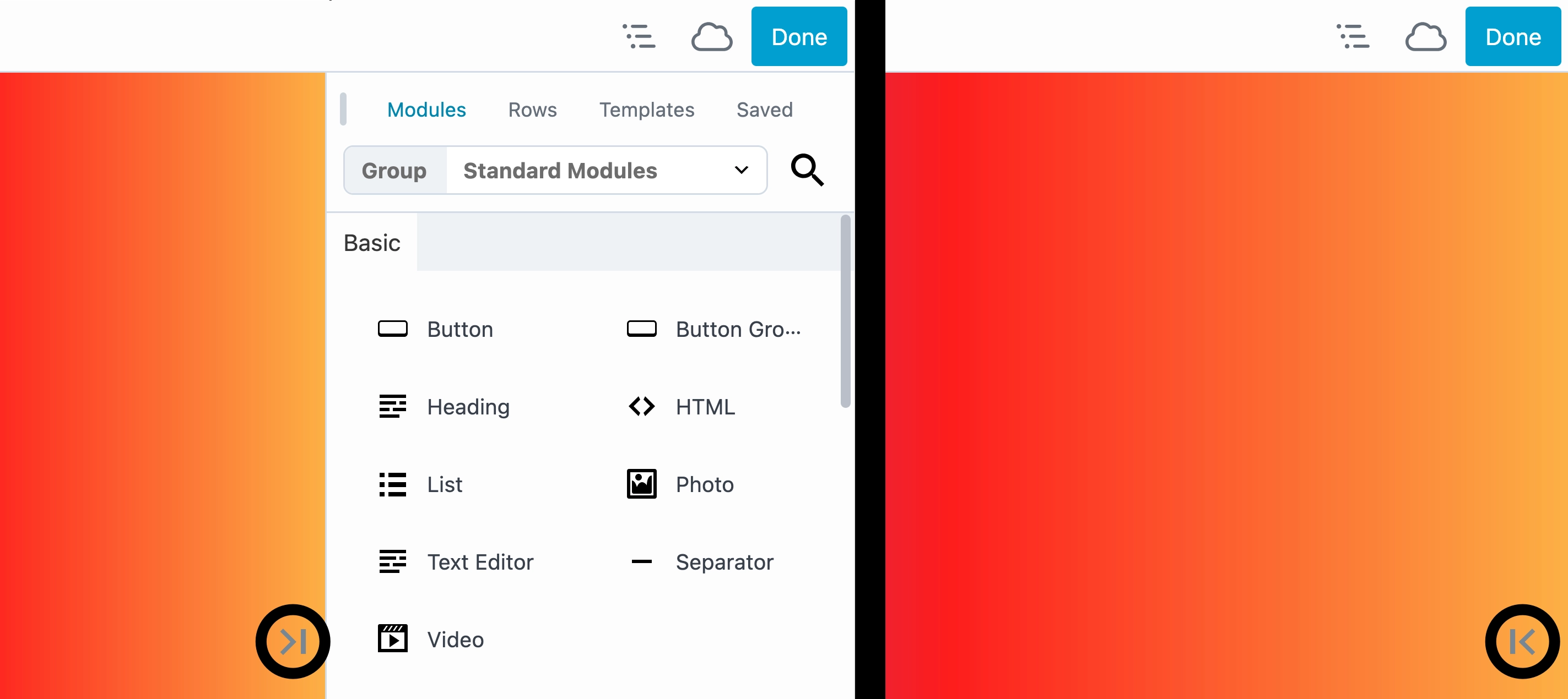
Drag Handle
The Content Panel includes a drag handle in the top-left corner, which you can use to pin the panel to either the left or right side of your screen.
Pin/Unpin the User Interface (UI)
By default, Beaver Builder displays the Content Panel as a floating side panel on the right-hand side of the screen. For more flexibility, the interface can be pinned to either the left or right side, which is especially helpful on smaller screens or when the Settings Window pop-up gets in the way.
To pin the Content Panel, drag it to your preferred side of the screen and drop it into the blue vertical area that appears on the left or right. To unpin the panel, grab the top of the panel and drag it back to the center of the screen. When released, the Content Panel will return to its default floating position on the right-hand side.
Keep in mind that pinning the Content Panel also pins the Settings Window for rows, columns, modules, and container modules to the same side. The reverse is also true—pinning the Settings Window will automatically pin the Content Panel as well.