Outline Panel
The Outline panel provides a bird's eye view of all the content on your layout and a streamlined interface to edit and interact with layout content.
Usage
Attempting to drag a row from "below the fold" on a long page could always be a bit agonizing. The Outline panel makes it easy to rearrange content on large pages and to quickly jump around and edit different parts of a page.
Access Outline Panel
Click the Outline icon in the Top Bar to open the Outline panel, which lets you view and modify the structure of your page layout in an outline format:
The Outline panel doesn't have a drag handle, but you can remove its overlap on the layout with this trick. First display the Content panel and the use the drag handle to pin it to the right of the layout, then click the Outline panel icon. It then overlays the Content panel.
Search
You can search for a specific node—whether it’s a row, column, or module—by clicking the magnifying glass icon and typing part of its name (e.g., “Box” or “Loop”). Any node that matches your search term will be highlighted in the Outline Panel. You can also search by label, ID, or classname if you know them.
Expand/Collapse
You can Expand (show) and Collapse (hide) all items using the Outline Panel actions menu item ( Ellipsis icon).
By using persistent storage, the Outline Panel keeps track of what sections have been expanded and collapsed.
Keyboard Shortcut
Using the Outline Panel's keyboard shortcuts, you can open and close the Outline Panel as well as expand and collapse the tree view.
- Toggle Outline Panel - Shift & O
- Expand or Collapse the Tree View - Shift & T
Navigate
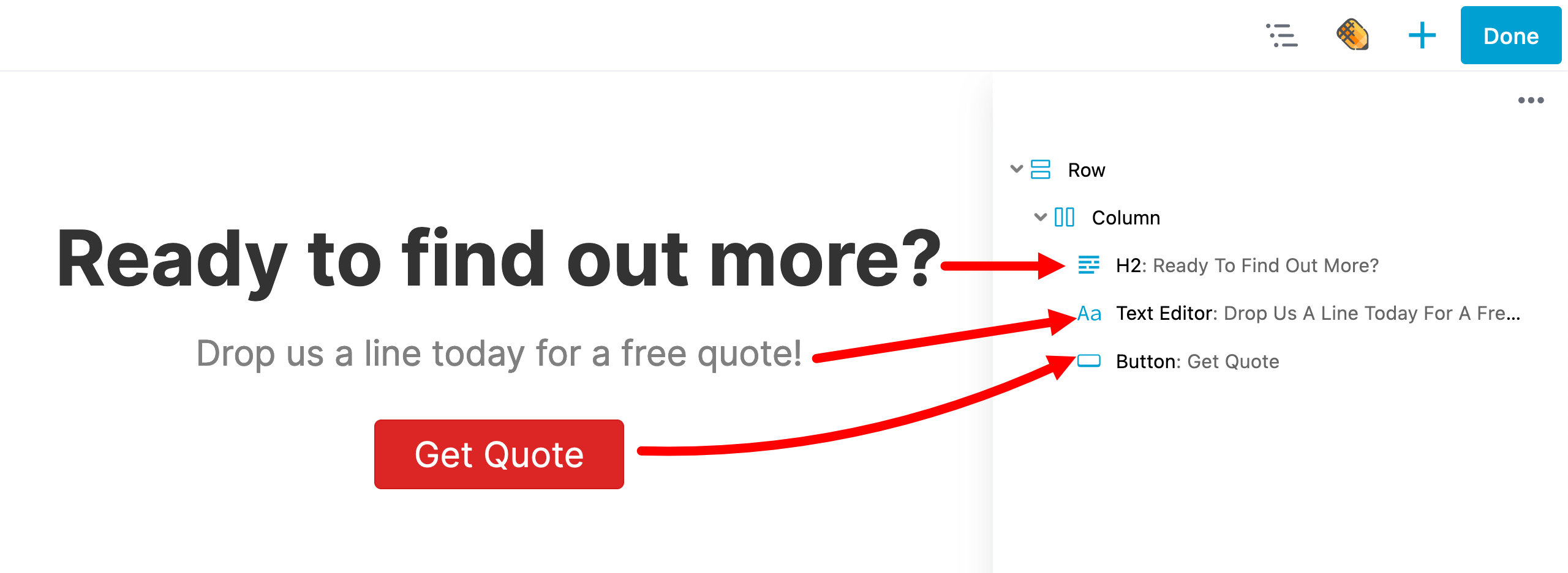
Click once in any entry in the Outline panel to scroll to that node (row, column, or module) in the layout. Click twice to open that node's settings.
Move Content
You can quickly move content such as rows, columns (except for child columns), and modules within the Outline Panel using drag-and-drop.
Context Menu (right-click)
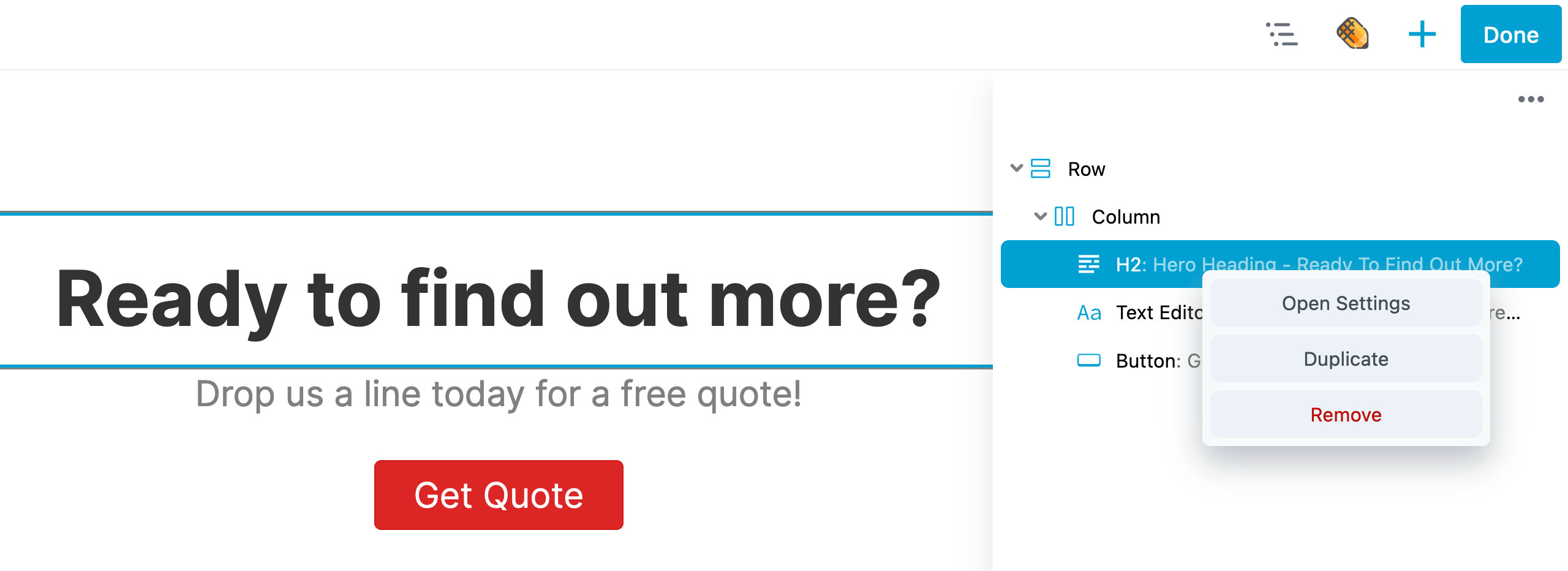
The Outline Panel includes a right-click feature that opens the Context Menu, giving you quick access to common actions for nodes (rows, columns, modules, and container modules. This makes it easier to manage and customize your layout directly from the Outline Panel, without needing to scroll through the layout to find a specific node. The available actions include:
- Open Settings – Opens the settings window for the selected node (row, column, or module).
- Duplicate – Creates a duplicate of the selected node.
- Copy Settings – Copies the settings of the selected node to your computer’s clipboard.
- Paste Settings – Available after copying settings, this option lets you paste them into a corresponding node (row to row, column to column, or module to module).
- Remove – Deletes the selected node.
Labels
To help identify the purpose of a row, column, or module in the Outline Panel tree view, you can add a label. You can add a label in two ways:
Adding a Label Inline
You can add a label inline by opening the Outline Panel, moving your mouse cursor to the "type a label" field, and typing your label. When you're done typing, either click the checkmark icon or press the Enter key to save your label.
Adding a Label Through the Advanced Tab
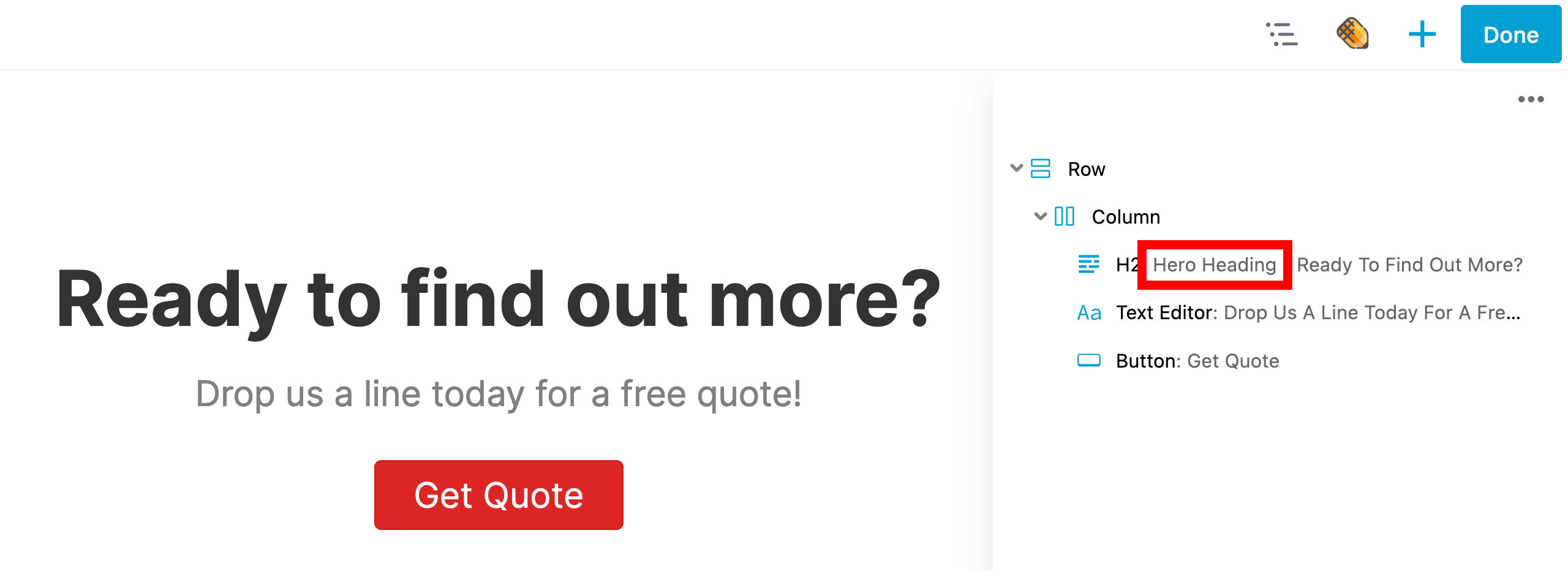
You can also add a label through the Advanced tab. The screenshot below shows an example where a label "Hero Heading" was added to a Heading module and is displayed in the Outline Panel.
Icon Indicators
In the Outline Panel, each row, column, module, or container module is displayed with a unique icon that makes it easy to identify different content types. These icons also provide visual feedback by changing color when the node is saved as reusable content: blue for standard modules and templates, orange for Global items, and purple for Component items.
Additional icons appear when certain settings have been applied, such as modified display visibility or custom CSS or JavaScript added through the Advanced tab. This gives you a quick way to identify special configurations at a glance.
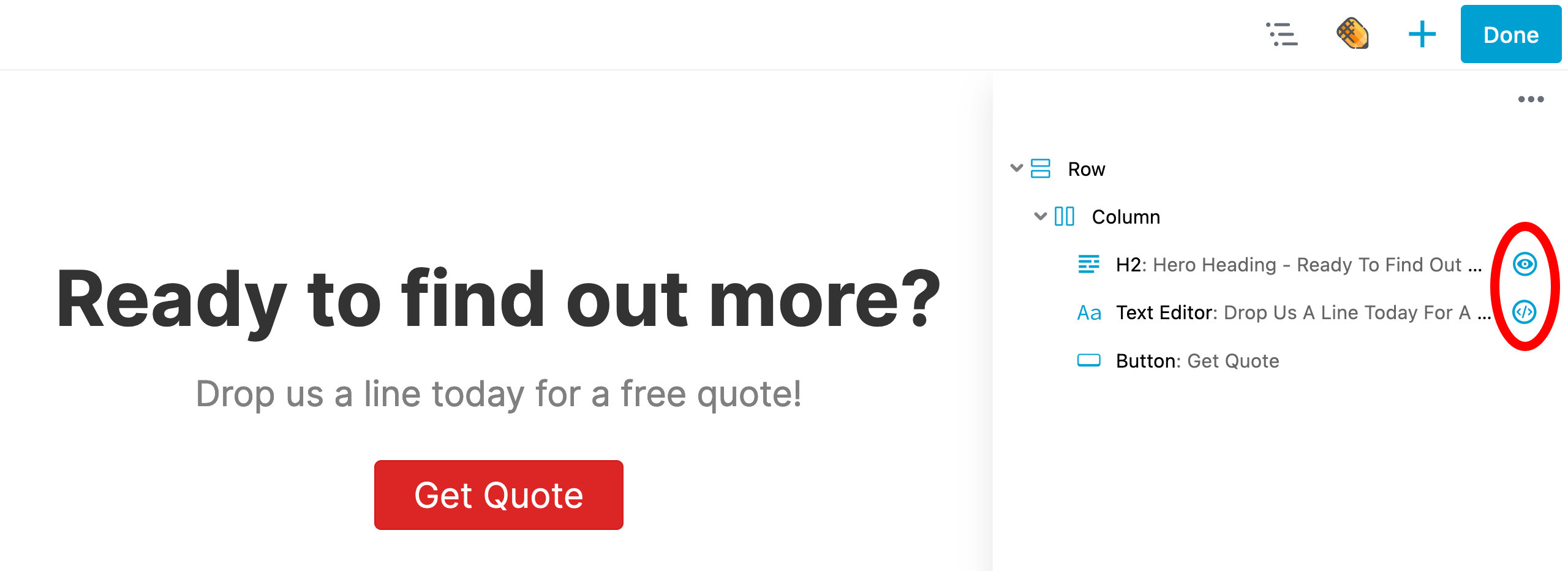
The Blue Eye icon indicates a row, column, or module visibility display state is no longer using the default state of "Always".
The Red Eye icon indicates a row, column, or module visibility display state is now using the Conditional Logic option which is available when you have Beaver Themer installed.
The Exclamation icon indicates that a module is missing from the layout. This can happen when a module has been disabled or in the case of a third-party module, the plugin providing the module has been deactivated or uninstalled.
The Code icon indicates that custom CSS or JavaScript has been added to that specific row, column, or module through the CSS or JavaScript sections found in the Advanced tab.