Overlay & Actions Toolbar
The Beaver Builder user interface provides a overlay that enables you to visualize your layout's structure, assists in identifying relationships between nodes (rows, columns, and modules) and provides convenient access to tools and actions for configuring your rows, columns, and modules.
Overlay Outline
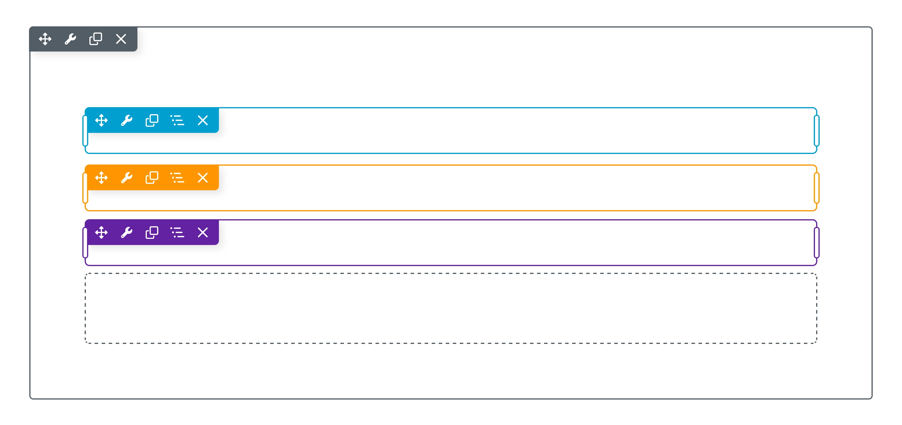
The overlay outline is a visual editing aid in Beaver Builder. It appears when you hover your mouse over a row, column, or module in your layout, highlighting only the element under your cursor. This makes it easier to see the structure of your layout and confirm which part you are about to edit.
The overlay outline is visible only in the editor and never appears on the published page. The outline helps you quickly distinguish between different nodes (rows, columns, or modules) and prevents mistakes by showing exactly which item will be edited. It also makes reusable content, such as Global and Component types, easy to identify since the outline changes color for these content types. In complex layouts, the overlay outline is especially useful for showing which nodes belong to a container module or row and for clarifying how columns and modules are structured within them.
Outline Colors
The color of the overlay outline changes depending on the type of content or editing context:
| Color | Indicates |
|---|---|
| Dashed Blue | An empty column, meaning a column that does not contain any modules. |
| Gray | The row that contains the column or module you are currently editing. |
| Blue | The row or module you are currently editing. Also used for Reusable Content templates. |
| Orange | A Global Reusable Content item, such as a saved row, column, or module. |
| Purple | A Component Reusable Content item, such as a saved row, column, or module. |
Actions Toolbar
The Actions Toolbar is located in the upper left corner of the Overlay for both rows and modules, providing convenient and swift access to essential tools and actions.
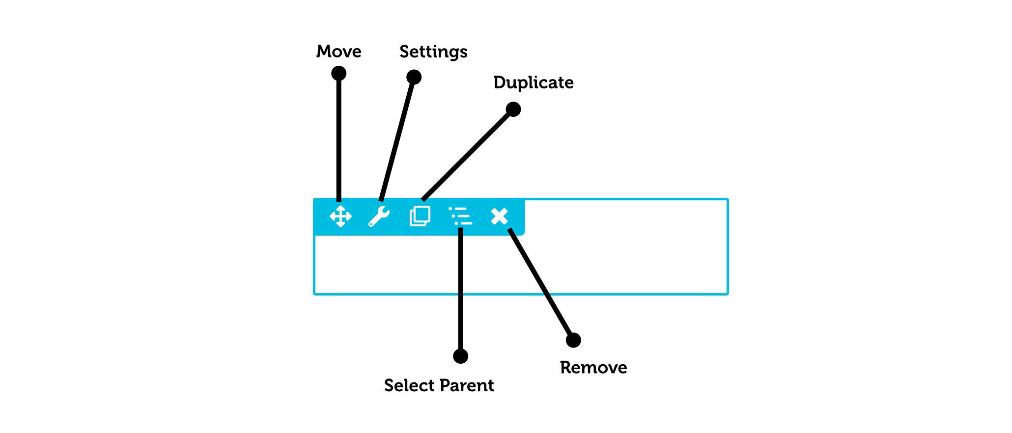
Move
Enables you to rearrange the placement of a row or module within the layout through drag-and-drop. You can also use the Move Left or Move Right actions to quickly change the position of the column or Box module.
Settings
Enables you to access the row or module settings. The Settings drop down menu also provides access to the following actions:
- Reset Row Widths (row only) reverts all row widths to the default.
- Reset Column Widths (row only) reverts all column widths within that row to the default.
- Copy Settings copies the row or module settings to the clipboard.
- Paste Settings pastes the row or module settings from the clipboard.
The Paste option becomes accessible only after you've copied the settings of a row or module to the clipboard.
Duplicate
Creates an identical copy of the row or module. Appears in the Overlay Actions Toolbar as a clone.
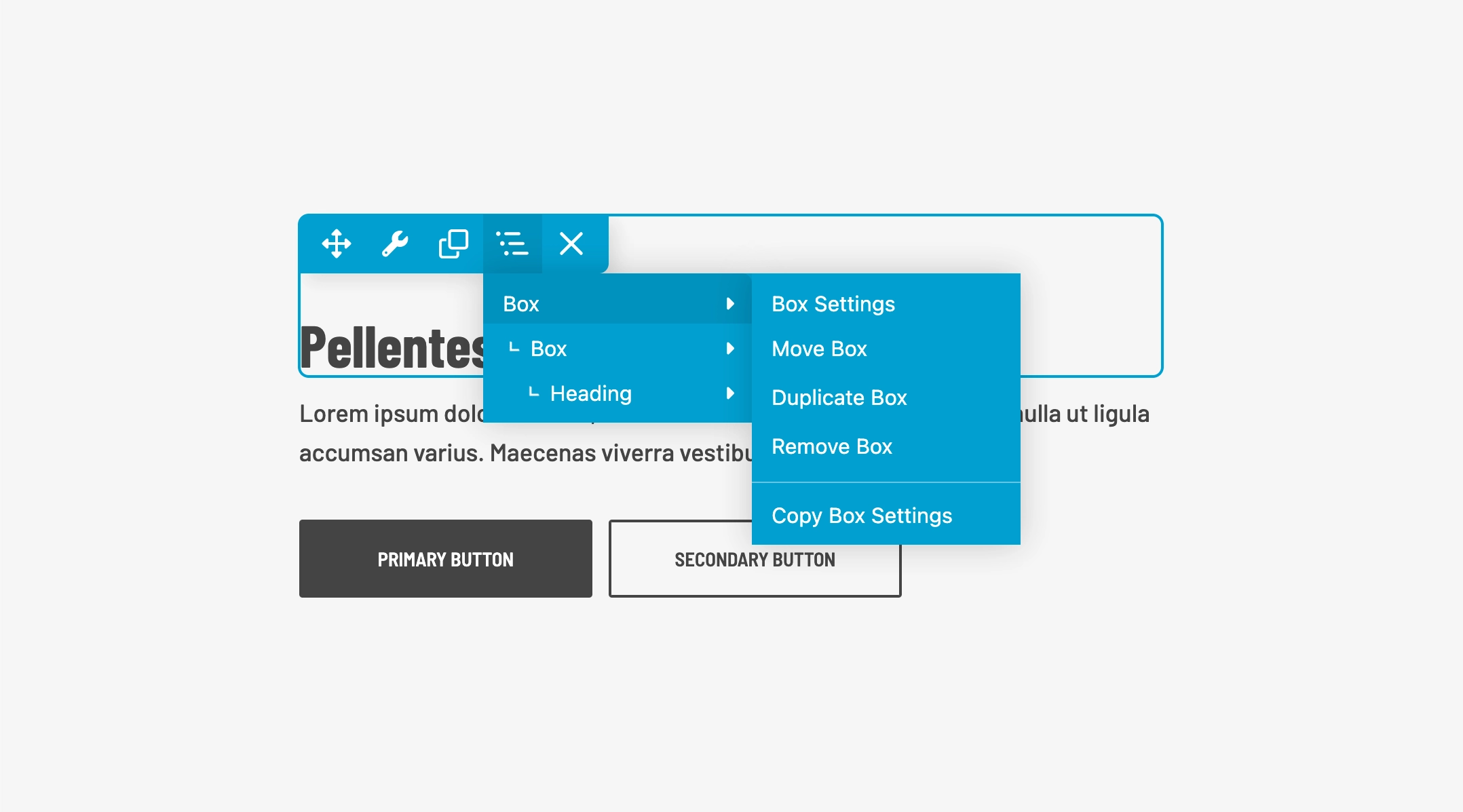
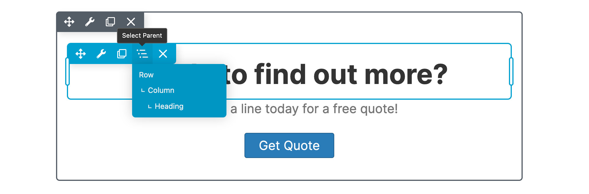
Select Parent
Provides a tree view of your row structure and hierarchy, allowing you to quickly select parent and child nodes. Clicking on a node item in the tree view will open the Settings Window for that specific node.
By hovering your mouse cursor over any node item, the overlay outline will change to aid in identifying the node.
The Select Parent action toolbar menu item is only accessible for the overlay outline of a column or module.
Remove
Deletes the row or module, this action requires confirmation via a popup window.
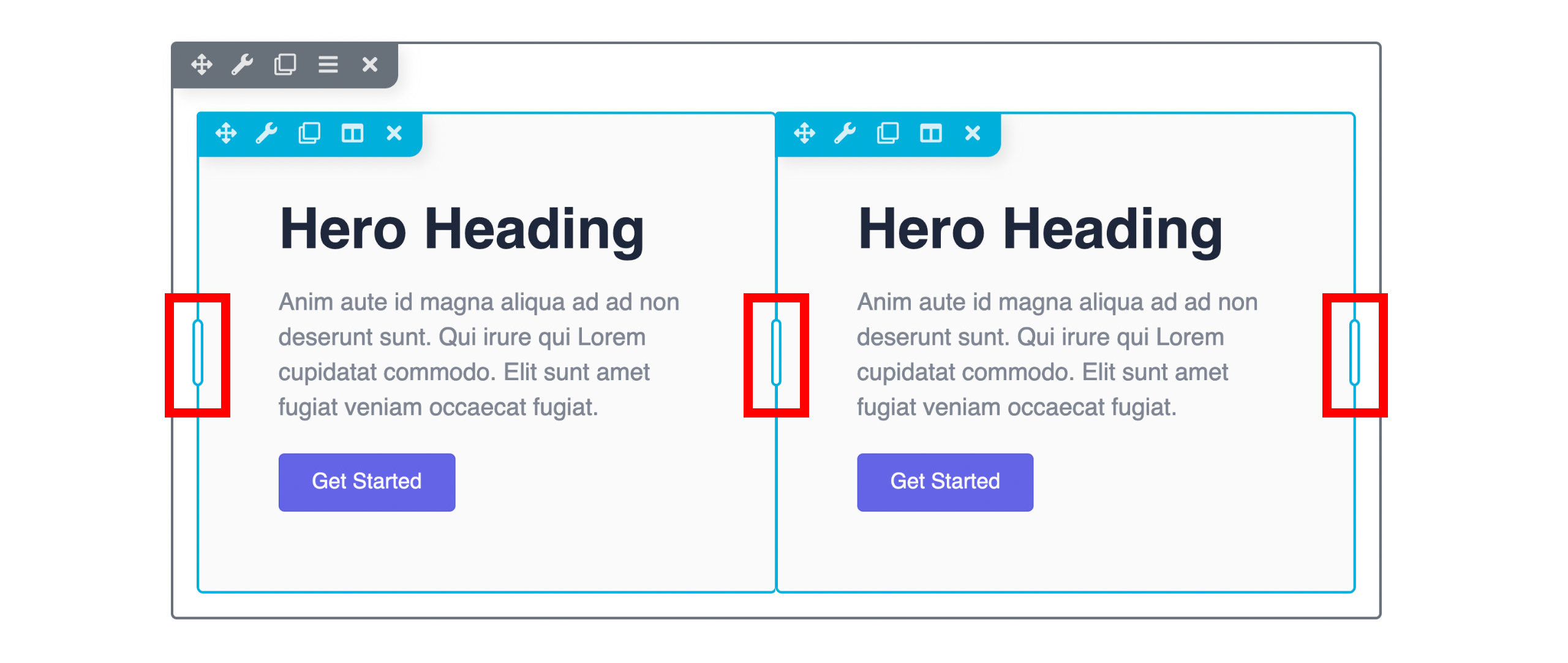
Overlay Drag Handle
Drag handles on the outer edge of the overlay let you adjust the row's max-width and column width by moving the drag handle.