Global Styles
Global Styles provide you with the capability to define your styling preferences for elements and colors within Beaver Builder. These global styles are subsequently accessible throughout your entire website, enhancing your page builder workflow.
Access Global Styles
To access Global Styles, you can either open the Tools menu and select "Global Styles," or use the keyboard shortcut:
- macOS - ⌘ command + G
- Windows - Ctrl + G
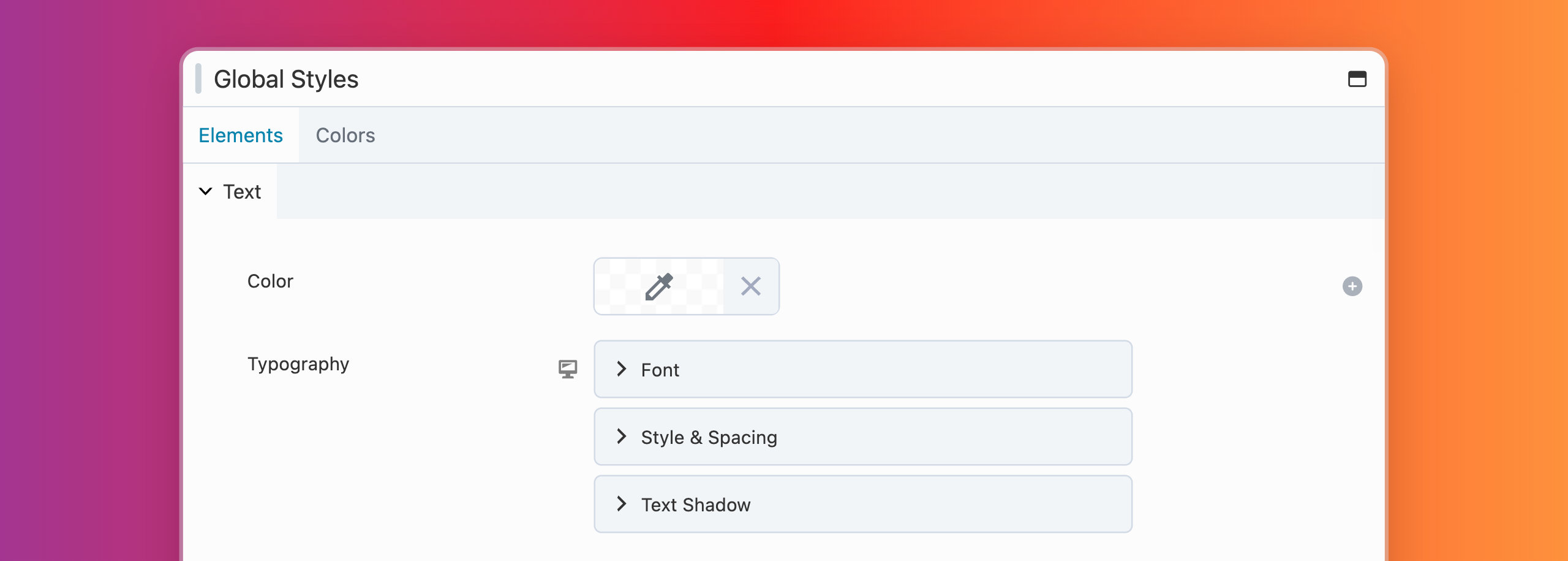
Elements Tab
In the Elements tab, you can set up global styles for elements like text, headings, links, and buttons. The available styling options consist of a color picker, typography settings, and for buttons, there are choices for borders and radius adjustments.
You can override these styling options on a case-by-case basis using the module styling options.
Text
The global Text styling options allow you to style any text that is within <p> and <span> tags.
In case you haven't set up any global styling for Links, the text global styling will be applied.
Headings
The global Heading styling choices enable you to style all heading tags (<h1>, <h2>, <h3>, <h4>, <h5>, and <h6>).
Links
The global Link styling options enable you to customize the appearance of HTML links, which also includes an additional color picker for link hover color.
Buttons
The global Button styling options allow you to style button tags (<button>) as well as any HTML link using the fl-button class.
<a href="https://mywebsite.com/" class="fl-button">Some Link</a>
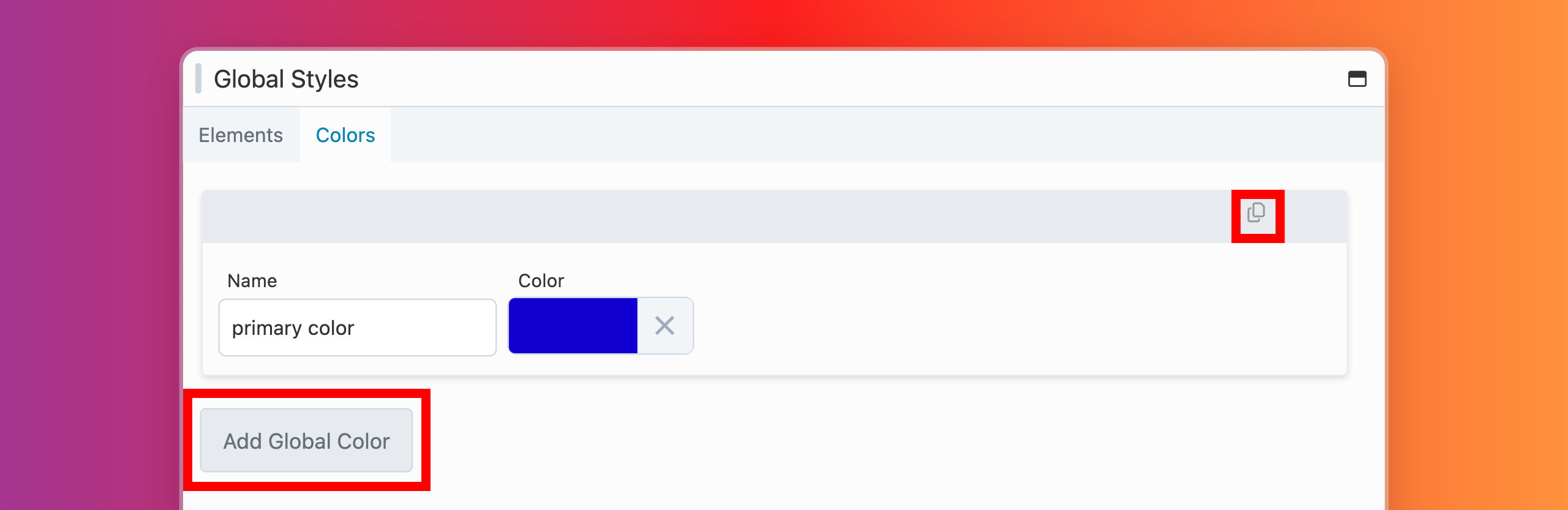
Colors Tab
The Colors tab allows you to establish a global color palette, which can be accessed across your website through the Beaver Builder color picker tool.
You can override these styling options on a case-by-case basis using the row, column, and module color picker.
Add a Global Color
To add a global color:
- Navigate to Global Styles within the Tools menu and choose the Colors tab.
- Assign a name to your color, such as "primary color."
- Use the Color Picker tool to choose your desired color.
While assigning a color name, you have the flexibility to use lowercase, uppercase, or capital letters. If you opt for uppercase or capital letters in your color name, they will be automatically converted to lowercase for the CSS Variable name.
You have the option to include additional global colors by either clicking the Add Global Colors button or duplicating a color item using the duplicate icon located in the upper right-hand corner.
Prefix
The Prefix option allows you to introduce a custom CSS Variable prefix, replacing the default Beaver Builder prefix,
--fl-global.For example, if you named a global color item as
primary-colorand used a prefix such asmy-prefix, the resulting CSS Variable name for that item would be:--my-prefix-primary-color
Delete Global Color
To remove a global color item, simply click the Delete icon located in the upper right-hand corner of the color item you wish to delete.
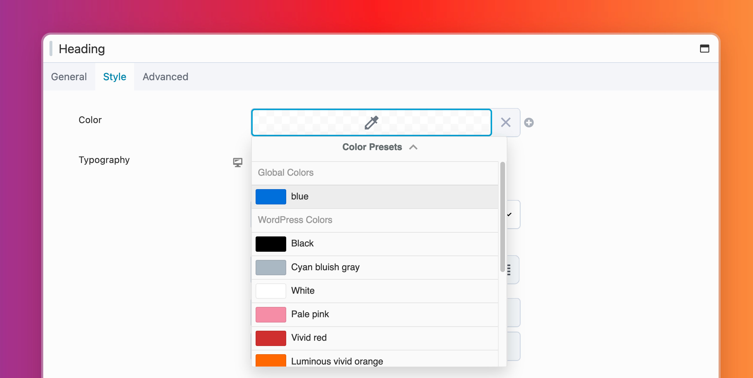
Apply a Global Color
To apply a global color:
- Open the Settings Window for any row, column, or module.
- Select a color option to open the Color Picker tool.
- Click on Color Presets located at the bottom of the Color Picker.
- This action will open the Color Presets panel, granting access to all Global Colors you have created.
- Choose the desired Global Color from the panel to apply it to the Color Picker tool.
Global Color CSS Variables
Any Global Color you create is automatically generated as a CSS Variable, which can be utilized in custom CSS. The CSS Variable uses a prefix of --fl-global, followed by the assigned name of your global color.
For example, if you named a global color item as primary color, the CSS Variable for that item would be:
--fl-global-primary-color
You can make use of your global color in custom CSS by using the CSS Variable, as shown in the example below:
p {
  color: var(--fl-global-primary-color);
}

.my-custom-class {
  color: var(--fl-global-secondary-color);
}

#my-custom-id {
  color: var(--fl-global-tertiary-color);
}
You also have the option to include your Global Color CSS Variable within the Beaver Builder color picker.
See the Color Picker article for more information.