Posts, Posts Carousel, and Posts Slider modules examples
There are three modules that insert a display of Posts or Pages into a Beaver Builder layout: Posts, Posts Carousel, and Posts Slider. The difference in the modules is the way the posts or pages are displayed and the settings that are available to configure layout, content, and style. In addition, the modules can have more than one layout. See the individual articles about the Posts, Posts Carousel, and Posts Slider modules for details about settings.
Which of the posts modules to choose?
The main distinction between the Posts module and the other two modules is that the Posts Carousel and Posts Slider modules can be animated, while the Posts module cannot.
The Posts module displays a subset of posts in a variety of layouts. You can control the number of posts displayed and also control pagination of the display. There are a number of screenshot examples in the following section.
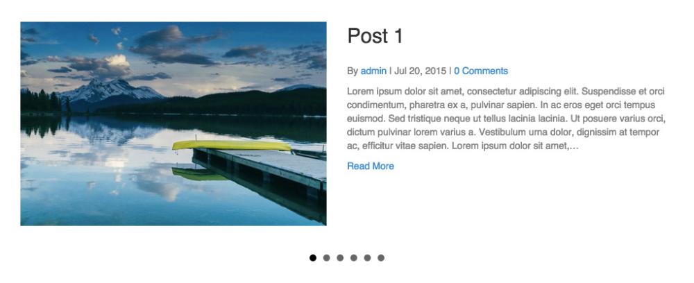
If you want to display the full text of a post, you must use a Posts module and choose the List layout type.
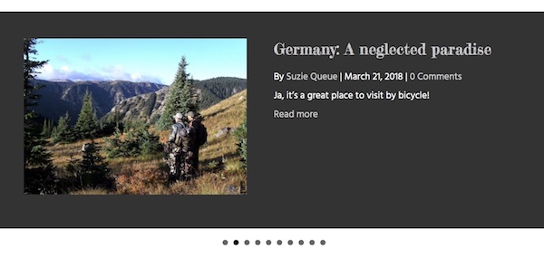
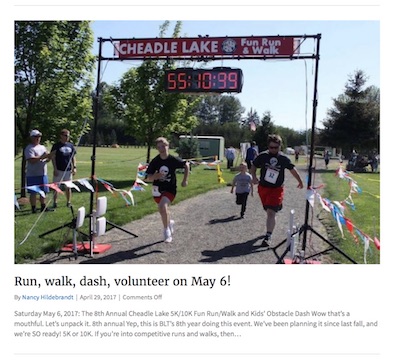
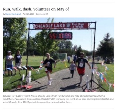
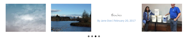
In a carousel, a few items are presented in a horizontal row, with animation or the manual ability to progress through a larger set. In the Posts Carousel module, the post or page title and other information are overlaid on the featured image. The following screenshot shows one of the variations of the Posts Carousel module, with the navigation shown as dots below the posts. See more examples later in this article.
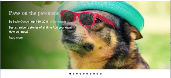
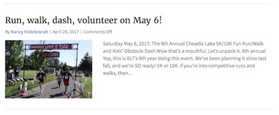
In a slider, an image is usually displayed in a background that fills the screen horizontally, overlaid by text, cycling through a set of image/text combinations. Here's an example of a Posts Slider module layout. See more examples later in this article.
Posts module examples
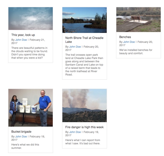
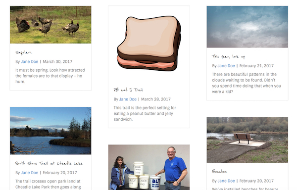
Posts module – Columns layout
Posts or pages are displayed in top-aligned column groups. In this example, the columns are not set to equal height, so each group is top- aligned, but the bottom borders are adjusted to fit the posts.
Posts module – Masonry layout
Posts or pages are displayed with alternating heights, as shown in this screenshot:
Posts module – Gallery layout
Gallery layout displays featured images in blocks of equal height and width with no space between. Mousing over an image shows post information, as shown in the following screenshot. You cannot display post content with Gallery layout.
When the post has no featured image, only the post information is displayed.
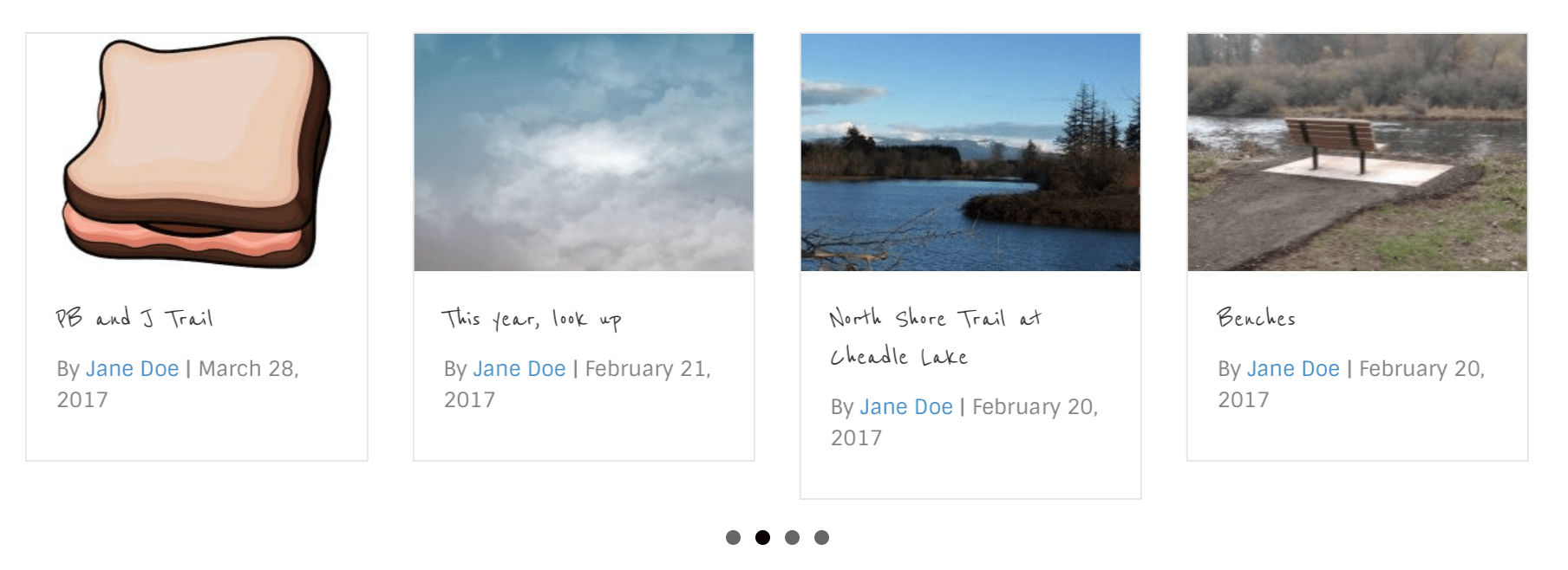
Posts module – List layout
In List layout, posts or pages are displayed in a vertical list takes up the full single-column width. The featured image can be set to appear in any of the following locations:
Above title
Above content
Left
The image is top-aligned with the title.

Left content (Version 1.10.7)
The image is top-aligned with the post content.
Right
The image is top-aligned with the title.

Right content
The image is top-aligned with the post content.

Posts Carousel module
Gallery layout
The Gallery layout of the Posts Carousel module displays the featured image in a single row of blocks of uniform height and width, and when you mouse over the image the title and post info are displayed with a color background, as shown in the screenshot below. You can't display post content with the Gallery layout.
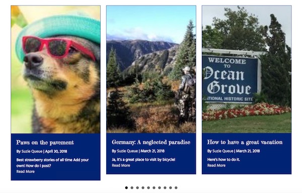
Grid layout
The Grid layout of the Posts Carousel module displays the thumbnails of featured images with post title, optional post info, and optional post excerpt underneath. The column height can be equalized, which means the content borders are the same size and the columns are top-aligned.
Posts Slider module
The Posts Slider module only has one layout style: an animated display of one post or page at a time, with post or page text overlaid.
The featured image can be displayed in two ways.
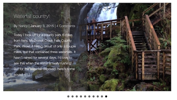
- The featured image can be set to display as the background with the post info and post excerpt appearing on top, as in the following screenshot:
- The featured image can be set to a thumbnail, with the post info and excerpt appearing to the left or right of it, as in this screenshot:
When the featured image appears in the background, you can set the post text to the left, right, or bottom of the slide. When the featured image appears as a thumbnail you can set the post text to appear to the left or right of the image.
You can also set a background color for the text portion of the slide. You can choose whether the background color is the full height of the slide or covers only the portion of the slide where the text is displayed. You can also choose the opacity of the background color and whether the background has a gradient.
To stretch the slides to the full width of the browser window, in the Row settings make the row full width, the content full width, and set the row padding to 0px on left and right. Change the Posts Slider module margins to 0px on left and right.
The following screenshots show some more examples of the text background settings.
In the next screenshot, Text background height is set to Auto, and text padding is set to 50 px. With text placed on the left, the text background extends to the slide border on the top and left and extends 50px beyond the text on the right and bottom.
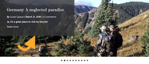
Posts Slider with text left, featured image in background, text background color #333333, 80% opacity, auto height, no gradient:
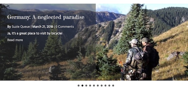
Compare with the next screenshot, in which Text background height is set to 100%. In this case, the text background extends to the slide border on the top , left, and bottom and extends 50px beyond the text on the right.
Posts Slider with text left, featured image in background, text background 50% opacity, full height, no gradient:
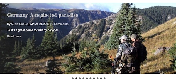
The following slide matches the settings in the previous slide, but with a gradient. Note how the opacity is the full 50% opacity at the left edge and decreases towards the center.
Posts Slider with text left, featured image in background, text background 50% opacity, full height, gradient:
With thumbnail images, the text background is always a solid color and fills the slide background, as shown in the following screenshot. Text background opacity and gradient do not apply to thumbnail layouts.
Posts Slider with text right, featured image as thumbnail, text background set to dark gray: