Posts
The Posts module allows you to display posts, pages, or custom post types in a variety of layouts, such as columns, gallery, list, or masonry. You can display posts by taxonomy or author using the filter options.
Layout tab
Using the Layout tab, you can customize the layout and control which elements are displayed in your posts, such as the featured image, date, and comments.
Layout
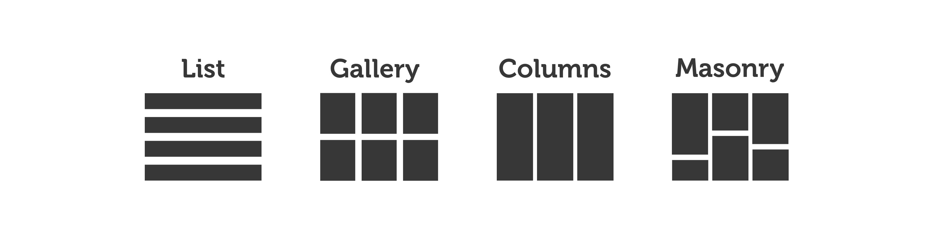
Columns
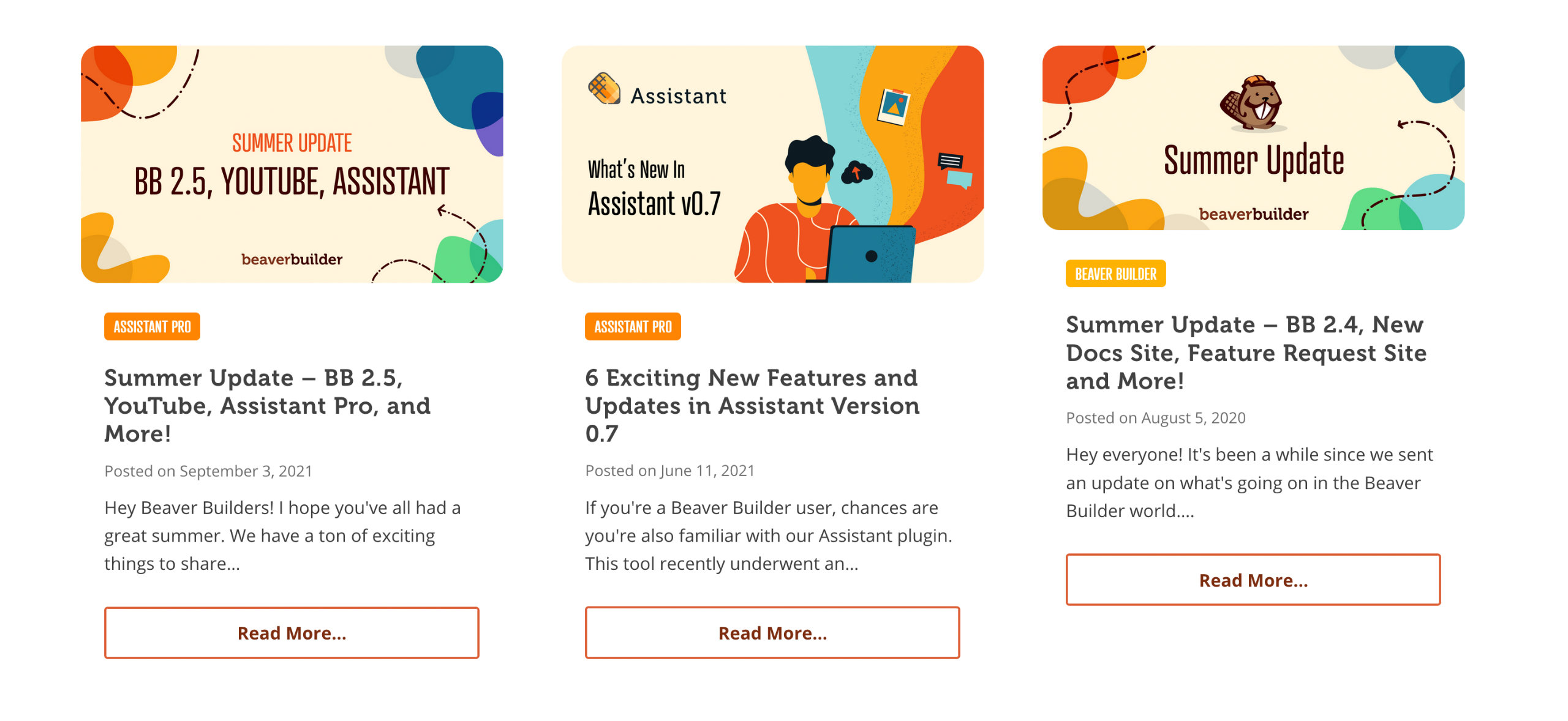
Posts are displayed in top-aligned rows. Title, metadata, and content appear under featured image. Columns layout lets you choose number of columns.
Masonry
Posts are displayed in columns but vertical spacing is fit to the height of the post (unless the equal heights setting is selected). Masonry layout lets you choose the width of each post in pixels.
Gallery
Post title and metadata are overlaid on the featured image and displayed on mouseover. There is no option to display content. if there is no featured image, an image icon is displayed. Gallery layout offers no options to set number of columns or post width.
It is recommended that all featured images have similar dimensions in order to achieve the best results and to maintain consistency
List
The posts are listed vertically in a single column.
Post layout
Post Layout is only available when Beaver Themer is installed.
Default
Use the layout selected from the Layout option.
Custom
Enables the Custom Post Layout Editor, allowing you to customize the post layout using HTML, shortcodes, and Beaver Themer field connections. A CSS tab is also available in the Custom Post Layout Editor for entering CSS that applies only to that Post module.
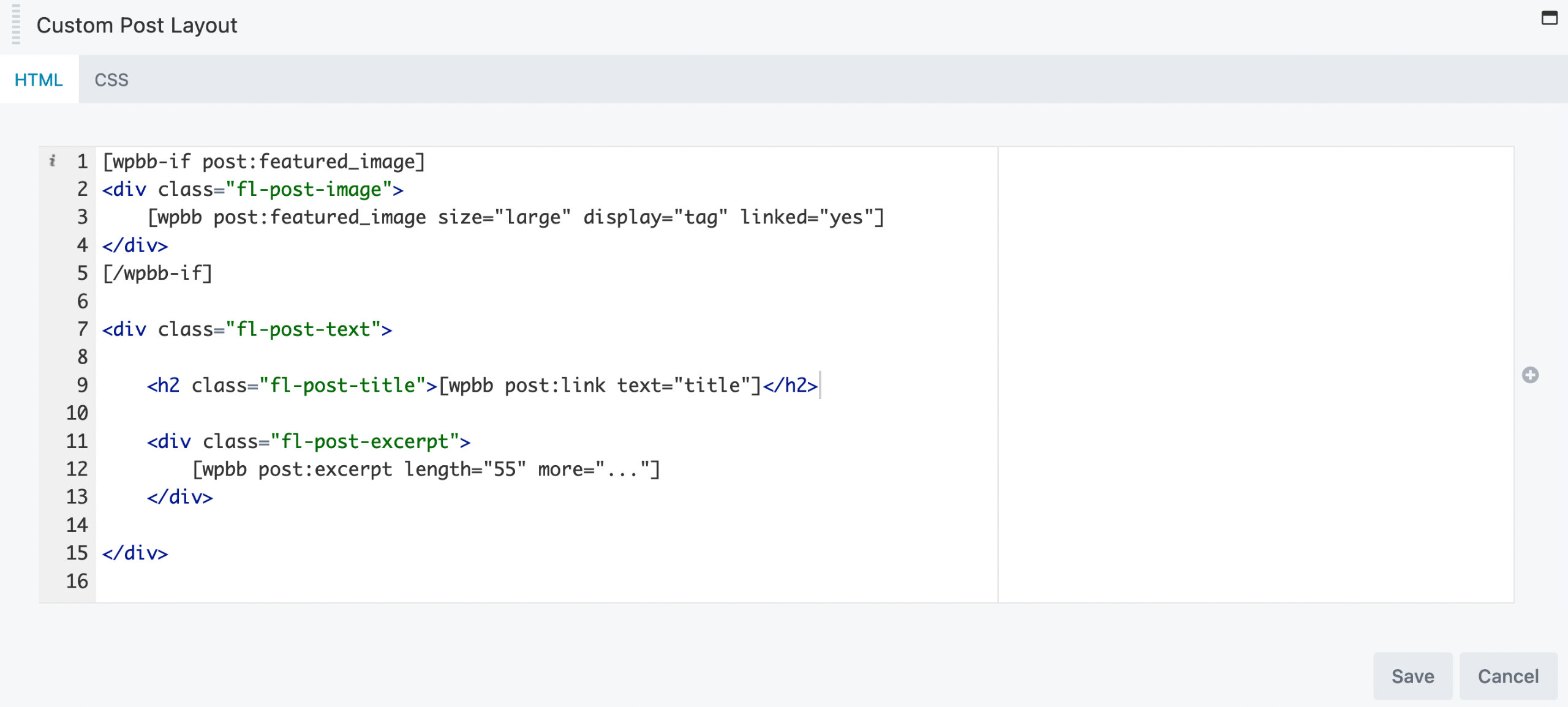
The Custom Post Layout Editor overrides whatever layout you select from the Layout option.
WooCommerce Classes
Adds the woocommerce and woocommerce-page classes to module wrapper.
Only available when Custom is selected.
<div class="fl-module fl-module-post-grid fl-node-123456789 woocommerce woocommerce-page">
Equal Heights
Equalizes the height of all posts to fit the post with the greatest height.
Available for Columns and Masonry layouts only.
Setting Equal Heights to Yes for the Masonry layout changes the masonry appearance to look like the Columns layout. The major difference is that you set width of each post in Masonry layout and number of columns in Columns layout.
Columns
Control the maximum number of columns for the Post module. Automatically adjusts as screen size reduces. The Column option supports the Responsive Toggle allowing you to choose a different number of columns per-device.
Available for Columns layout only.
Post width
Width of each post display in pixels. The default value is 300px.
Masonry layout only.
Post Spacing
Allows you to control the distance between the individual posts horizontally and vertically, in pixels. The Post spacing value does not affect the spacing above the top layer of posts, but it does affect the spacing below the bottom layer of posts.
Post Padding
Allows you to control the padding inside the individual posts. The featured image is not affected by this setting, so if there is a featured image the upper post padding occurs between the featured image and the post text.
Posts Element
Allows you to choose an appropriate HTML5 sectioning content element replacing the default <div>. Choose between <div> (default), <article>, and <li>. Using these elements on your pages gives your content more semantic meaning, improving accessibility and machine-readability.
Posts Element Class
Allows you assign a custom class to the <div class="fl-post-grid-post">.
<div class="fl-post-grid-post my-custom-class"> <!-- Post Element Class -->
  <div class="fl-post-text">
    <h2 class="fl-post-title">Hello World</h2>
    <div class="fl-post-excerpt">
      <p>Welcome to WordPress. This is your first post. Edit or delete it, then start writing!</p>
    </div>
    <div class="fl-post-more-link">
      <a href="https://my-website.com/hello-world" title="Read More...">Read More...</a>
    </div>
  </div>
</div>
Post Title Tag
Choose an appropriate heading tag for the post title. You can choose between <h1>, <h2>, <h3>, <h4>, <h5>, and <h6>.
Default is <h2>.
Featured Image
Show or hide the post's featured image.
It is recommended that all featured images have similar dimensions in order to achieve the best results and to maintain consistency.
Available for all layouts except Gallery. Gallery layouts automatically use the featured image as the background image.
Fallback image
Choose a fallback image to appear for posts without featured images.
Image position
Set the position of the featured image relative to post title or post content.
- Columns & Masonry - Above Post Title or Above Post Content.
- List - Above Title, Above Content, Left, Left Content, Right, and Right Content.
Available for all layouts except Gallery.
Image Size
Choose which image size from the WordPress Media Library to use.
Any Custom Image Sizes added also become available in the list.
Available for all layouts except Gallery.
Equal Height Images
Choose whether all featured images should have the same height. You can select from the following options:
- Disabled: Featured images will display at their natural height.
- Fixed Height: All featured images will have a consistent, fixed height.
- Aspect Ratio: All featured images will maintain the same aspect ratio.
When selecting Fixed Height or Aspect Ratio, the CSS property object-fit will be set to cover to maintain each image's aspect ratio.
Image Spacing
Adds padding to the around the image. Where the spacing occurs depends on the Image position setting.
- Above Title: The number of pixels above, left, and right of the image.
- Above Content: The number of pixels left and right of the image.
- Left or Left Content (List only): Spacing between the image and the text to the right.
- Right or Right Content (List only): Spacing between the image and the text to the left.
Image width
When Image position is Left, Left Content, Right or Right Content the Image width setting determines the column width for the image.
Available for List layout only.
Author
Show or hide the post author.
Enable Author Link
Enable or disable the author link.
Date
Show or hide the post date.
Date format
Select Default to use the WordPress date format specified in WordPress Admin Dashboard Settings > General or override the default with a specific date format.
Appears when Date is set to Show.
Comments
Show or hide the number of comments.
Available for Columns, Masonry, and List layouts only.
Separator
Choose the character that separates the display of author, date, and comments on the same line.
The default is the Pipe | symbol.
Available for Columns, Masonry, and List layouts only.
Terms
Show or hide the post terms.
Terms Label
Choose the text that prefixes the post terms. The default is Posted in. For example, Posted in Uncategorized.
Terms Separator
Choose the character that separates the display of terms on the same line.
The default is a comma ,.
Content
Show or hide post content. If set to Yes, the post excerpt is displayed, with an ellipsis of three dots at the end to show there is more content.
Content Type
- Excerpt - Show the post excerpt.
- Full Text - Show the full content of each post. If Full Text is selected, the Content Length option is no longer available.
Available for List layout only.
WordPress removes all formatting from excerpts by default. If the post contains HTML formatting, the excerpt may appear incorrectly. To solve this problem, add a custom excerpt that includes the HTML formatting.
Content length
Set a custom number of words in the post excerpt to display.
The default is 55.
More link
Show or hide the Read more link after the post content. If set to Show, you can also customize the default Read more text.
More Link Text
Customize the default Read more... text.
Appears if More Link is set to Show
WooCommerce
The WooCommerce options appear in the Layout tab when WooCommerce is installed.
- Product Ordering Show or hide product ordering and product results information (Showing 1–16 of 22 results).
- Sale Show or hide the On Sale label.
- Rating Show or hide the product rating.
- Price Show or hide the product price.
- Cart Show or hide the add to cart button.
- Show Hidden Products Show or hide hidden products.
Events Calendar
The Events Calendar options appear in the Layout tab when the Events Calendar is installed.
- Event Date Show or hide the event date.
- Event Venue Show or hide the event venue.
- Event Address Show or hide the event address.
- Event Cost Show or hide the event cost.
- Events Order By The choices are: Default, Start Date, and End Date. Selecting Default uses the sorting option via the Content tab.
- Events Order Choose between descending or ascending.
- Show Events The choices are: Future Events, Past Events, Todays Events, All Events, and Featured Events.
Style tab
The Style tab allows you to style the individual elements of the post, including the post title, contents, and the read more link, by adjusting the colors and typography.
Style tab options vary based on Post Layout.
The Style tab is unavailable if Post Layout is set to Custom. Posts can be styled using the CSS tab in the Custom Layout Editor.
Post alignment
Sets the overall alignment of the post title, post info, and post content. This setting can be overridden for each component in the Typography subsection for each component (title, info, content) in the Text section of the Style tab.
Post Background Color
Set a background color for each post using the color picker.
Border
The Border section has settings for border, radius, and shadow.
The Post module has a 1px border by default. To remove the border, set the Border > Style option to None.
See the Borders article for more information.
Title Color
Set the color of the post title.
Title Typography
You can style the title of the post using the Typography options, including font size, family, line height, and more.
Post Info Color
Color of the post info (author, date, comments, separator).
By default the link color in the Post Info is set by the theme's accent color, if there is one. If you set Post info color, the color of the entire Post Info line is this color, with no distinction between text and links.
Post Info Typography
You can style the post info using the Typography options, including font size, family, line height, and more.
Content Color
Color of post content.
Content Typography
You can style the content of the post using the Typography options, including font size, family, line height, and more.
Link Color
Sets the color of links in full-text post content or custom excerpts.
Link Hover Color
Sets the hover color of links in full-text post content or custom excerpts.
Gallery Layout
The following styling options are available for the Gallery layout only.
- Hover transition The type of transition when a user mouses over a post in the display: fade, slide up or down, scale up or down.
- Overlay Text Color The color of text overlaid on the featured image.
- Overlay Background Color The color of the overlay placed on the featured image. This setting is generally used to make the overlay text color more legible. Opacity is set in the color picker.
- Use Icon for Posts Choose Yes to display an icon on the line above or below the text.
- Post Icon Select the icon you want to display.
- Post Icon Position Above or below the text.
- Post Icon Color Set the Icon color.
- Post Icon Size Icon size in pixels.
WooCommerce
The WooCommerce options appear in the Style tab when WooCommerce is installed.
- Product Sale Background Set the Sale background color.
- Product Sale Text Color Set the Sale text color.
- Product Rating Foreground Set the product rating foreground color.
- Product Rating Background Set the product rating background color.
- Product Rating Font Size Set the product rating font size.
- Product Price Text Color Set the product price color.
- Product Price Font Size Set the product price font size.
WooCommerce Cart Button
- Background Color Set the background color for the add to cart button.
- Text Color Set the text color for the add to cart button.
- Hover Background Color Set the background hover color for the add to cart button.
- Hover Text Color Set the text hover color for the add to cart button.
Content tab
The Content tab allows you to control the source of your posts and what content is displayed using the filter options.
Source
Choose between Main Query or Custom Query. The default query is Custom Query.
Main Query
The main query is used to display the primary content on that page or post. Most of the time, the main query will not be appropriate for Beaver Builder layouts and a custom query should be used instead.
It is recommended to use the main query over the custom query when creating Beaver Themer archive layouts, such as the blog page, categories, tags, and search results.
Suppose you create a Beaver Themer archive layout and assign it to all archives on your website with a custom query as the source in the Post module. All archives on your website will display the same posts.
However, when you use the main query as the source and view your archive pages, the posts will display correctly.
The custom query and filter options are removed when main query is selected. The main query cannot be customized or filtered via the Post module. To do this, you will need to use the pre_get_posts() hook.
Custom Query
The custom query is the most appropriate option for Beaver Builder layouts, as it reflects the configuration of the custom query options and filters.
You can use the custom query option if you wish to display specific pages, posts, or custom post types on any of your pages or posts. For example, your homepage could be used as a showcase for WooCommerce products.
Post Type
Select the post type(s) you wish to populate the Post module with. You can choose pages, posts, or a custom post type, such as WooCommerce Products or a custom post type that you created yourself.
You can also select more than one post type with the Post Type option. For example, you can display both posts and pages, or both posts and WooCommerce products.
Order
Descending or ascending, and whether it is by date, numerical, or alphabetical depends on the Order by setting.
A featured post could be displayed on your homepage using a Post module configured to display one post. You could then place another Post module below and use an offset of 1 to skip over the featured post.
Order By
The choices are: Author, Comment count, Date, Date last modified, ID, Menu order, Meta value (alphabetic or numeric), Random, Title, Selection order.
Menu order can be used with a plugin such as Post Types Order to order the posts or custom posts in the same way you arrange them in the back end.
Meta value option enables ordering by a custom field. If you select either the alphabetic or numeric Meta value option, a Meta key field appears so you can enter the key (
meta_key).Selection Order allows you to use drag and drop to reorder posts, pages, or custom post types added to the Filter settings. The order in which your posts, pages, or custom post types appear is reflected in the order of the items that appear on the page.
 info
infoSelection order works only for selected posts, pages, and custom posts. It doesn't work for selected categories, tags, or authors.
The Ascending and Descending settings don't affect the order of posts when Selection order is used.
Offset
The Offset option allows you to exclude a certain number of pages or posts from the Post module.
For example, using the Offset option, you can skip the most recent post on your website on pages that use more than one Post module.
Exclude Current Post
Excludes the current post from the query. This is useful when you are using the Post module to create a list of related posts on a single post page.
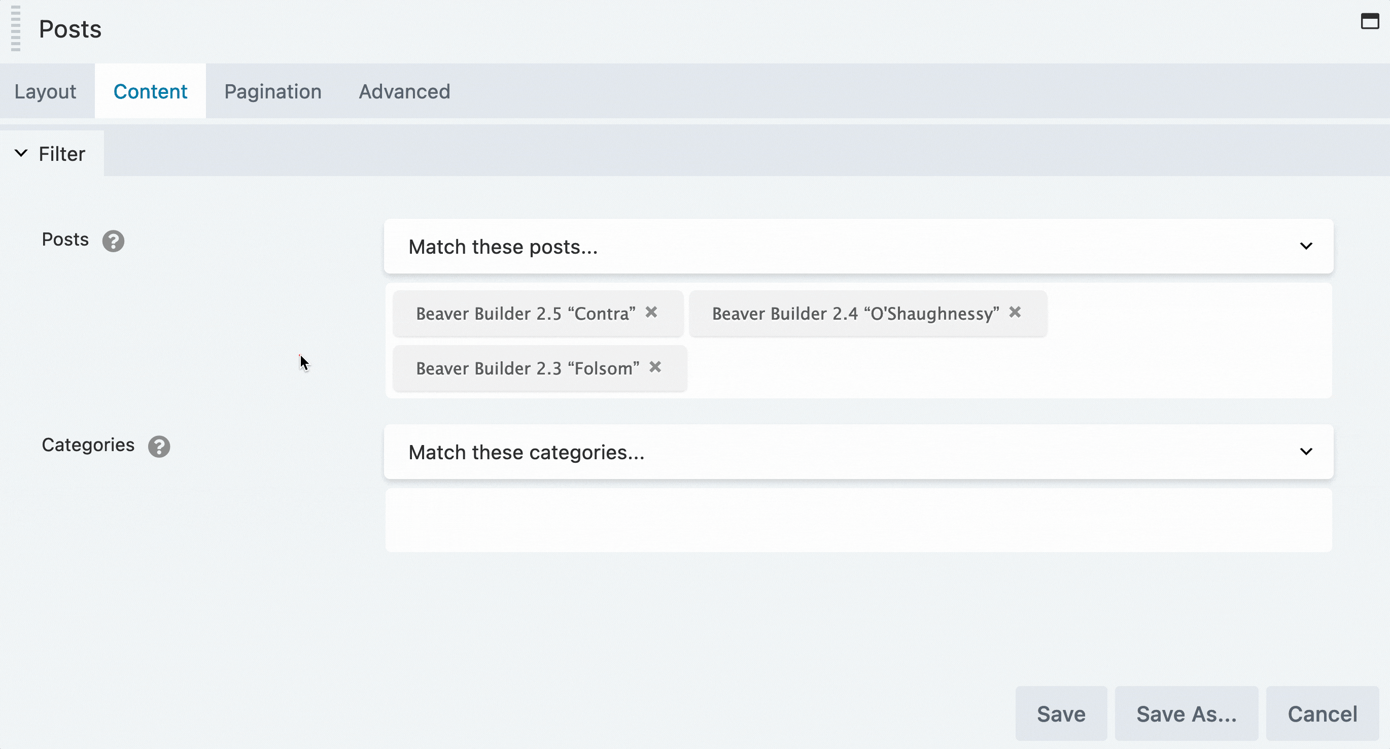
Filter
The Filter section allows you to include or exclude a set of posts, pages or custom post types by title, taxonomy, and author.
Filter options vary depending on the post type selected. The post category and tag filters will not be available if you select Products (WooCommerce).
If you use Multi-select Post Types, filters from one post type apply to all post types because there is an AND filter relationship. For example, if you choose to display both posts and pages but filter to show only one specific page for pages, there will be no posts displayed.
Start typing a word, and the filter options will display any title that matches what you typed. Keep selecting titles until you have the set you want to include or exclude. You can reorder the selections and how they are reflected in the front end. See also Selection Order in Filtering.
Post - Include or exclude a post or multiple posts, by typing the post title(s).
Page - Include or exclude a page or multiple pages, by typing the page title(s)
Custom Post Type - Include or exclude a set of posts from the custom post type, by the custom post type title(s).
Categories - Include or exclude posts assigned to a specific category.
Custom Taxonomies - Include or exclude custom post types assigned to custom taxonomies. For example, if WooCommerce is installed, the Product Categories and Product Tag taxonomies are available.
infoMatch related categories except, is useful in Singular-type Themer layouts when you want to use the Posts module to display a list of related posts, and you want to display the related posts in a family of categories except for the specific categories that you name.
Tags - Include or exclude posts assigned to a specific tag.
Authors - Include or exclude posts or pages by specific authors.
Custom Field Filter
The Custom Field Filter section allows you to include or exclude a set of posts, pages or custom post types by custom field. You can add as many custom fields as you want.
Relation
The Relation option allows you to apply logic to filter by custom fields. The rules operate with AND or OR logic.
Edit/Add Custom Field
Label Labels are used to identify custom fields. They appear in the Custom Field Filter section.
Meta Key Custom field key or field name.
Meta Value Custom field value.
Type A list of all available field types supported. Choose between:
- Numeric
- Binary
- Text
- Date
- Date Time
- Decimal
- Signed
- Time
- Unsigned
Compare You can use the Compare option to check whether or not the field value matches, or if it is greater than, less than, or the same as, depending on the comparison operator. Choose from the following operators:
- Equals
- Does not equal
- Greater than
- Less than
- Greater than or equal to
- Less than or equal to
- Exists
- Not Exists
Pagination tab
The Pagination tab has settings that let you divide a large collection of posts into multiple pages.
Pagination style
Numbers The pagination appears as numbers under the posts, and when a different number is clicked, a new page loads with the new set of posts.
Scroll A new set of posts are loaded into subsequent rows on the same page as the user scrolls down.
Load More Button The Load More Button appears under the initial set of posts, and when clicked it generates the next set of posts. The user must keep clicking to get each next set of posts. This setting works better than Scroll when you want your users to have more control over the display, or when network bandwidth is low and you don't want to use resources loading more sets of posts unless the user really wants to see them.
tipYou can use the Load More Button style options to control the button's background, text, and icon colors.
None No Pagination. Use this setting when you want to display only a subset of posts. For example, you might want to display only the three most recent posts.
Posts Per Page
Determines how many posts constitute each set. The default is 10 posts.
Posts Per Page does not set the number of columns across the page. That is controlled automatically according settings on the Layout tab and screen width. For example, if the screen size allows 3 posts per row and your Posts Per Page is set to 5, you will see three posts in the first row and two posts in the second row in the first chunk of posts.
When Source on the Content tab is set to Main query, the Posts per page setting does not appear. In this case, the number of posts that appears on the page is determined by the WordPress value for the Blog pages show at most field at WordPress Admin Dashboard > Settings > Reading.
No Results Message
The message displayed when there are no posts to display.
This option also supports shortcodes, which lets you add more complex layouts (rows, columns, modules, templates) than just text.
Show Search
Show or hide a search form when no posts are found. See the screenshot below the table.
Load More Button Styling
This section appears when Pagination Style is set to Load More Button.
- Button Text The text that appears on the Load More Button.
- Button Icon
Optional icon to appear on the button. If you select an icon, there are two additional fields:
- Icon position: Before or after the button text.
- Icon visibility: The icon can be always visible or appear on hover only.
- Button Width
- Auto Width: Width adjusts to fit the text and icon.
- Full Width: The width expands to the content area minus the module's margin settings.
- Button Padding Set a specific padding value in pixels. Click the Link Value icon to automatically make all four padding values the same.
- Button Text Color Set the button text color in the resting state.
- Button Text Hover Color Set the button color on hover. If this setting is left blank, the Text color setting applies for hover also.
- Button Typography See the Typography article for more information.
- Button Background Color Set the fill color for the button in the resting state.
- Button Background Hover Color Set the button's fill color on hover. If this setting is left blank, the Background Color setting applies to hover also.
- Button Background Style
- Flat: consistent fill color
- Gradient: gradient of the background color, lighter on top and darker on the bottom.
- Button Background Animation Disabled by default. If set to Enabled, there's a 0.2-second linear transition from resting state to hover state.
- Button Border See the Border article for more information.
- Button Border Hover Color Set the border hover color for the button.
Advanced tab
There are all the usual Advanced tab settings for margins, visibility, animations, and advanced HTML settings.
See the Advanced tab for more information.
Sticky Posts
The Sticky Post feature in WordPress allows you to place a post at the top of the Posts page (blog), regardless of when it was published, and it will remain there until a new sticky post is published.
By default, the Post module ignores the sticky posts feature and displays them in the order specified in the Order By option.
You can override this behavior by using the fl_builder_loop_query_args_filter filter.
function fl_builder_loop_query_args_filter($query_args)
{
  $query_args["ignore_sticky_posts"] = false;
  return $query_args;
}
add_filter("fl_builder_loop_query_args", "fl_builder_loop_query_args_filter");
The Sticky Post feature is only available for Post type post and not for custom post types.