Accordion
The Accordion module lets you present a variety of content by expanding and collapsing the text, saving space while maintaining a professional appearance.
Usage
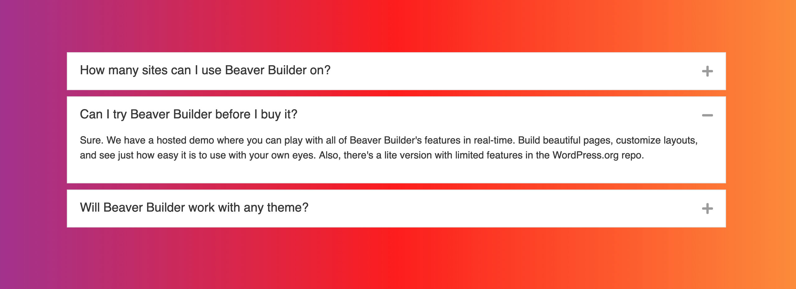
The Accordion module is ideal when you have a list of items with detailed information that you want to keep easily accessible without cluttering up the main page. Below are some examples of useful applications for the Accordion module:
- FAQs
- Q&A
- Feature Lists for products or services
In this Section
🗃️ Settings
2 items
📄️ Link to a Specific Item
In this article, you will learn how to create a link that navigates to a specific item in an Accordion module.
📄️ CSS Customization
Here's some CSS to change the icons to Media Library images in the Accordion module.