Callout and Call to Action modules
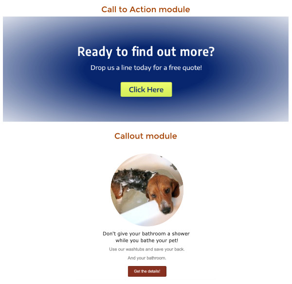
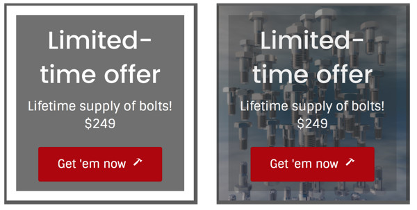
The Callout and Call to Action modules are very similar, as shown in this screenshot, with a heading, some text, and a button, but their uses are often different.
Uses of these modules
With the Call to Action module, the emphasis is usually on the button. The point is to get the visitor to click the button to take an action on your website. Often much of the preceding page is the lead-in to funnel the visitor into wanting to click that button. By that point, no image and little text is required. It's the final action of a persuasive presentation.
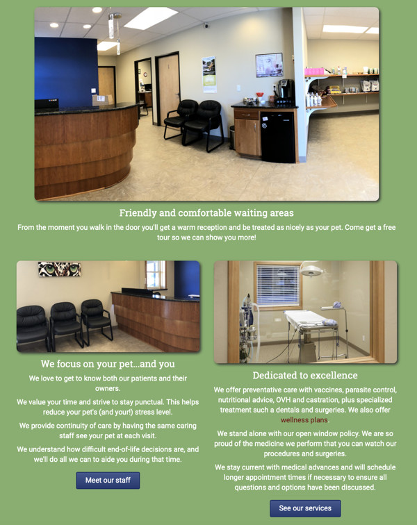
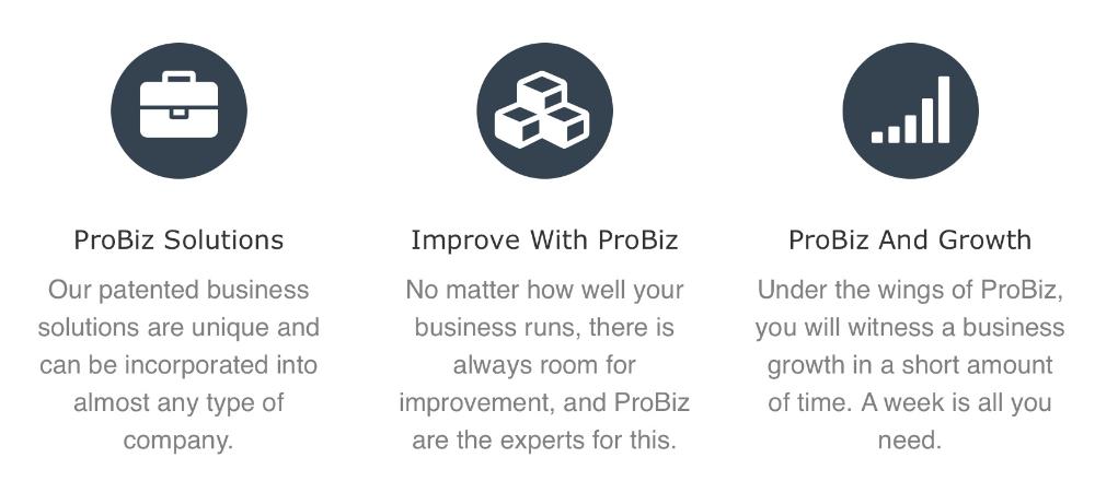
The callout module tends to be used in groups, often to highlight the features of a business that send the visitor to the appropriate page of the site. Here's an example of a grouping of Callout modules. Although you could construct the same look with a Photo module, Heading module, Text Editor module, and Button module, the Callout module keeps it of these parts together nicely on smaller devices, and it automatically adds the link to the image and the heading as well as to the button to facilitate getting to the right location.
Properties of the Call to Action and Callout modules
Both modules offer:
- A heading and a text editor for optional text.
- A button with the ability to configure button style.
- An optional icon on the button with the ability to position it relative to the text.
They differ in the following ways:
- The Callout module allows an optional image or icon, with the ability to position it above, below, left, or right of the text.
- In the Call to Action module, the button is required; in the Callout module it is optional, and there is an option for linked text instead of a button, or neither one.
- In the Callout module, the link you specify applies to the heading, the image, and the button. In the Call to Action module, only the button has the link.
- There are some minor styling differences. For example, the Call to Action module allows you to adjust the spacing above and below it.
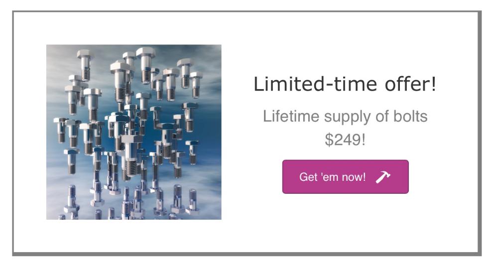
Here are some more examples of Callout and Call to Action modules with buttons. Here's a Callout module with the image on the left and an icon on the button, plus a border.
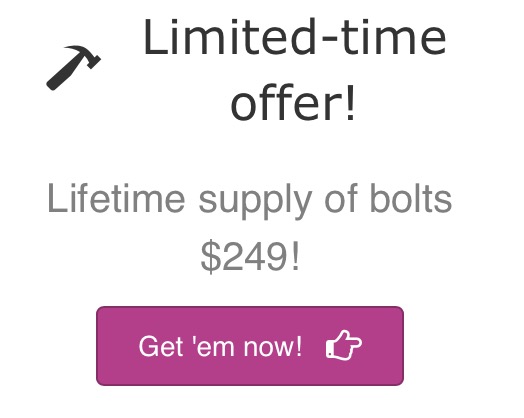
Here's the same Callout module with an icon instead of an image. The icon can be placed in a number of positions relative to the heading and text.
And here's the same content in a Call to Action module placed in a column, with the border set on the column. The icon can only appear on the button, and there is no provision for adding an image, though you can add one as a column or row background, as shown in the version on the right.
Aside from the ability to set vertical space above and below the Call to Action, the Callout module is more powerful and more flexible.
Other uses of the Callout module
You can position the image in various locations with respect to the text. Here's an example in which the images are positioned over the text.
A big advantage of using the Callout module for image-text groupings is that they stay together and stack correctly at smaller device sizes.
Call to Action module settings
General tab
This tab has fields to enter the heading and text portion of the call to action. You can also specify the Heading tag that you want used (H1, H2, etc.). If you want to enter a custom font size, you can do that in the Typography section of the Style tab.
Style tab
The Style tab has three sections, as shown in the following screenshot and described below.
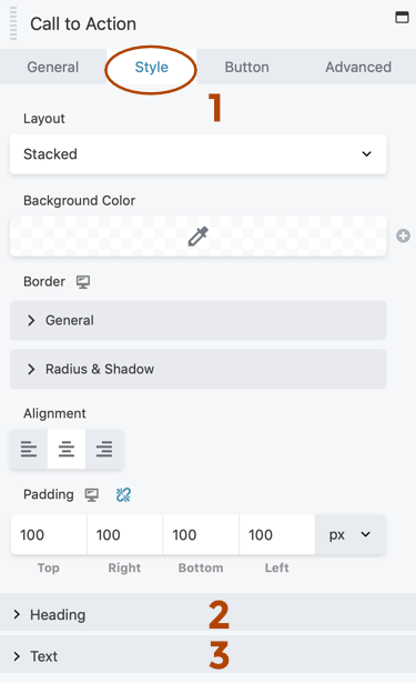
1 Top section
Layout Stacked : the heading appears above the text, which appears above the button. Inline : the heading a text appear to the left of the button.
Background color Fills the module background with the designated color. If you have Beaver Themer, this field has a field connection (the Plus icon) to let you use a custom field to assign the color for the particular post or page the layout applies to.
Border (responsive) This is the standard Border section, to attach a border or border effect.
Alignment Left, center, or right horizontal alignment, or default alignment if none of the three choices are selected. See this article for more information.
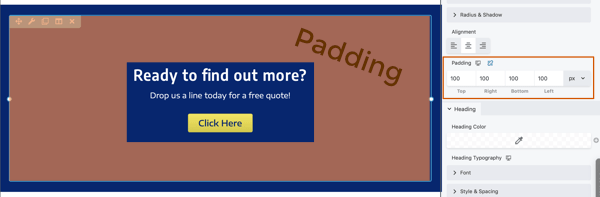
Padding (responsive) The distance from the module's border to its content, in px, em, or % units. You can enter these values per device size by clicking the device icon or entering Responsive Editing Mode. See this article for more information about responsive editing.
2 Heading section
Settings for the heading portion of the call to action:
- Heading color Opacity is set with the right-hand slider in the Color Picker.
- Heading Typography section (responsive) Includes various font settings and a text shadow effect.
3 Text section
Settings for the text portion of the call to action: Text color and the Typography section.
Advanced tab
There are all the usual Advanced tab settings for margins, visibility, animations, and advanced HTML settings.
Callout module settings
General tab
This tab has fields to enter the heading and text portion of the call to action. You can also specify the heading tag that you want used (H1, H2, etc.). If you want to enter a custom font size, you can do that in the Typography section of the Style tab.
Style tab
The Style tab for the Callout module is identical to that for the Call to Action module. See the previous section for a description of the fields.
Image tab
On the Image tab, the settings are different depending on whether you select a photo or an icon in the Image type field.
Photos
Setting Image type to Photo opens two sections: Photo and Photo style.
The Photo section has the following fields:
Photo Select the photo and the maximum photo size. The photo size can be customized in the Width field of the Photo style section.
Position You can choose for the photo to appear above or below the heading or to the left or right of the text and heading. If there's also a button or link, the photo is vertically centered to the left or right.
The Photo style section has the following fields:
Photo crop You can crop the photo into a specific shape.
Width Choose a custom max width for the photo in px, vw, or %. If you don't enter a value here, the max width will be determined by the photo size you selected in the Photo section.
Alignment (responsive) Sets the alignment for the photo within its column space. If the photo placement is over or under, this aligns the photo to the left, center or right over the heading and text. If the photo placement is to the left or right, this aligns the photo in the left column. Tip: To move the left or right photo closer to the heading and text, adjust the settings in the Padding field on the Style tab.
Border Standard settings for border and border effects. Setting Radius rounds the corners of the photo.
Icons
Setting Image type to Icon opens three sections: Icon, Icon colors, and Icon style.
The Icon section has the following fields.
Icon Select the icon.
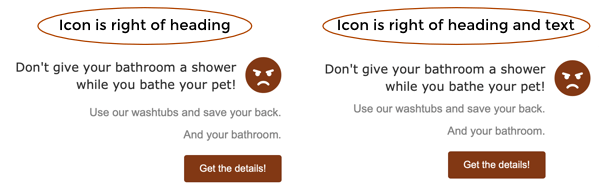
Position You can choose for the icon to appear above or below the heading or to the left or right of just the heading or the heading and text both. If there's also a button or link, the photo is vertically centered to the left or right.
Note:
With any of the left or right selections, the icon position is vertically centered with the heading. The difference between Left/Right of Heading and Left/Right of Heading and Text is that with the former, the text and optional button or link are aligned under both the heading and icon, whereas in the latter, the text and optional button remain aligned under the heading, and the icon appears to the left or right of that grouping. The following screenshot shows an example in which the overall alignment (on the Style tab) is set to Right.
The Icon colors section has the following fields:
Color If this color is unspecified, the default accent color is used. For Beaver Builder Theme, this is set in the Customizer at General > Accent Color.
Hover color If this color is unspecified, the default accent color is used. For Beaver Builder Theme, this is set in the Hover colo r field in Customizer at General > Accent Color.
Background color Setting a background color adds a circle with a border behind the icon, as shown in the screenshot. If this color is unspecified no color is added.

Background hover color Sets the background color on hover. If this field is not set, the Background color setting is used.
Gradient Sets a gradient on the background color, if there is one. The screenshot above shows a gradient on the background color, which is lighter at the top and darker at the bottom.
Link tab
In the Link section, setting a link adds a hyperlink to the heading, the photo or icon, and the button or link text.
In the Call to Action section, the Type field has the following choices:
None Does not display either a button or link text. however, if you have set a link, that link will still be set on the heading and a photo or icon.
Link Choosing Link opens a Text field and a Link text section, as shown in the following screenshot and described below.
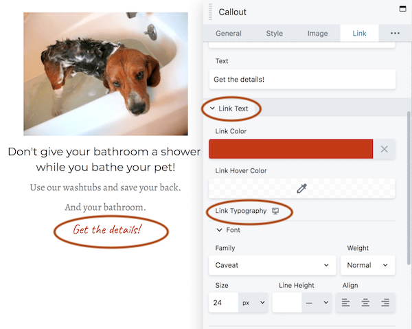 The Link text section lets you assign link and link hover color, and the
Link typography subsection is the standard Typography section.
The Link text section lets you assign link and link hover color, and the
Link typography subsection is the standard Typography section.Button This choice opens a Text field and a number of button sections, as shown in the following screenshot.
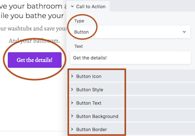 These button sections have most of the same options of the Button module.
Advanced tab
There are all the usual Advanced tab settings for margins, visibility, animations, and advanced HTML settings.