Components
Components provide a balance between consistency and flexibility. Unlike templates, which are fully independent, or globals, which update universally, components allow you to define which options remain fixed and which can be customized per instance. This makes them ideal for layouts where the overall design should stay consistent while the content varies across different pages.
Use cases
Components work best when you want a uniform structure with customizable content. For example:
- A hero section where the layout, colors, and button placement are locked, but headlines or background images can change.
- A call-to-action block with fixed styling but editable text and links.
- A product or service card where the design is consistent, but images, titles, and descriptions differ.
Create Component
Creating Components is only possible via the builder (front-end).
- Open the Settings window for the desired row, column, or module.
- Click the Save As... button.
- From the Type dropdown, select Component.
- Optionally, assign a category, upload a photo to serve as a visual reference (similar to a featured image), and add notes that may be helpful for collaboration with team members.
- Click Save to begin configuring your Component.
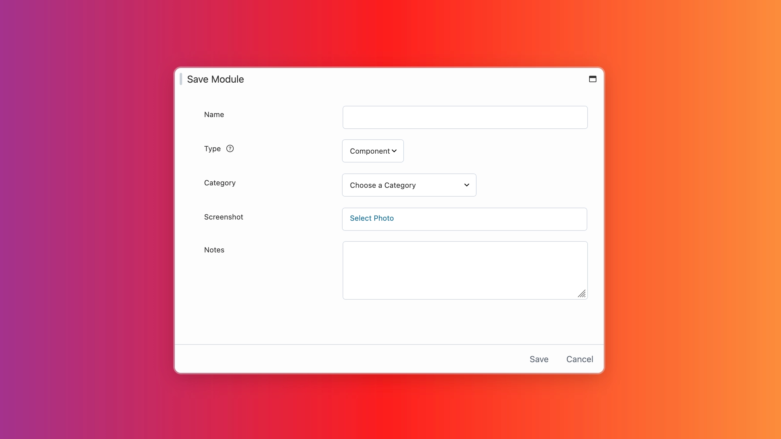
If no category is selected, your saved row, column, or module will be assigned to the Uncategorized category by default.
Configuration
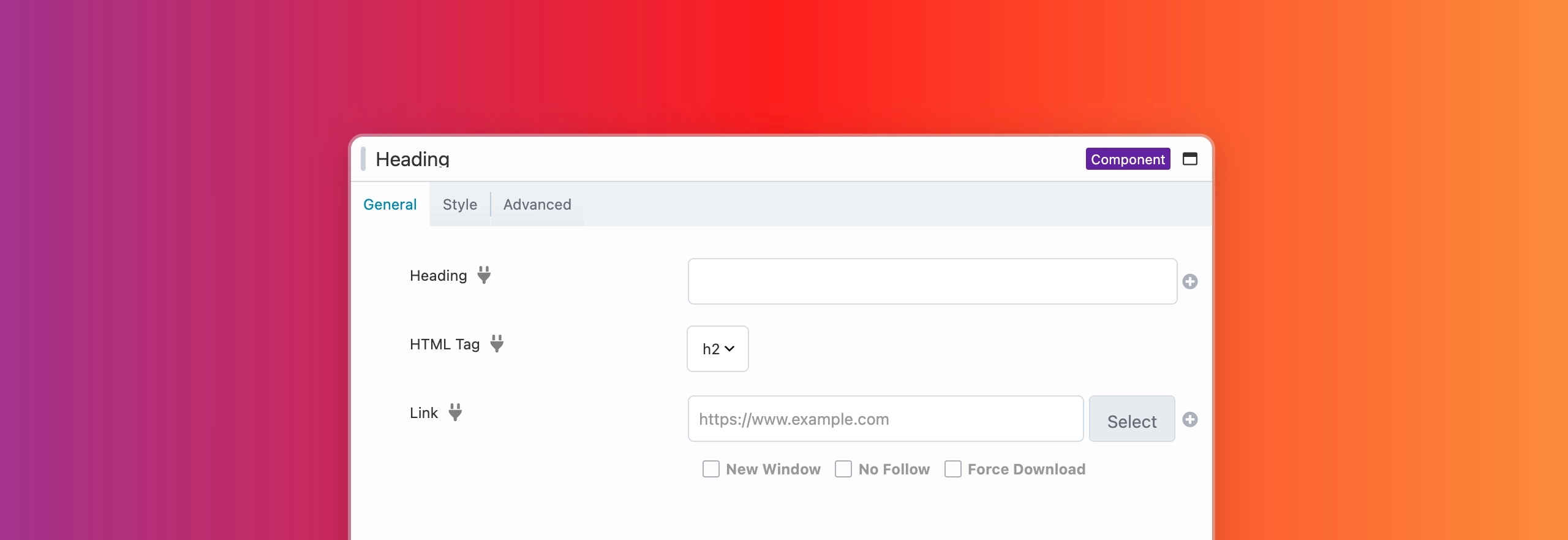
When you click Save in the Settings window, a new browser tab will open where you can configure the component item. Each option includes a socket icon that you can toggle to define which settings remain fixed and which can be customized per instance.
By default, the socket icon appears gray, meaning the option is fixed and cannot be modified when the component is added to a page. Clicking the socket icon turns it blue, allowing that option to be customized in each instance of the component.
After configuring your Component and saving the changes, you can revisit it at any time to adjust which options are editable if you’re not satisfied with your original choices. To do this, either click the Wrench icon in the Content Panel for the Component item or navigate to your WordPress Admin Dashboard. From there, open the Beaver Builder Layouts menu, locate your Component, and launch the builder. Within the builder, you can modify the Component and, using the Socket icon, toggle which options are fixed and which are available for user modification.
If you create a component without configuring any options to be modifiable, the following message will appear when you attempt to edit the component.
No editable settings are defined for this component. To allow editing, add settings in the main instance. Add Settings →
Adding Component Items
Component items appear with a purple overlay outline in the Beaver Builder UI and a (Component) label in the top-right corner of the Settings window. These indicators confirm that you are modifying a component and are especially helpful, as the settings for rows and modules saved as components can vary significantly depending on how many options are enabled (modifiable) or disabled (fixed), which may be confusing at first.
- Launch Beaver Builder on your page or post.
- Open the Content Panel.
- Click the Saved tab and locate the component you want to use.
- Drag and drop the item onto your layout.
Edit Component Items
You can edit component items through the Beaver Builder user interface (UI).
Front-end
- Launch Beaver Builder.
- Open the Content Panel and click the Saved tab.
- Hover over the template you want to edit, then click the Wrench icon.
- The component will open in a new browser tab.
- Make your changes, then click Done > Publish.
Rename Component Items
You can rename component items in the same way you would rename a page or post.
- Log in to your site’s WordPress Admin Dashboard.
- Go to the Beaver Builder Layouts Menu.
- Click the component you want to rename.
- Update the title, and optionally the slug, then click Update.
Delete Components
You can delete component items in two ways: from the builder (front end) or through the WordPress Admin Dashboard (back end).
If you delete a Component item, any instances already placed in layouts will revert to standard rows or modules. For example, if you saved a Heading module as a Component, deleting that Component will convert it back into a standard Heading module within the layout.
If you used the Beaver Builder shortcode to render a Component item and then delete that Component, the shortcode will no longer display any content.
Front End
- Launch Beaver Builder.
- Open the Content Panel and click the Saved tab.
- Hover over the component item you want to delete, then click the x () icon.
- A confirmation popup will appear with a warning message.
- Click OK to delete the component. All instances on your site will be converted to standard rows or modules.
Back End
- Log in to your site’s WordPress Admin Dashboard.
- Navigate to the Beaver Builder Layouts Menu.
- Click Templates and locate the component item you want to delete.
- Hover over the item and click Trash.
- To permanently remove the item, go to the WordPress Trash by clicking the Trash link at the top of the page.
- Hover over the item again and click Delete Permanently.
Categorize Saved Content
You can categorize your component items to help you organize your content and make it easier to find. This is especially useful if you have a large number of component items. You can categorize your items on the front-end and back-end.
Front-end
To category component items on the front-end, you can only do so when you are initially saving the content.
- Access the Settings Window for the desired row, column, or module.
- Click on the Save As... button.
- After providing a name, select a category from the dropdown menu.
Back-end
- Access your site's WordPress Admin Dashboard.
- Navigate to Beaver Builder's Layouts Menu.
- Click Templates and find the component item you want to categorize.
- Click on the Categories tab and select the category you want to assign to the saved content item.
Shortcode
You can render Template items in any text or text editor field, including within other modules, by using the Beaver Builder shortcode.
See the Shortcode article for more details.
Export & Import
You can export Component items and import them into another site, share them with clients, or even sell them.
See the Export and Import article for more details.