Responsive columns
Columns in layouts can become quite complex, with multiple column groups in rows, child columns, and multiple modules in a single column group. For an overview of columns with many visual examples, see the column layouts overview.
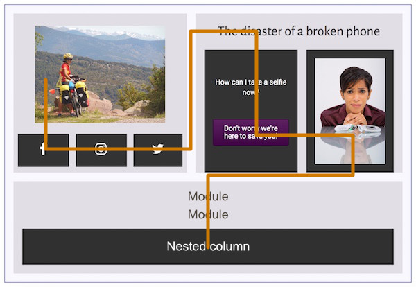
Here's a complex example of column stacking. This example shows a single row with two column groups. The first column group has two columns, left and right, with child columns in both. The second column group has two modules and a child column group. The main columns have a light gray background. The child columns have a dark gray background.
As screen size decreases, column and module stacking occurs left to right, top to bottom, first within each column, then across columns in the same group, then across column groups:
This stacking behavior applies to both standard content area layouts and to Beaver Themer layouts, such as in a Header layout.
You can reverse the column stacking order for any column group in your layout by following these instructions.
You can also prevent columns from stacking by setting custom responsive widths.
Knowing how columns will stack is an important factor in how you construct your page. It's important to test your layouts at various device sizes as you develop the page to make sure the information flow across your columns is preserved. See the article on Responsive Editing Mode with an example that shows how responsive preview in Beaver Builder works.