Breakpoints
CSS breakpoints determine how a responsive layout behaves on different devices based on its width. You can use them to control when your layout can be adapted or to show or hide content based on a device's size.
Desktop-first Approach
Beaver Builder takes a desktop-first approach. That is, you begin by designing for your desktop or Extra Large device layout and work your way down to smaller devices like tablets and smartphones. As a result, Beaver Builder uses the max-width expression in the breakpoint media queries, as shown in the example below.
@media (max-width: 1200px) {
  .fl-node-glvo1rmpjqa6.fl-module-heading .fl-heading {
    font-size: 48px;
  }
}

@media (max-width: 992px) {
  .fl-node-glvo1rmpjqa6.fl-module-heading .fl-heading {
    font-size: 36px;
  }
}

@media (max-width: 768px) {
  .fl-node-glvo1rmpjqa6.fl-module-heading .fl-heading {
    font-size: 26px;
  }
}
Default Breakpoints
Beaver Builder includes three breakpoints enabling you to fine-tune your layout for a variety of device sizes. The default breakpoint values can be modified to suit your needs.
When a device's screen width exceeds 1200px, the Extra Large device size is used.
Small Device Breakpoint
The Small Device Breakpoint allows you to style your layouts for smaller devices, such as smartphones, mini tablets, and portrait-oriented tablets. Devices with a screen width of 768px or less are considered small devices.
Medium Device Breakpoint
The Medium Device Breakpoint allows you to style your layouts for medium devices, such as small desktop computers, some laptops, and tablets. Devices with a screen width between 769px and 992px are considered medium devices.
Large Device Breakpoint
The Large Device Breakpoint allows you to style your layouts for large devices, such as desktop computers, laptops, and landscape-oriented tablets. Devices with a width between 993px and 1200px are considered large devices.
Default Breakpoint Values
The default breakpoint values for each device size are:
- Large -
1200px. - Medium -
992px. - Small -
768px.
Custom Breakpoints
The default breakpoints in Beaver Builder can be customized to suit your needs. If you modify the default breakpoint values, those changes will be applied globally.
Launch Beaver Builder on a page or post.
Access the Global Settings from the Tools menu.
Go to the Responsive Layouts sections and change the number of pixels for the Large, Medium, or Small device breakpoints.
Click Save.
If the Use Responsive Settings in Previews? setting in Global Settings is enabled, custom breakpoints will be used in Responsive Editor mode.

Landscape & Portrait Orientation
Although Beaver Builder breakpoints were chosen to accommodate the majority of popular device sizes and screen widths, they don't target every use case.
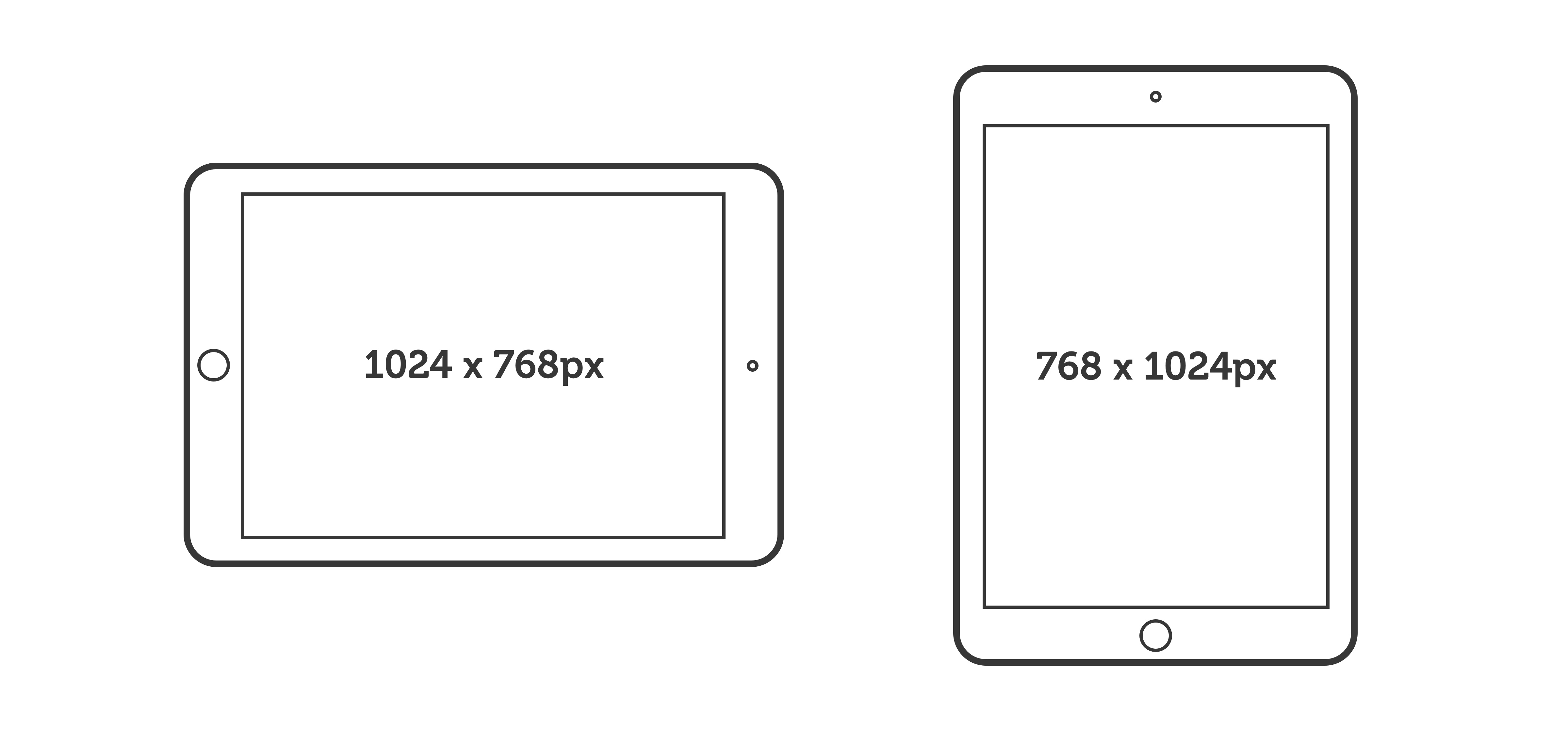
In many iPad models, the landscape orientation display dimensions are 1024x768 pixels, and a portrait orientation display width of 768x1024 pixels, making landscape orientation a large device and portrait orientation a small device.

By changing the Small Device Breakpoint value from 768px to 767px, you can make the iPad's portrait orientation a medium device. You can then use the Visibility setting on the Advanced tab to display one row for tablets in both orientations, but a separate row for phones.