Column Stacking
In this article, you will find information about the stacking of columns in Beaver Builder, including the reversal of stacking order, as well as any limitations that may apply.
What is Column Stacking?
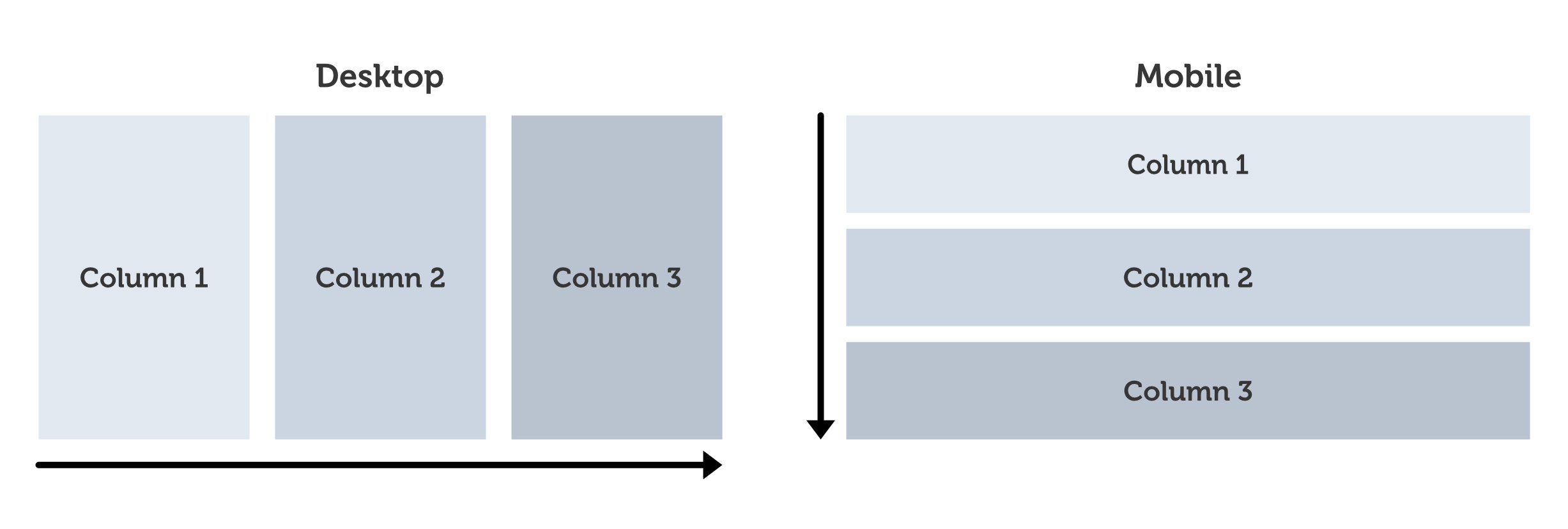
Beaver Builder's columns are designed to be responsive and adapt to varying screen sizes. While multi-column rows with two, three, four or more columns may look impressive on larger screens, they can pose readability challenges on smaller devices.
To solve this issue, Beaver Builder automatically stacks columns vertically at the small device breakpoint by setting the column widths to 100%. This requires no input from the user, resulting in an improved mobile browsing experience and increased readability of the column content.
Prevent Column Stacking
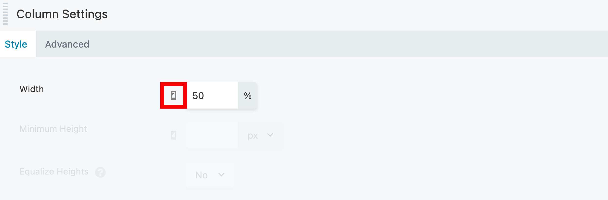
You can prevent columns from automatically stacking at the Small Device Breakpoint by using the Responsive Toggle and selecting the small device size (represented by the Smartphone icon).
When on the small device size, set a custom width value for each column within the row, ensuring that the total width of all columns doesn't exceed 100% if you want them to be side-by-side.
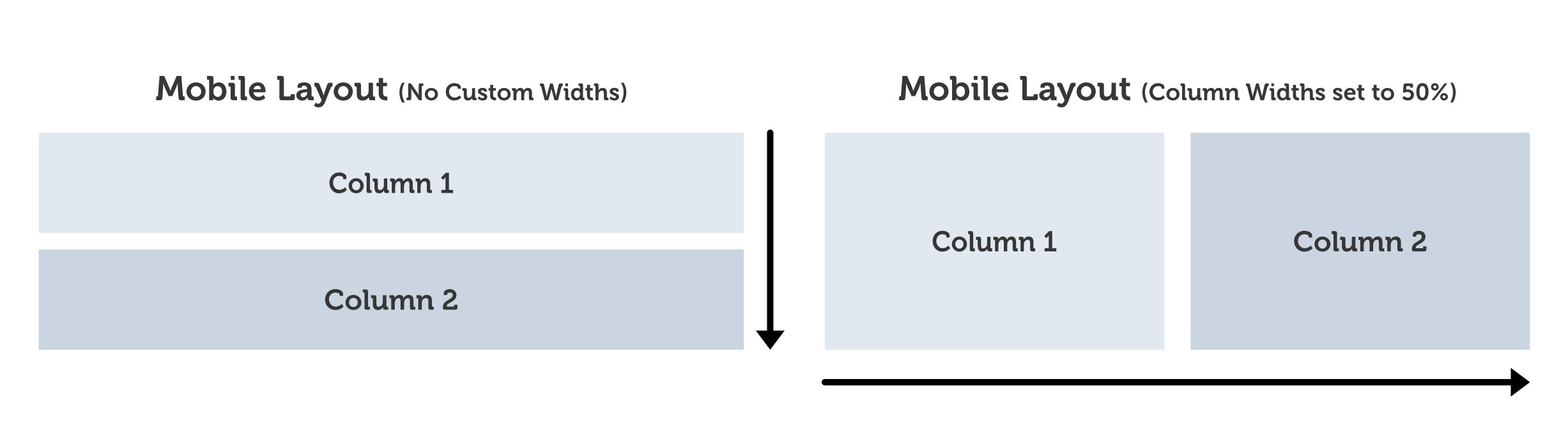
For instance, let's say you have a row with two columns and want to keep the two-column layout on small screens. To do this, switch to the Small Device Breakpoint using the Responsive Toggle, and customize the width of both columns to 50%. By doing this, you can maintain the original two-column layout and keep the columns side-by-side on smaller screens.
Enforce Column Stacking
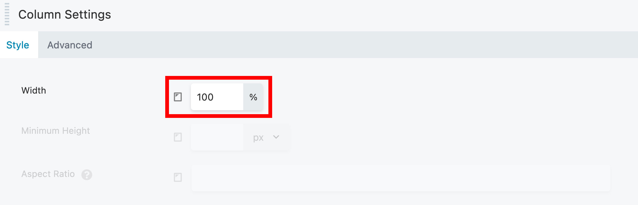
You can enforce column stacking for other device sizes too. For instance, if you want two columns in a row designed for Extra Large Device size to stack on Medium Device size, use the Responsive Toggle to switch to the Medium Device Breakpoint (represented by the Tablet icon) and set the width of each column to 100%.
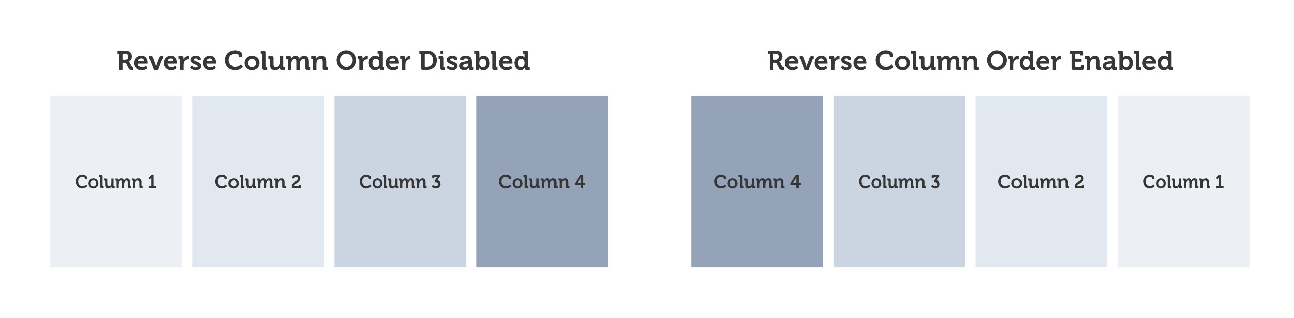
Reverse Column Order
You can use the Reverse Column Order option to reverse the column sequence for either small, medium, or both small and medium devices simultaneously. This reversal applies to the entire column group, so you only need to adjust the setting for one column within the group.
How to Reverse the Order of Columns?
- To access the Column Settings, hover your mouse over one of the modules and click on the Column Settings icon.
- Go to the Advanced tab.
- Under the Visibility section, click on Reverse Column Order.
- Select your preferred option from the available choices: Disabled, Small, Medium, or Small & Medium.
When prioritizing accessibility on your website, it's worth noting that utilizing the Reverse Column Order option involves using flex-wrap: wrap-reverse; to achieve the reversed order. However, this method does not modify the order of the Document Object Model (DOM), therefore, screen readers will continue to read the original stacking order, which may cause confusion.
The code example below showcases a row with four columns that have Reversed Column Order enabled. While the website displays the columns in the reversed order of 4, 3, 2, and 1, the column order remains unchanged in the Document Object Model (DOM).
<div class="fl-row">
  <div class="fl-col-group fl-col-group-medium-reversed">
    <div class="fl-col">Column 1</div>
    <div class="fl-col">Column 2</div>
    <div class="fl-col">Column 3</div>
    <div class="fl-col">Column 4</div>
  </div>
</div>
When designing for accessibility, as a best practice, it's recommended to design web pages in a way that avoids the need for changing stacking order.
For further details, refer to the Alternative to Reverse Column Order section.
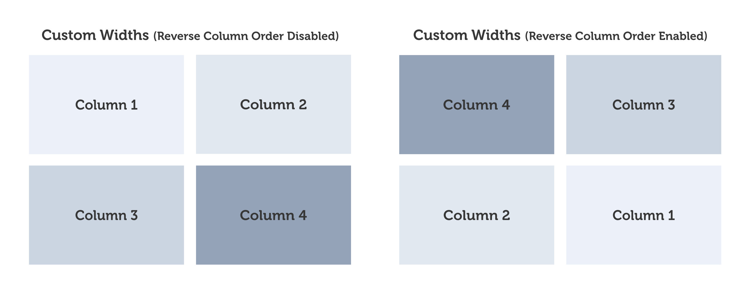
Custom Column Widths
You can use Reverse Column Order with custom column widths for medium and small device sizes.
For example, let's say you have a row with four columns, and on small devices, you set the column widths to 50% to prevent columns from stacking and create a two-by-two-column grid. By enabling Reverse Column Order, you can reverse the order of stacking, as shown in the diagram below.
Alternative to Reverse Column Order
Instead of using the Reverse Column Order, another approach is to create separate rows for each breakpoint and using the Visibility option to show or hide those rows for particular device sizes. This approach enables you to refine and enhance your row and column structure and order for each device size.
Furthermore, this would help users who prioritize accessibility since it preserves the Document Object Model (DOM) order, which is not maintained when the Reverse Column Order option is used.