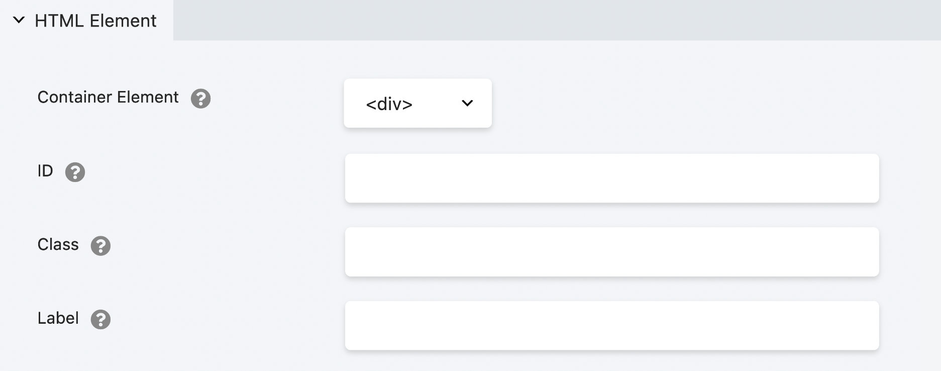
HTML Element
The HTML Element section in the Advanced tab lets you apply a custom ID, classes, labels and choose the HTML5 sectioning content element to improve accessibility and machine-readability.
Container Element
The Content Element section allows you to choose an appropriate HTML5 sectioning content element replacing the default <div>. Using these elements on your pages gives your content more semantic meaning, improving accessibility and machine-readability.
<div>
Defines a division in your layout (default).
<div class="fl-row fl-row-fixed-width fl-row-bg-none fl-node-4m98zgeu7tyc" data-node="4m98zgeu7tyc">
    <div class="fl-row-content-wrap">
      <div class="fl-row-content fl-row-fixed-width fl-node-content">
        <div class="fl-col-group fl-node-gy3dorte1pkb" data-node="gy3dorte1pkb">
          <!-- Column markup -->
            <!-- Module markup -->
          <!-- End of Column markup -->
        </div>
      </div>
    </div>
</div>
<section>
Defines a section in your layout.
<section class="fl-row fl-row-fixed-width fl-row-bg-none fl-node-4m98zgeu7tyc" data-node="4m98zgeu7tyc">
    <div class="fl-row-content-wrap">
      <div class="fl-row-content fl-row-fixed-width fl-node-content">
        <div class="fl-col-group fl-node-gy3dorte1pkb" data-node="gy3dorte1pkb">
          <!-- Column markup -->
            <!-- Module markup -->
          <!-- End of Column markup -->
        </div>
      </div>
    </div>
</section>
<article>
Defines an article in your layout.
<article class="fl-row fl-row-fixed-width fl-row-bg-none fl-node-4m98zgeu7tyc" data-node="4m98zgeu7tyc">
  <div class="fl-row-content-wrap">
    <div class="fl-row-content fl-row-fixed-width fl-node-content">
      <div class="fl-col-group fl-node-gy3dorte1pkb" data-node="gy3dorte1pkb">
        <!-- Column markup -->
          <!-- Module markup -->
        <!-- End of Column markup -->
      </div>
    </div>
  </div>
</article>
<aside>
Defines content aside from the page content.
<!-- Row markup -->
  <aside class="fl-col fl-node-jkv0cyspnrgu" data-node="jkv0cyspnrgu">
    <div class="fl-col-content fl-node-content">
      <!-- Module markup -->
    </div>
  </aside>
<!-- End of Row markup -->
<main>
Defines the main content in your layout.
<main class="fl-row fl-row-fixed-width fl-row-bg-none fl-node-4m98zgeu7tyc" data-node="4m98zgeu7tyc">
  <div class="fl-row-content-wrap">
    <div class="fl-row-content fl-row-fixed-width fl-node-content">
      <div class="fl-col-group fl-node-gy3dorte1pkb" data-node="gy3dorte1pkb">
        <!-- Column markup -->
          <!-- Module markup -->
        <!-- End of Column markup -->
      </div>
    </div>
  </div>
</main>
<header>
Defines a header in your layout.
<!-- Row markup -->
  <!-- Column markup -->
    <header class="fl-module fl-module-heading fl-node-lrqwuvkn30px" data-node="lrqwuvkn30px">
      <div class="fl-module-content fl-node-content">
        <h2 class="fl-heading">
          <span class="fl-heading-text">Hello World</span>
        </h2>
      </div>
    </header>
  <!-- End of Column markup -->
<!-- End of Row markup -->
<footer>
Defines a footer in your layout.
<footer class="fl-row fl-row-fixed-width fl-row-bg-none fl-node-4m98zgeu7tyc" data-node="4m98zgeu7tyc">
  <div class="fl-row-content-wrap">
    <div class="fl-row-content fl-row-fixed-width fl-node-content">
      <div class="fl-col-group fl-node-gy3dorte1pkb" data-node="gy3dorte1pkb">
        <!-- Column markup -->
          <!-- Module markup -->
        <!-- End of Column markup -->
      </div>
    </div>
  </div>
</footer>
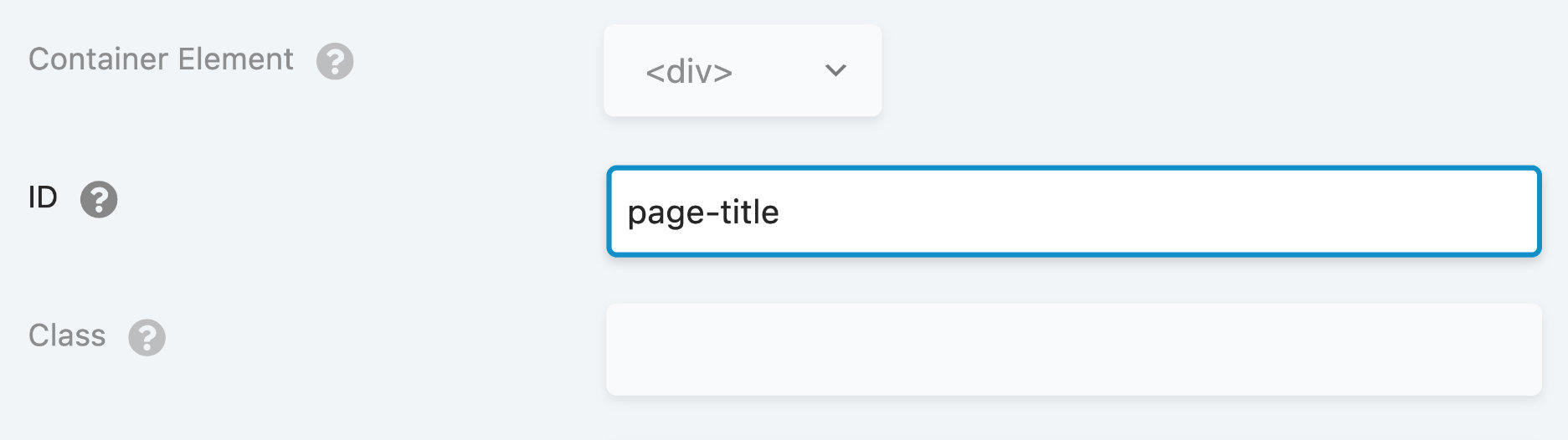
ID
Using the ID option, you can assign a custom ID to a specific node (row, column, or module) on your layout.
Custom ID HTML Markup
<div id="page-title" class="fl-module fl-module-heading fl-node-3eacnxf28pt0">
  <div class="fl-module-content fl-node-content">
    <h2 class="fl-heading">
      <span class="fl-heading-text">Hello World</span>
    </h2>
  </div>
</div>
Usage
This unique identifier can then be used for various purposes, such as:
Styling: You can use CSS to target specific elements on a web page using their ID. This allows you to apply custom styles to that particular element, which may differ from the rest of the page.
Identifying: You can use the ID to identify specific elements in your code. For example, if you are using JavaScript to manipulate the elements on your layout, you can use the ID to reference a specific element and perform actions on it.
Anchoring: You can use the ID to create anchor fragments. This allows you to create links that jump directly to a specific section of your page or post.
An important point to remember is that IDs on a page or post should be unique, meaning that no two elements should share the same ID.
Adding the pound symbol (#) to the ID option is not necessary, just the name of the ID is needed.
page-title#page-title
CSS Example
Once you've added the custom ID to your node (row, column, or module), you can use it in your custom CSS by prefixing it with the pound symbol (#), like this:
#custom-id {
  color: tomato;
}
This can be taken a step further by targeting a specific element. For example, if you have a Heading module with the ID page-title, and you would like to style the heading tag (h2), you can use the .fl-heading class which is assigned to the heading tag in your custom CSS, as shown in the example below:
#page-title .fl-heading {
  color: tomato;
  font-size: 48px;
}
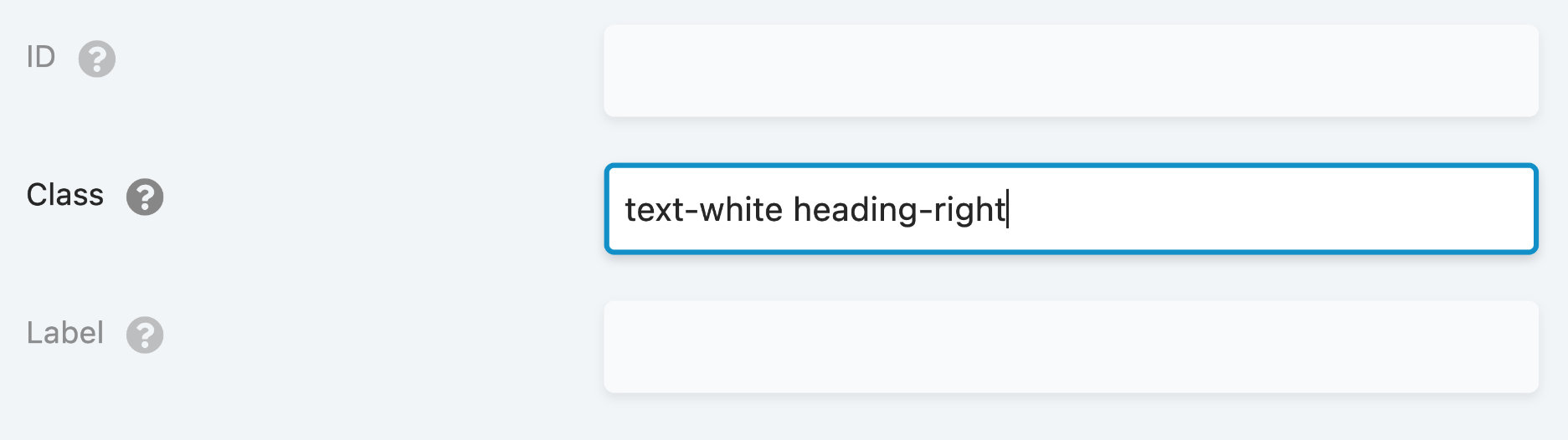
Class
Lets you apply a class or multiple classes to a row, column or module HTML. Must start with a letter and only contain dashes, underscores, letters or numbers. A class can be used to apply custom CSS rules and be used multiple times on the same page.
Separate multiple classes with spaces. The screenshot below shows an example of two classes being applied to the Class setting: text-white and heading-right.
Custom Class HTML Markup
<div class="fl-module fl-module-heading fl-node-3eacnxf28pt0 text-white heading-right">
  <div class="fl-module-content fl-node-content">
    <h2 class="fl-heading">
      <span class="fl-heading-text">Hello World</span>
    </h2>
  </div>
</div>
Adding the period (.) to the class option is not necessary, just the name of the class is needed.
text-whiteheading-right.text-white.heading-right
CSS Example
Once you've added the custom class to your node (row, column, or module), you can use it in your custom CSS by prefixing it with a period (.), like this:
.text-white {
  color: white;
}

.heading-right {
  text-align: right;
}
This can be taken a step further by targeting a specific element. For example, if you have a Text module with a class name heading-text, and you would like to style only the heading tag (h3), you can use the h3 element selector in your custom CSS, as shown in the example below:
.heading-text h3 {
  color: tomato;
  font-size: 36px;
  font-weight: 900;
}
Label
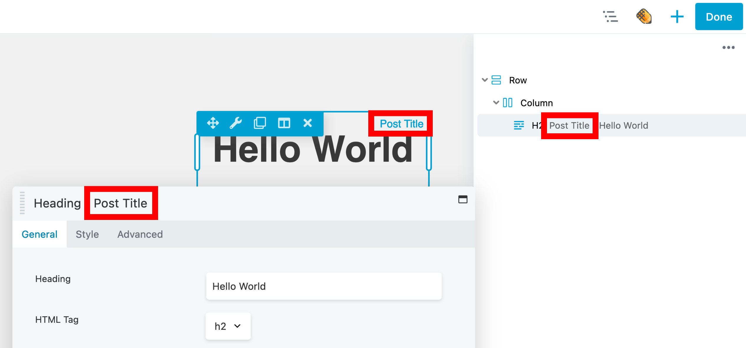
The Label option is available for all rows, columns, and modules. It is used to provide a concise description of the content or purpose of the row, column, or module.
Labels appear in the Beaver Builder user interface overlay, settings window, and Outline panel once they are added, as shown below.