Merge page content into the header
Transparent headers are very popular in web page design. The header "transparency" means that the page content area is merged up into the header, and the background image or video of the content row becomes the background of the header, as shown in the following screenshot.

Here's an overview of how it can be done in Beaver Builder Theme and the Beaver Builder editor, with details in the procedures below:
- Create your header in Beaver Builder Theme.
- Create a content row with a background image or video in the Beaver Builder editor.
- Move the content rowup and the header down.
1 Create your header in Beaver Builder Theme
- Create a header in Beaver Builder Theme, such as in the following screenshot.
Note If you set a background color, don't enable the background gradient.
 The header transparency will be controlled by the CSS, so this version of the header with a background color is what will display on any pages to which the transparent header doesn't apply.
2 Create row background image and row content
- Open the page in the Beaver Builder editor on which you plan to merge the header and create a row.
- Add a background photo or video to the row.
- On the Advanced tab, change top row padding to a number of pixels that will create room for the header. You'll probably need to tweak this number later. In the example here, it's 300px. Test and adjust after superimposing the header onto the content area in the next procedure.
- Add the content you want to the row.
If you plan to apply a transparent header to every page, you might want to save this row, so you can easily add it to the new pages on your site and change the content as you like.
3 Add CSS to move the page content up and the header down
The following code will apply these CSS rules to every page. See the tweaks in the next section for other options.
- Copy and paste the CSS below. Refer to the article on where to put CSS code.
.fl-page-bar {
  position: absolute;
  top: 0;
  z-index: 11;
  width: 100%;
}

.fl-page-header,
.fl-page-header-wrap {
  background-color: transparent;
  border-bottom-style: none; /* Removes the 1px border below the menu */
  position: absolute;
  top: 80px; /* Height of top bar */
  width: 100%;
  z-index: 10;
}
- In the
.fl-page-headerrule, change thetopproperty to the number of pixels it takes to move the header down from the top of the page to the position you want. Test and adjust. - Remove the
.border-bottom-styleline if you want to keep the 1px border below the nav area.
Further tweaks
Limit the transparent header to a specific page
To make the transparent header apply to the home page only, you can add the .home class to both rules, as in the following code:
.home .fl-page-bar {
  position: absolute;
  top: 0;
  z-index: 11;
  width: 100%;
}

.home .fl-page-header,
.home .fl-page-header-wrap {
  background-color: transparent;
  border-bottom-style: none; /* Removes the 1px border below the menu */
  position: absolute;
  top: 80px; /* Height of top bar */
  width: 100%;
  z-index: 10;
}
To make the transparent header apply to a page other than the home page, find the ID of the page by mousing over the page in the admin panel and viewing the ID number in the browser status bar, as shown in the following screenshot.
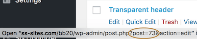
In this example the ID is 73, so you'd replace the .home selector with .page-id-73 in the first line of the two CSS rules, as follows.
First line of first rule:
.page-id-73 .fl-page-bar { ... }First line of second rule:
.page-id-73 .fl-page-header, .page-id-73 .fl-page-header-wrap { ... }
Create different rules for device size
The CSS rules in the previous procedure apply to all device sizes. To make the transparent header apply only to large devices only, wrap the two CSS rules in an @media rule, as shown in the following code.
@media (min-width: 992px) {
  .fl-page-bar {
    position: absolute;
    top: 0;
    z-index: 11;
    width: 100%;
  }
  .fl-page-header .fl-page-header-wrap {
    background-color: transparent;
    border-bottom-style: none; /* Removes the 1px border below the menu */
    position: absolute;
    top: 80px; /* Height of top bar */
    width: 100%;
    z-index: 10;
  }
}
- To apply the rules to both medium and large devices, set
min-widthto768 px). If you have set a custom medium device breakpoint in the Beaver Builder editor's Tools > Global Settings, change themin-widthvalue in these rules to match your custom value. - To apply the rules to only medium and small devices, replace the
min-widthline with the following:@media (max-width: 991px) { ... } - To apply the rule only to small devices, use the following first line:
@media (max-width: 768px) { ... }