Work with rows
Row layout options are available on any page that you create with Beaver Builder. They can be accessed in the following way:
- In the upper right corner, click + (plus sign) to expose the Content panel, then click the Rows tab.
To begin working on a new layout, drag and drop a row layout of your choice onto the page.
Mouse over the row that you just dragged onto the page to see a set of icons that show the available actions for that row, as shown in the following screenshot.
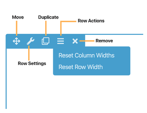
You can:
- Move the row by clicking the Move icon and dragging it.
- Edit the settings by clicking the Row settings icon.
- Duplicate the row.
- Reset column widths for the entire row or Reset row width , which resizes the row to its global setting. See this article on how to set a custom global default row width.
- Delete the row.
Row settings
Style tab
Click the Row settings icon for a row to display the Style tab. You can make the following changes on the Style tab.
Row and content width and max width fields
When you add a row to your layout, the initial width settings are the defaults in Tools > Global settings. If you want different defaults, set your own global default row widths.
In the Width field, set the row width to Full width or Fixed.
For fixed-width rows, choose a maximum row width in the Fixed width field. Maximum width means the row can become less wide when the screen size shrinks below the max width, but can't become wider as the screen grows larger.
For full-width rows, choose whether the Content width will be Full width or Fixed. If the Content width is Fixed, choose a max width for the content. For more information about Full width, fixed width, and max width, see this article on full-width and fixed-width row layouts.
Row height
Set the row height to one of the following values:
Default The row height automatically sizes according to the row content.
Full height The row fits the browser window. You can align the content to Top, Center, or Bottom.
Minimum row height Set the value you want for minimum height. Use this in cases in which you want the row height to be greater than the default but less than the full browser window height. You can also choose the vertical alignment of the content in the row: Top, Center, or Bottom.
Colors section
Override default color settings for text, link, and heading colors.
Here's why it's handy to change text color in row settings rather than module settings. Suppose your default text color is black, but you want a dark background for your row, so you want all the text in the row to appear in white. By setting text color on the row, you don't have to set it for each module. In addition, when you move modules around, any module moved into that row will automatically have the right color text. If you change text color in a row setting, you can still override that by setting another text color in a module.
Background section
Create and style any of the following types of row backgrounds. Each choice opens a section with settings for that type of background.
- None
- Color
- Gradient
- Photo
- Video See the article about row background video settings and tips.
- Embedded code Use HTML to embed content such as videos from other sources or sliders from other plugins using shortcodes.
- Slideshow
- Parallax See the article about parallax row backgrounds.
Background overlay section
This section appears if you choose Photo, Video, Slideshow, or Parallax as the background type. You can select a color overlay and manipulate the opacity to show more or less of the underlying background.
Usually a background color overlay is done using a semitransparent white or black color to improve legibility of content on top of the row background, but in some cases a semi-transparent color is used for design effect.
Border section
You can add a row border. With or without a border, you can add a corner rounding (radius) and a shadow effect. See the article about borders and the article about radius and shadow effects.
Top shape, Bottom shape sections
Assign a shape overlay to the top or bottom edge of the row. See the article on row shape overlays.
Advanced tab
There are all the usual Advanced tab settings for margins and padding, visibility, animations, and advanced HTML settings.
Choose between new rows or rows with column groups
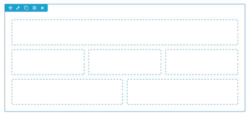
Rows can contain multiple column groups, which can be thought of as rows within rows. In the following screenshot, there's one row that has three column groups with a different number of columns in each group.
For even more complex layouts, you can have columns nested within columns. For more information about how columns work, see the column layouts overview.
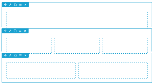
But you could also put each or these column groups into their own row, as shown in this screenshot:
What determines when you start a new row in your layout? There's no hard and fast rule, but here are some considerations:
- You want to set a background color, image, or video for a particular row in your layout. Create a separate row for that section.
- You want to save a particular row in order to reuse it somewhere else.
- You have content sections on your page that you might want to reposition later – if they are in separate rows, it's easy to move them by dragging.
- You want to take advantage of the row's margin or padding features to position a block of content within a row or position the row with respect to other rows.
- Instead of a theme sidebar, you want to add a Sidebar module or some other module that appears to span several rows. To give this area the look of a sidebar, you need a single row with column groups, shown in this mockup. There's a single row with one column group containing two columns. The sidebar is in the right column, and the left column has two Heading modules.