The Header tab in Customizer
The Beaver Builder Theme supports several different header styles with a variety of styling options.
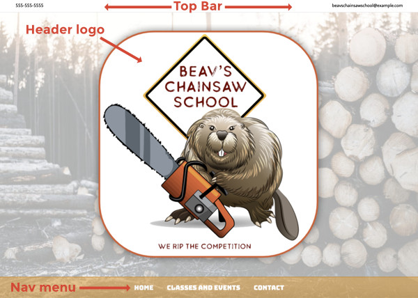
The header area includes:
- An optional top bar
- The main header area, which contains text or a logo
- A navigation menu, which in some header layouts is part of the main header area and in others (Nav Bottom and Nav Centered) is styled as a separate menu bar below the header, as shown in the following screenshot.
See the header descriptions below and the article on where menu colors come from for more information about the color sources of header layout types.
Beaver Themer Header-type layouts override these Customizer settings on the pages to which they apply. If you have the Beaver Themer plugin installed and your Customizer settings don't seem to be working, check to see if there is a Themer Header layout applied to that page.
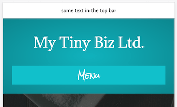
Top bar layout
You can optionally enable a top bar strip above your header with up to two columns of content. It’s a great place for quick messages or social icons.
If you select Text for either column, you can enter HTML in the content areas, such as links to email addresses, heading tags, or even a small image.
If you select Social icons, configure the icons at Customize > General > Social links.
If you enable just one column, the content is centered. If you enable two columns, the left column is left-justified and the right column is right-justified at larger screen sizes. As the screen is sized smaller, the two columns become stacked and centered.
The maximum width of the content is controlled by the Content width setting in Customize > General > Layout.
Top bar style
You can set the following styles in the top bar:
- A background color or image in the top bar, with all the usual settings for positioning and sizing the background image.
- Top bar text font color, link color, and hover color.
Header layout
Header layout settings apply to both the main header and menu areas, not the top bar. The settings on this tab depend on the choice you make in the Layout field. We'll cover the Layout options one by one.
None
The header and menu are not displayed when the page first loads. The top bar remains visible if it is enabled. If you set the Fixed header field to Fade in, a header with the site title on the left and menu on the right will appear when you start scrolling the page on large screens only. On medium and small screens, the header remains hidden.
See this article for the CSS code to display the header but hide the nav menu.
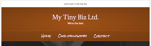
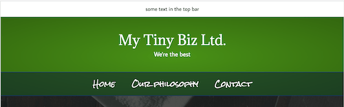
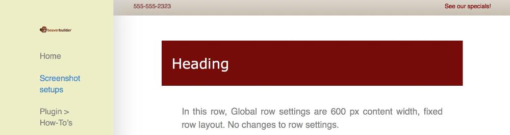
Nav bottom
Menu items appear below the header. The site title (or header logo) and the menu are left-aligned.
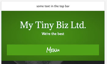
Here's the default Nav Bottom layout on medium devices, with the same settings.
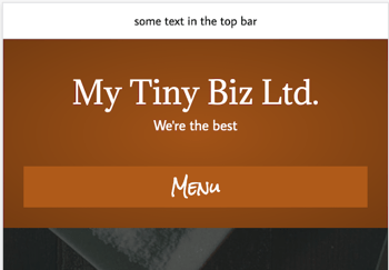
And here's the default mobile layout with the same settings. Either the Menu button or the hamburger icon will appear, depending on your setting in Customize > Header > Nav layout > Responsive nav toggle.
See the article on where menu colors come from for more information about where to adjust color settings in Nav Bottom layouts.
Nav Bottom layout options:
- Padding
Vertical space in the top and bottom of the header area. - Fixed header
Disabled by default, or you can choose a type of fixed header. See the article about fixed header types for details. - Content layout
If enabled, you can add text, social icons, or both in a second column to the right of the header logo. If you select Social icons, configure the icons at Customize > General > Social links.
Nav layout and style
The Nav area can be configured separately on the Nav layout and Nav Style tabs. See those sections for details.
Device view
You can check the layout at the three device sizes by clicking one of the WordPress device view icons at the bottom of the Customizer panel.
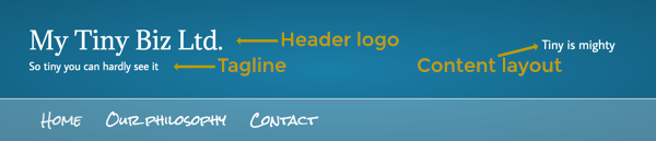
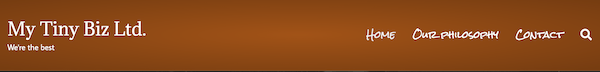
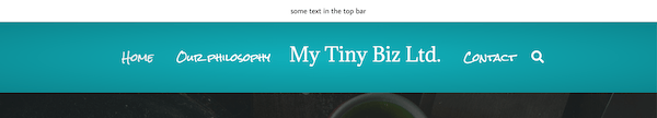
Nav right, Nav left
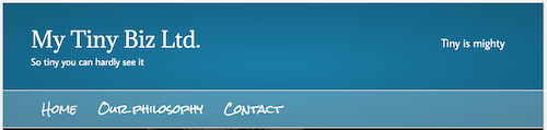
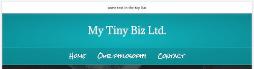
Menu items appear to the right or left of the header logo respectively. Here's a screenshot of a Nav Right layout with the site tagline enabled.
Here's the same Nav Right layout on medium devices, without any custom modifications. You can see that the layout has automatically shifted to a Nav Centered layout.
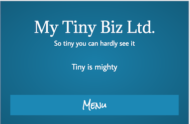
And here's the default mobile layout with the same settings. Either the Menu button or the hamburger icon will appear, depending on which Nav layout option you choose.
See the article on where menu colors come from for more information about where to adjust color settings in Nav Left and Nav Right layouts.
Nav Left and Nav Right layout options
- Padding
Vertical space in the top and bottom of the header area. - Fixed header
Disabled by default, or you can choose a type of fixed header. See the article about fixed header types for details.
Nav layout and style
The Nav area can be configured separately on the Nav layout and Nav style tabs.
Device view
You can check the layout at the three device sizes by clicking one of the WordPress device view icons at the bottom of the Customizer panel.
Nav centered
Menu items appear below the header. Both menu and header logo are centered. The following screenshot is of Nav centered layout on a large screen with the optional site tagline enabled.
Here's the same Nav Centered layout on medium devices, without any custom modifications.
And here's the default mobile layout with the same settings. Either the Menu button or the hamburger icon will appear, depending on which Nav layout option you choose.
See the article on where menu colors come from for more information about where to adjust color settings in Nav Centered layouts.
Nav Centered layout options
- Padding
Vertical space in the top and bottom of the header area. - Fixed header
Disabled by default, or you can choose a type of fixed header. See the article about fixed header types for details.
Nav layout and style
The Nav area can be configured separately on the Nav layout and Nav style tabs.
Device view
You can check the layout at the three device sizes by clicking one of the WordPress device view icons at the bottom of the Customizer panel.
Nav centered + inline logo
In this layout, the header logo is centered and the menu items straddle the logo text or image, as shown in the following screenshot.
Here's the same Nav Centered layout on medium devices, without any custom modifications. You can see that the layout has automatically shifted to a Nav Centered layout.
And here's the default mobile layout with the same settings. Either the Menu button or the hamburger icon will appear, depending on which Nav layout option you choose.
See the article on where menu colors come from for more information about where to adjust color settings in Nav Centered + Inline Logo layouts.
Nav Centered + Inline Logo layout options:
- Inline logo position
When there is an odd number of menu items, should the logo appear to the right or the left of the middle item? In the large-screen screenshot above, the setting is Right. - Padding
Vertical space in the top and bottom of the header area. - Fixed header
Disabled by default, or you can choose a type of fixed header. See the article about fixed header types for details. - Site tagline
You can add your site's tagline below the header logo text. See this article on how to add the site tagline to your header.
Nav layout and style
The Nav area can be configured separately on the Nav layout and Nav style tabs.
Device view:
You can check the layout at the three device sizes by clicking one of the device view icons at the bottom of the Customizer panel.
Inline logo position
When there is an odd number of menu items, should the logo appear to the right or the left of the middle item? In the screenshot, the setting is Right.
Nav vertical left, Nav vertical right
Header and menu items appear in a vertical bar along the left or right side of the page in the header background color, with a fixed layout (doesn't scroll with the content to the right). You can customize settings for the width and padding of the left or right bar.
The header logo is sized according to the amount of space in the vertical bar. If the logo appears too small, decrease the Padding setting first, then try increasing the Vertical nav width setting.
As screen width is sized smaller, menu items appear centered below the header, then as the width is reduced even more, menu items are replaced by the word MENU or a hamburger icon, depending on which Nav layout option you choose.
Header style
This category has several settings that relate to two aspects of the header logo area:
- Background
You can set a background color or image, with associated style settings. - Text color
You can set text color, link color, and hover color. These color settings apply to the two parts of the header logo area that can contain text: the header logo if you choose text instead of an image; and the Content layout area in the Nav bottom layout. Note that the hover color also styles the current page item in the menu.
Header logo
Choose Text or Image as the logo type.
For text as the logo type, you can choose font family, font weight, and font size, logo text color and text hover color. Horizontal alignment is controlled by the header layout type.
For image logos, you can add both a standard and high-DPI (retina) version. You can set a different header logo image for mobile devices in the Mobile header logo field. By default, the max-width breakpoint for mobile devices is 768px.
You can also upload a different standard and Retina logo for Fade In header layouts. For example, you might want to upload a smaller or shorter version of the logo that will fit in the narrow upper band. After you've uploaded the logo, make sure you've selected the Fade In type of fixed header in Customize > Header > Header layout.
Nav layout
On the Nav layout tab, you can control the following aspects of the nav menu in the header.
- Nav item spacing
Set the number of pixels between menu items. - Nav search icon
Choose whether or not to display a WordPress search icon. By default, WordPress searches only Post titles and Post content. - Responsive nav toggle
Choose the Menu button or Hamburger icon to appear when the screen width goes below the Responsive nav breakpoint
For Menu button and Hamburger icon colors, see this article about where menu colors come from. - Menu button text
If you choose the MENU button for the Responsive nav toggle, you can enter a custom label instead of MENU. - Responsive nav breakpoint
Choose the breakpoint at which to display the Hamburger icon or Menu button. The choices are:- Always (displayed on every device size)
- Medium & small devices only
- (Default): Small devices only
Note The default breakpoints are 992px for medium screens and 768px for small screens. You can change these breakpoints on the General tab.
- Hamburger icon position
If you chose to display a Hamburger icon, then you can change the vertical position where it appears. The default setting is0and increasing the value moves the icon down. You can set the Responsive preview to mobile to view where it will appear. - Responsive nav layout
You can choose one of the animated flyout settings or the standard menu dropdown to appear when you click the Hamburger icon or Menu button. For more information about each choice, see the article about flyout animations. - Responsive nav layout position (Appears only when Responsive nav layout is set to a flyout choice.)
Choose whether the flyout menu appears to the left or right. - Responsive submenu toggle
This setting applies to the case in which you have a submenu of a submenu – in other words, multiple levels of submenus. When the setting is Disabled, clicking a top-level menu item opens all descendants with one click when the Hamburger icon or Menu button is in use.
When the setting is Enabled, you must click each level to display the next level of submenu.
- Responsive collapse
Choose No to allow more than one submenu to be open at the same time when the Hamburger icon or Menu button is in use. Choose Yes to automatically hide a submenu when another submenu is opened.
Nav style
The Nav style tab has the following settings.
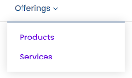
Submenu indicator
You can enable a Font Awesome down arrow icon to main menu items that have submenus, as in this screenshot.
Nav background and text color
When the header layout puts the menu below the header logo area ( Nav Centered or Nav Bottom ), you can select a background color or image for the menu bar plus nav text color for large screens. For medium and small screens, see this article about where menu colors come from.
Font family, weight, format, size
You can set the font family, weight, format, and size specifically for the navigation menu.