The Footer tab in Customizer
The Beaver Builder Theme supports a widget footer and a main footer. The widget footer appears above the main footer and can contain up to 4 widget areas. The main footer consists of one or two columns with several content options.
Footer widgets layout
You can set the footer widgets area to appear on all pages, just the home page, or not at all. If you enable the footer widgets area, choose which widgets to use in Customize > Widgets.
If you want to enable or disable footer widgets on particular pages, instead of this footer widget you could create a footer row in the Beaver Builder editor, containing either widgets or content, save it as a Global module, and use it in the pages where you want the footer widgets to appear.
Footer widgets style
If you enable the footer widgets area, you can change the style settings for it. The settings relate to two aspects of the footer widgets area:
- Background
You can set a background color or image, with associated style settings. - Text color
You can set text color, link color, and hover color.
Footer layout
Enable or disable a main footer. The Beaver Builder Theme’s footer supports up to two columns. Either column can contain text, social icons, both text and social icons, or a WordPress menu.
If you use the Beaver Builder Theme, there's a [fl_year] shortcode that you can use to insert the current date into any text area of the Beaver Builder Theme Customizer or into your Beaver Builder layouts. For more information, see the article about the Beaver Builder date shortcode.
For any shortcode you want to use, choose Text as the layout type.
If you choose Menu, go to Customize > Menus > Menu Locations. For the Footer Menu setting, choose which menu you want to display. If you don't set a menu for the footer, Beaver Builder will detect it, and you'll see a Choose menu link in the footer of any Beaver Builder page you're editing.
If you choose Social icons, configure the icons at Customize > General > Social links.
Footer style
If you have enabled a main footer, you can change the style settings for it. The settings relate to two aspects of the footer widgets area:
- Background
You can set a background color or image, with associated style settings. - Text color
You can set text color, link color, and hover color.
Footer parallax
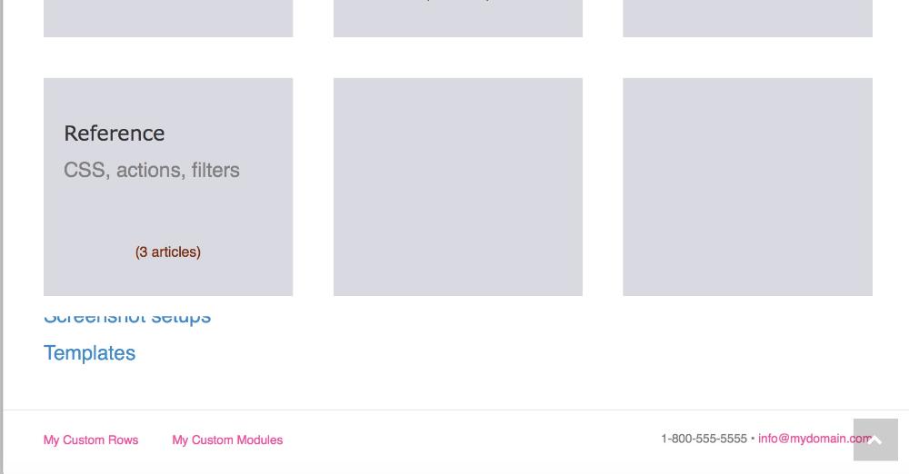
Enable a parallax effect in which the footer widgets and footer are revealed as the end of the content scrolls up. In the following example, the content (gray boxes) moves up as the footer comes into view.
