Color Picker
The Color Picker is used to select and adjust color values throughout the Beaver Builder user interface, such as backgrounds, buttons, text, and links. You can also adjust hue, alpha, and save your favorite color presets.
Using the Color Picker
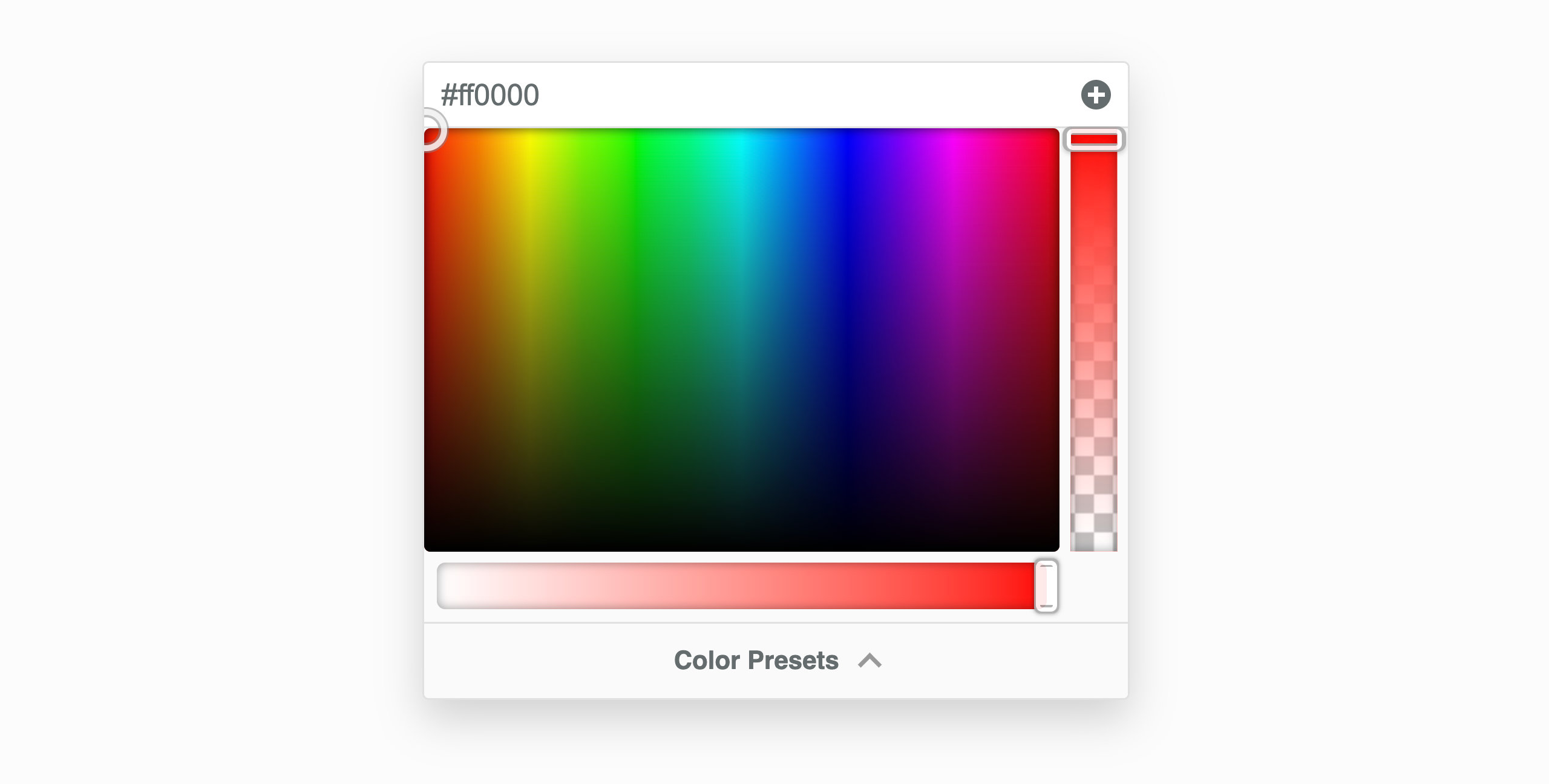
To pick a color, click and drag your cursor inside the color selection area to select a color. The color picker will display the color value in either rgb (red, green, blue) format or rgba (red, green, blue, alpha) format if you adjust the alpha slider.
To select a color, click and drag your cursor inside the color selection area. The color picker displays the value in either rgb (red, green, blue) format or rgba (red, green, blue, alpha) format when you adjust the alpha slider.
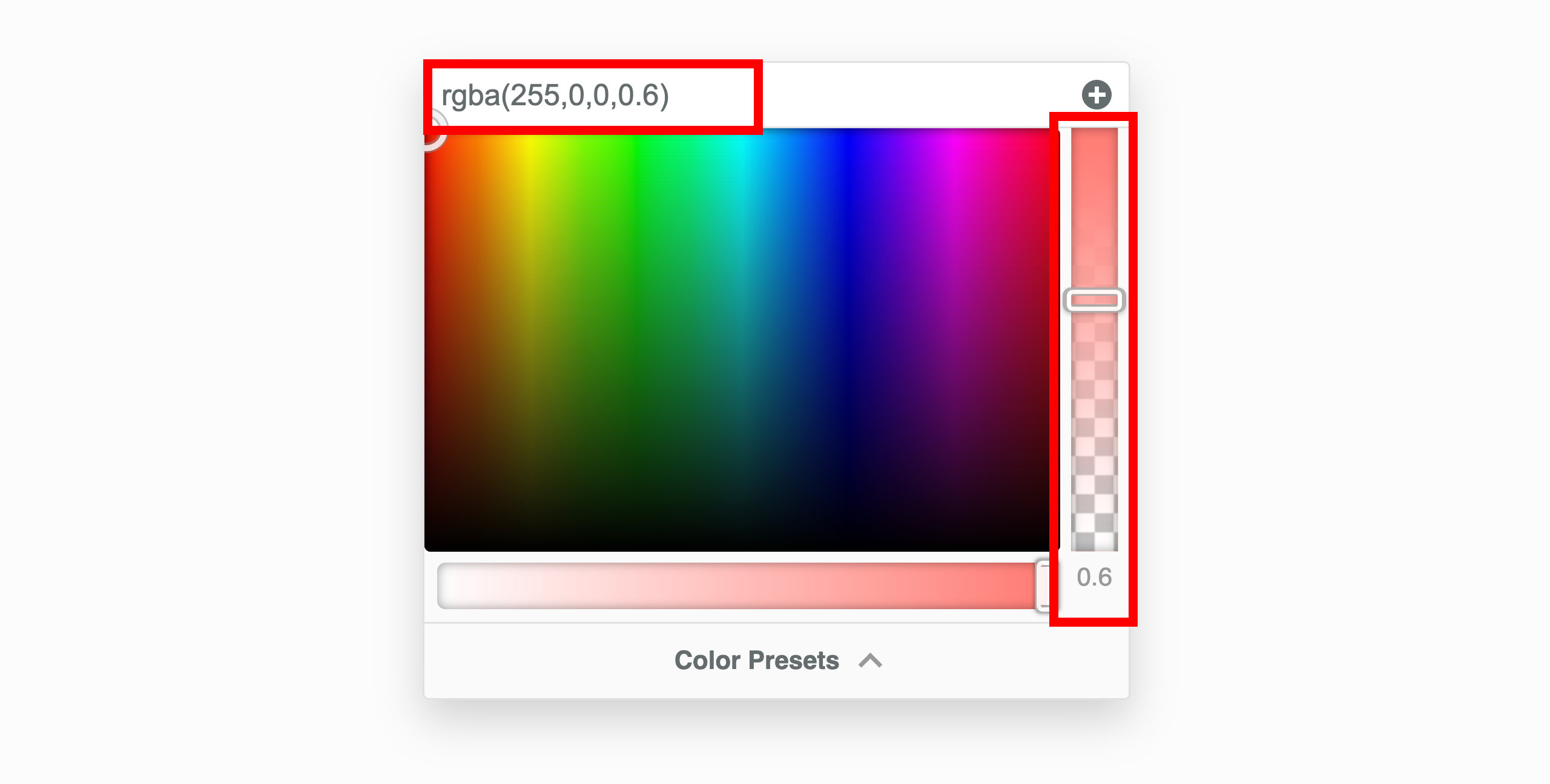
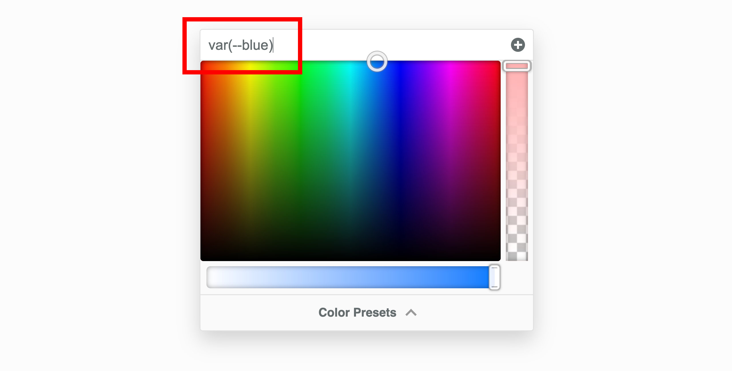
You can also enter a color value manually in the input field at the top of the color picker. This field accepts hex, rgb, rgba, hsl, hsla, and CSS variables. When entering a CSS variaable, make sure to include the var() function.
var(--css-var-name)
sRGB Tab
The sRGB (Standard Red Green Blue) tab allows you to view and adjust colors within the sRGB color space, the standard used for displaying colors on the web. You can adjust the hue and alpha of the selected color, as well as switch between multiple color spaces for more precise color adjustments.
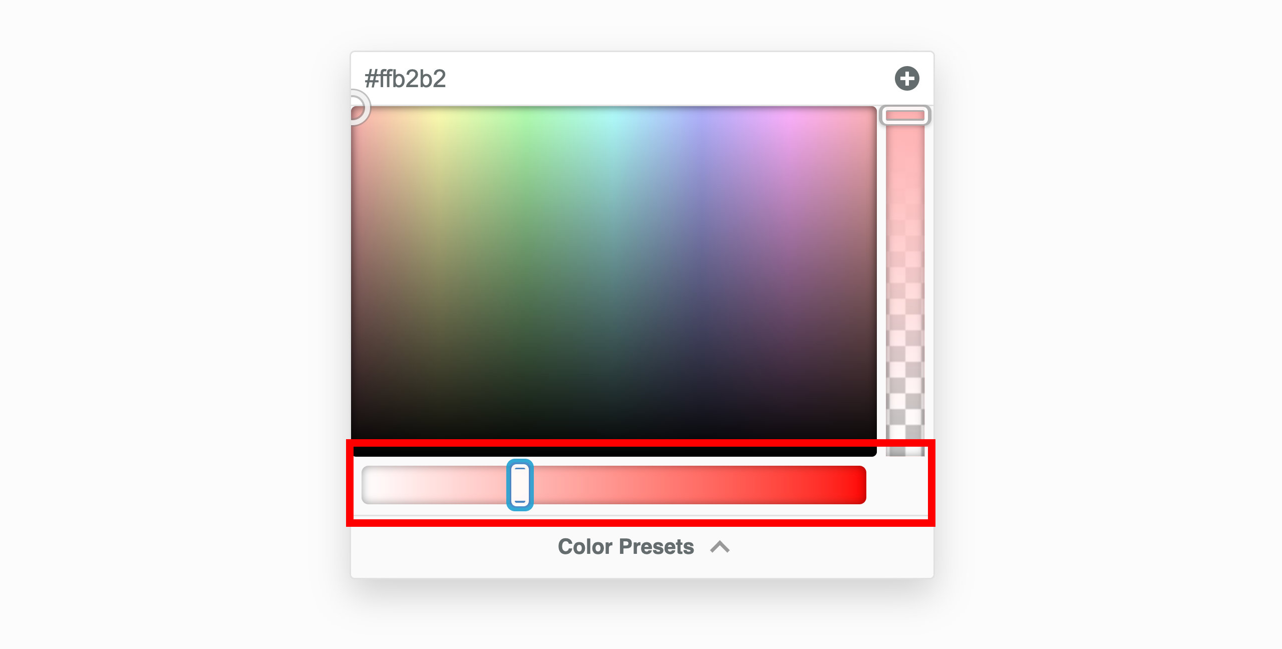
Color Scale
The color scale can be found to the bottom of color selection area and offers an easy way to select transparent, white, or black. It also includes a smooth gradient of grey tones, ranging from light grey near white to dark grey approaching black, providing a quick way to select a shade of grey.
Hue
The Hue slider allows you to modify the hue of the selected color, enabling you to change it to any shade across the color spectrum. As you adjust the slider, the RGB values are updated in real time to reflect the new hue.
Alpha
The Alpha slider lets you adjust the opacity of the selected color, enabling the creation of transparent or semi-transparent colors. As you move the slider, the color’s opacity changes, and the RGB value is updated to include an alpha channel, transitioning from rgb to rgba. For example, rgb(255, 255, 255) becomes rgba(255, 255, 255, 0.5) when the alpha value is set to 0.5.
Mix Tab
The Mix tab allows you to blend two colors together using the color-mix() function. This feature is perfect for creating unique shades or transitioning smoothly between two colors.
The Mix tab includes a grid that visually represents how two colors blend at different percentages across multiple color spaces. This grid makes it easy to compare and choose the perfect mix for your needs. Each row corresponds to a different color space, and each column represents a percentage mix between the two selected colors, starting from 0% (completely the first color) on the left and progressing to 100% (completely the second color) on the right.
If you're familar with color-mix() already, you can use the input field at the top of the color picker to enter the color-mix() function directly. The color picker will display the result of the mix. For example, entering color-mix(#ff0000, #00ff00, 50%) will display the color that results from mixing red and green at a 50% ratio.
How to use the Mix Tab
Select Two Colors: Choose the first and second colors you want to mix. These colors will serve as the starting points for blending.
Adjust the Mix Ratio: Use the slider to control how much of each color is blended. For example, setting the slider to 50% will create an even mix of both colors, while shifting it closer to one color will make that color more dominant.
Choose a Color Space: From the dropdown menu, select a color space to define how the colors are blended. Options include:
- sRGB: The standard color space for web use.
- Linear sRGB: A more precise version of sRGB for smoother transitions.
- OKLAB and OKLCH: Modern color spaces designed for perceptual accuracy.
- LCH: A color space based on lightness, chroma, and hue.
- display-P3: A wider color space for vibrant colors on supported devices.
Each color space provides a slightly different result, so feel free to experiment to see how it affects the final blend.
If you’re unsure which color space to use, start with sRGB, as it’s the most commonly used and widely supported. As you gain confidence, you can explore other color spaces for more advanced mixing and fine-tuned results.
Presets Tab
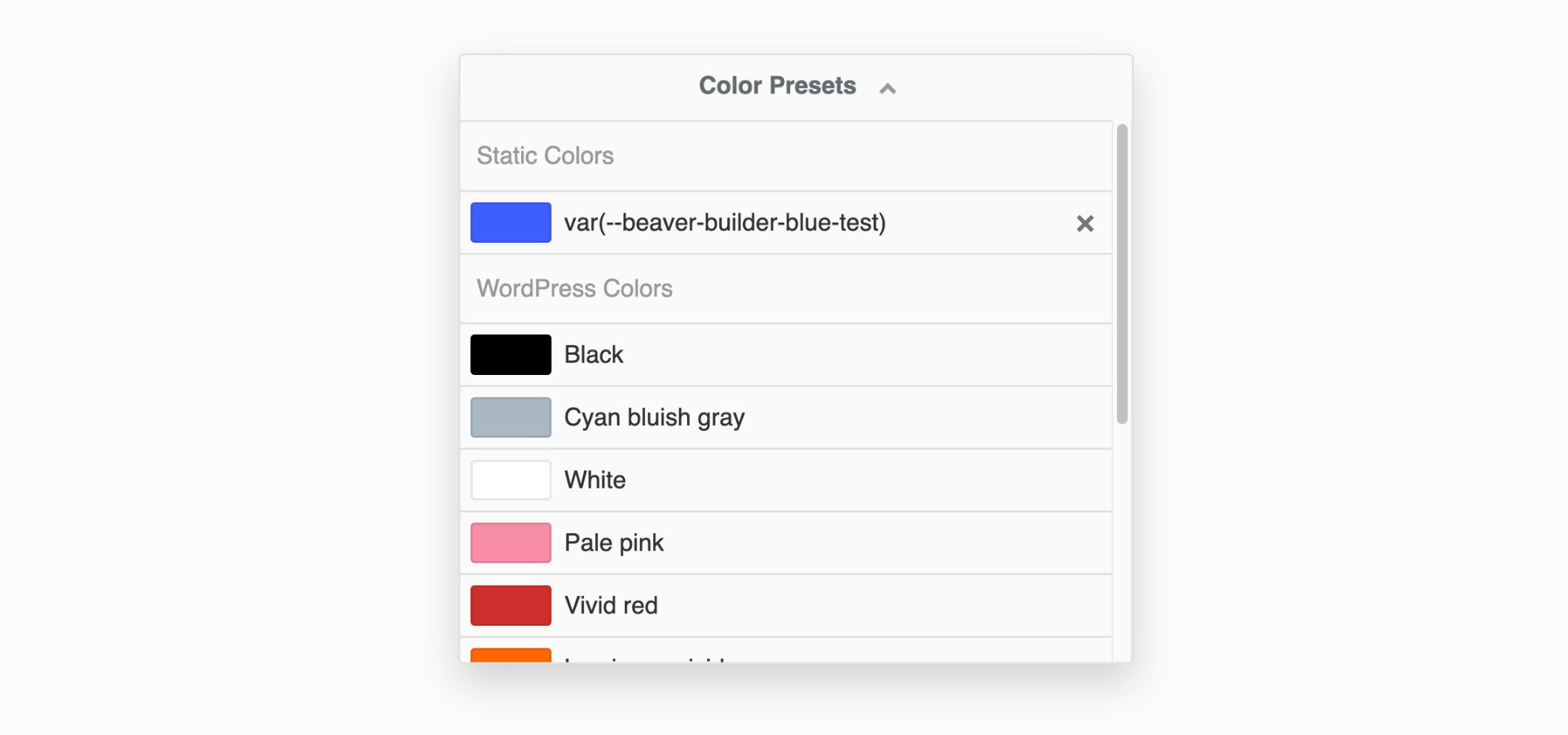
The Presets tab displays a list of color presets that you can use. These presets can be added manually, or automatically loaded from your theme or WordPress Core colors.
You can add a color preset by clicking the plus (+) icon in the top right corner of the color picker. To remove a color preset, click the X icon in the top right corner of the color preset item.
Theme Colors
If you have enabled the Load Theme Colors option in the Advanced tab of the Beaver Builder settings, the color picker presets will automatically include the colors defined in Block themes or themes that register colors using the Block theme JSON API, such as BB Theme.
WordPress Core Colors
If you have enabled the Load WordPress Colors option in the Advanced tab of the Beaver Builder settings, the color picker presets will automatically include the WordPress Core colors.
CSS Variable
You can add CSS variables as color presets by entering the variable name into the input field at the top of the Color Picker. Then, click the plus (+) icon in the top-right corner. The CSS variable will be saved as a preset under the Saved Colors section.
Eyedropper Tool
The Eyedropper tool allows you to select a color from any part of your screen. This feature is particularly useful when you want to quickly match a color from something you see on your screen, such as a logo or image.
- Click the Eyedropper icon located at the top-left of the color picker.
- Move your cursor to the desired color on your screen and click to select it.
- The color picker will automatically update to display the selected color.
The Eyedropper tool uses the Eyedropper API, which is currently only supported in Google Chrome (version 95+), Microsoft Edge (version 95+), and Opera (version 81+).
Legacy Color Picker
Version 2.9 of Beaver Builder introduces a redesigned color picker, offering users greater flexibility, precision, and ease of use when working with colors. This update includes several new features, such as support for multiple color spaces.
The information below pertains to the legacy color picker, for users who are still using Beaver Builder version 2.8 or earlier.
We recommend upgrading to version 2.9 for improved color picker functionality.
Legacy Color Picker Features
Opacity
The opacity slider located on the right-hand side uses the RGBa alpha channel (rgba(red, green, blue, alpha)) and when you adjust the opacity, you'll see the hex color value (#ffffff) change to the RGBa value (rgba(255,255,255,0.8)). Additionally, you can enter your own RGBa values in the input field at the top of the color picker.
Saturation
You can adjust the saturation of colors using the saturation slider located at the bottom. Color saturation is defined as the intensity of a color. For example:
- There are no shades of gray in 100%, it is pure color.
- 50% is 50% gray, but you can still see the color.
- 0% is completely gray and you cannot discern the color.
CSS Variables
Instead of selecting a color from the color picker or entering a hex or rgba value, you have the option to use CSS variables. This is particularly useful when you intend to utilize a color that's already established in Global Styles, your theme, or a color defined in your custom CSS.
To integrate a CSS variable, input the name into the field at the upper part of the color picker. Remember to enclose the CSS variable name within var().
var(--css-var-name)
Color Presets
You can add single colors or color palettes to the Beaver Builder editor both manually and programmatically.
These two procedures will not replace existing colors in existing modules, but it makes it easier for you to select the new color in the future. Each of these procedures saves the colors so they are usable wherever you edit in Beaver Builder.
Add color manually
Launch Beaver Builder on your page or post.
Click on any Color setting for a row, columns, or module to open the Color Picker.
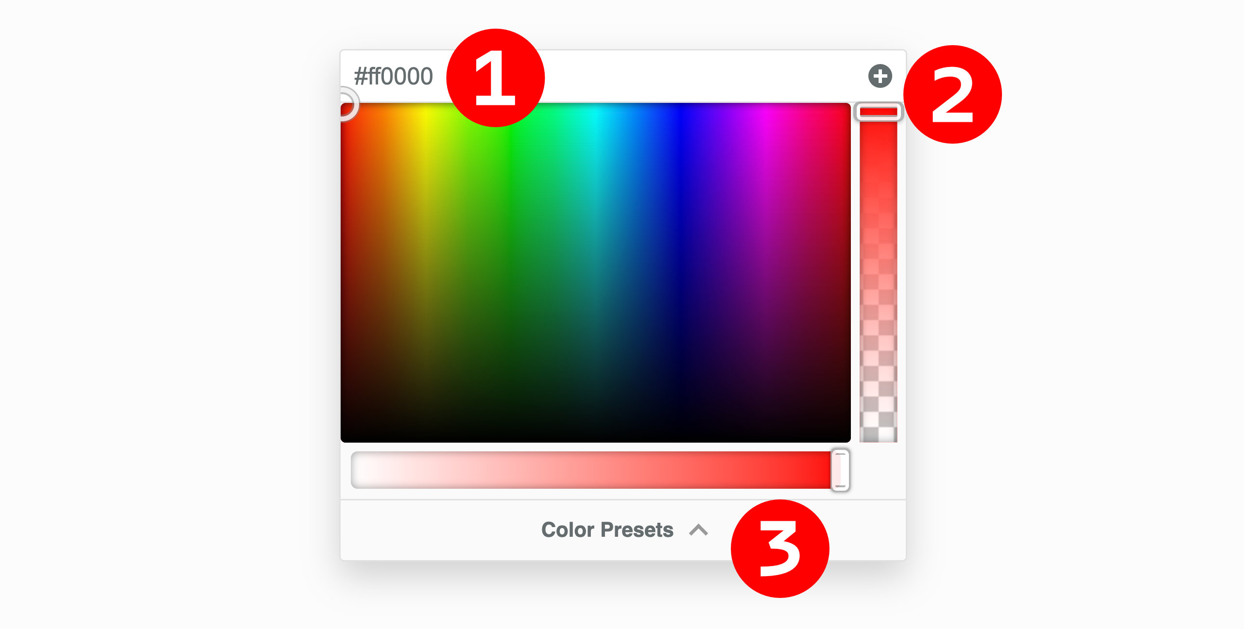
Select a color in the Color Picker or type/paste in a hex or RGBA color value for one of your colors. #1 in the screenshot below.
Click the Plus symbol (+) in the upper right corner of the Color Picker to create a preset. #2 in the screenshot below.
Review your color presets by clicking the Color Presets at the bottom of the Color Picker. #3 in the screenshot below.
Add color programmatically
You can register custom colors programmatically by using the fl_builder_color_presets filter.
Check your current color presets by opening a module for editing in Beaver Builder, then choose a color field and click Color presets. Delete any presets that you don't want to keep by clicking the X icon next to the color.
Add the following code to your child theme's functions.php file.
You can edit this file in Appearance > Editor, but make sure you choose the correct file.
//Add color presets for Beaver Builder
function my_builder_color_presets($colors)
{
  $colors = [];

  $colors[] = "8E181B";
  $colors[] = "D11C23";
  $colors[] = "1A4688";
  $colors[] = "D6E1EE";
  $colors[] = "fdfffc";
  $colors[] = "f1d302";

  return $colors;
}

add_filter("fl_builder_color_presets", "my_builder_color_presets");
- Replace the hex values in the code with the hex value for each color you want to define. Add or remove
$colors[]lines accordingly.
Do not include the hash symbol (#) when specifying hex values.
You can also add color presets to the Customizer settings in the Beaver Builder child theme.
CSS Variable Preset
You can also include CSS Variables as color presets. To do this, input the name of your CSS Variable into the field at the top of the Color Picker and then click the Plus symbol (+) situated in the top-right corner of the Color Picker. The CSS variable will be incorporated as a color preset.
Please be aware that the name of the CSS variable will function as the color preset's name, and it cannot be altered.
Theme Colors
Theme Colors support are disabled by default and can be enabled by visiting the Beaver Builder settings page in the WordPress admin area and enabling the Load Theme Colors option in the Advanced tab.
When enabled, the color picker presets will automatically include the colors defined in Block themes or themes that register colors using the Block theme JSON API, such as BB Theme.
WordPress Core Colors
WordPress Core Colors are disabled by default and can be enabled by visiting the Beaver Builder settings page in the WordPress admin area and enabling the Load WordPress Colors option in the Advanced tab.
When enabled, the color picker presets will automatically include the WordPress Core colors.