Border
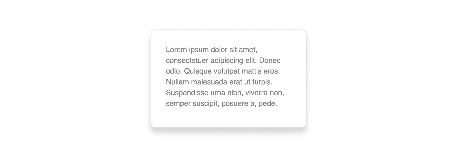
Each row, column, and some modules have a Border section that lets you decide how your content is framed using CSS borders, border-radius, and box-shadow.
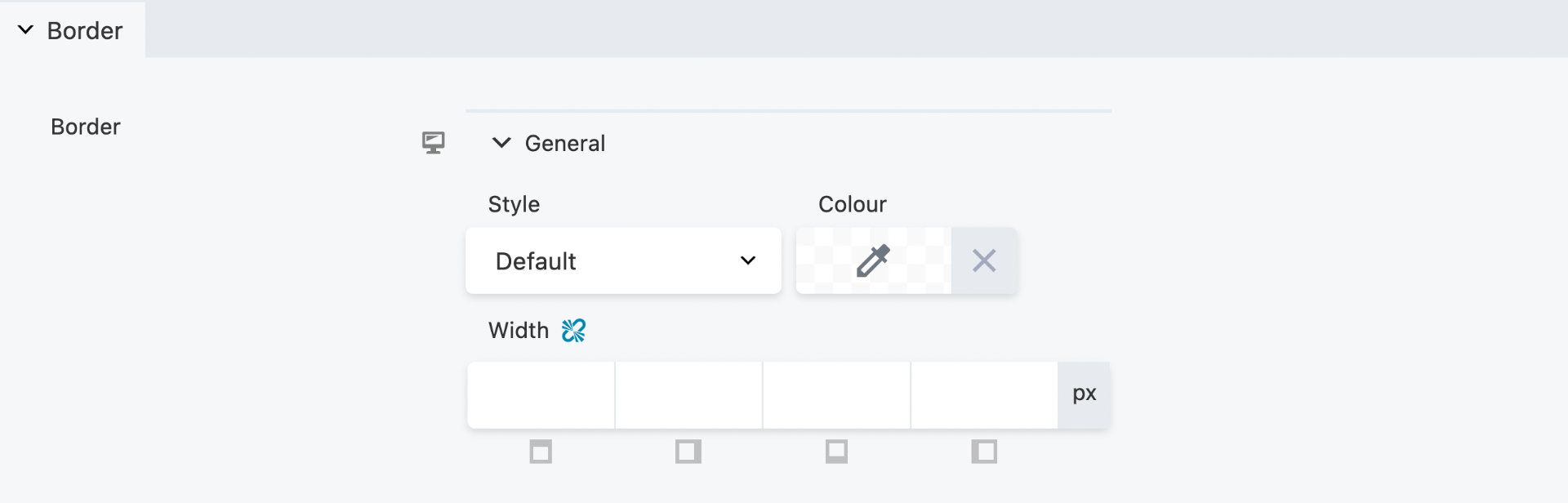
General
The General subsection has the following settings:
The Responsive Toggle can be used to adjust all border settings on a per-device basis.
Style
Let's you choose what kind of border-style to display. The following values are allowed:
- Default - Inherit from the theme.
- None - Defines no border
- Solid - Defines a solid border
- Dashed - Defines a dashed border
- Dotted - Defines a dotted border
- Double - Defines a double border
Color
Set the border-color using the Color Picker.
Width
Set the border-width for each side (top, right, bottom, and left) of a row, column, or module using the px CSS unit.
When you click on any of the Width value fields, a slider appears allowing you to quickly adjust the value. You can also type a Width value instead of using the slider. By clicking the Link Values icon, you can set all four corners to the same value.
Radius & Shadow
The Radius & Shadow subsection has the following settings:
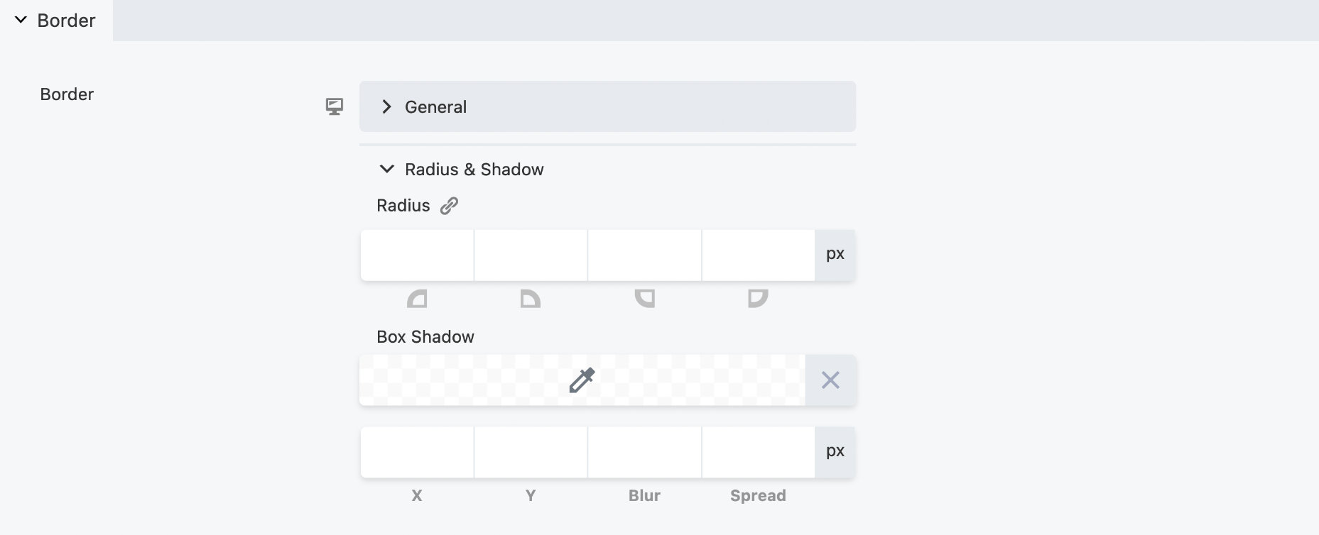
Radius
Set the border-radius for each side (top, right, bottom, and left) of a row, column, or module using the px CSS unit.
When you click on any of the Radius value fields, a slider appears to allow you to quickly adjust the value. You can also type a Radius value instead of using the slider. By clicking the Link Values icon, you can set all four corners to the same value.
Box Shadow
Set the box-shadow of a row, column, or module using the px CSS unit. When you click on any of the Box Shadow value fields, a slider appears allowing you to quickly adjust the value. You can also type a Box Shadow value.
Color - Set the
box-shadowcolor using the Color Picker.X allows you to adjust the horizontal offset of the shadow. When the value is positive, the shadow appears on the right side of the content, when the value is negative, the shadow appears on the left side of the content.
Y allows you to adjust the vertical offset of the shadow. When the value is positive, the shadow appears on the bottom side of the content, when the value is negative, the shadow appears on the top side of the content.
Blur is optional and allows you to adjust the blur radius. A higher number will result in a blurrier shadow.
Spread is optional and allows you to adjust the size of the shadow. A negative value will decrease the shadow size, while a positive value will increase it.