10: Setting fields reference
Please refrain from using the type or connection keys within the settings fields, as they have been designated for internal purposes and should not be used.
Align field
The align field displays a button group used to select either left, center or right values. The following screenshot shows the Alignment field button group in the UI and what the choices are:
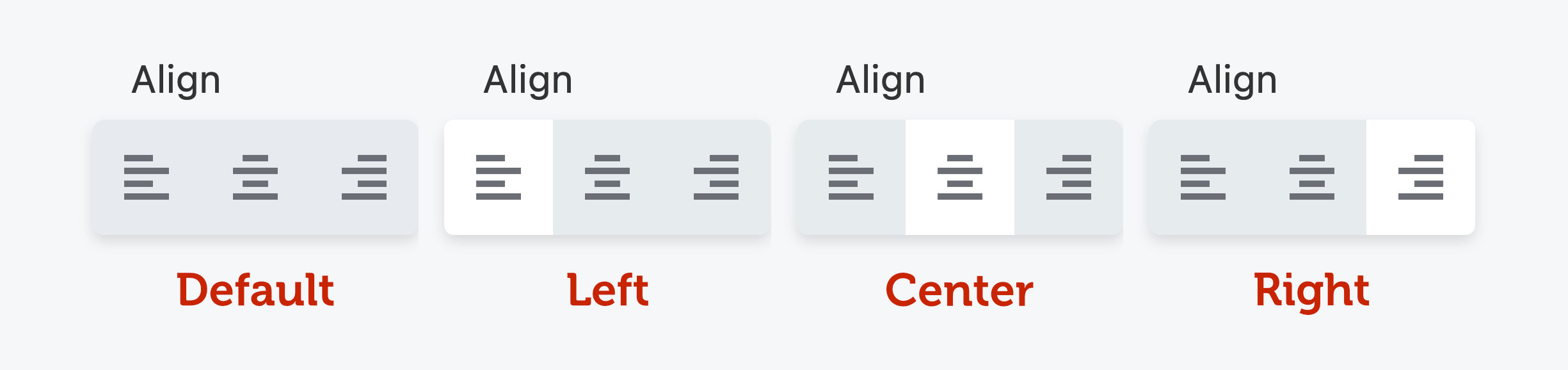
You can also set custom return values using the optional values param as shown in the example.
Return value
Returns left, center or right unless custom values have been defined.
'text-align' => array(
    'type'    => 'align',
    'label'   => 'Text Align',
    'default' => 'center',
    'preview' => array(
        'type'       => 'css',
        'selector'   => '.my-selector',
        'property'   => 'text-align',
    ),
),
Here is an example of an align field with custom return values.
'text-align' => array(
    'type'    => 'align',
    'label'   => 'Text Align',
    'values'  => array(
        'left'   => '0 auto 0 0',
        'center' => '0 auto',
        'right'  => '0 0 0 auto',
    ),
),
Border field
The border field displays a compound field with inputs for constructing borders. Using our live preview system will take care of the complexities of previewing the border field for you.
Return value
An array of border data.
'my_border' => array(
    'type'       => 'border',
    'label'      => 'My Border',
    'responsive' => true,
    'preview'    => array(
        'type'     => 'css',
        'selector' => '.my-selector',
    ),
),
To render the CSS for your border field, use the FLBuilderCSS::border_field_rule helper method in your frontend.css.php file as shown below.
FLBuilderCSS::border_field_rule( array(
    'settings'  => $settings,
    'setting_name'  => 'my_border',
    'selector'  => ".fl-node-$id .my-selector",
) );
Button Group field
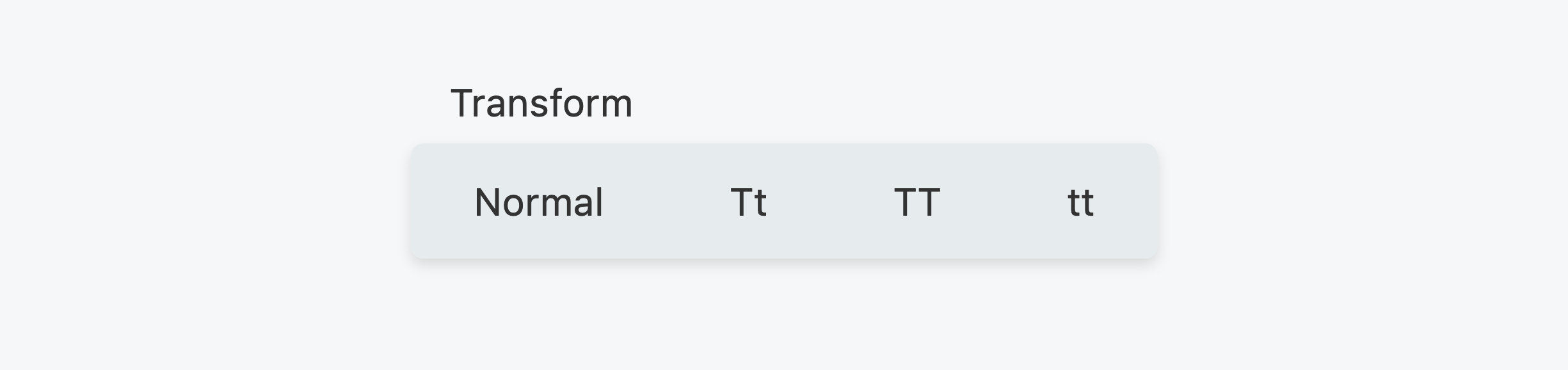
The button group field displays a group of buttons for selecting a single value when one of the buttons is clicked. Only one button can be selected at a time. When no button is selected, the default setting applies. Here's a screenshot example of a button group used in the Typography section.
Return value
The selected string value.
'my_setting' => array(
    'type'    => 'button-group',
    'label'   => 'My Setting',
    'default' => 'two',
    'options' => array(
        'one'    => 'One',
        'two'    => 'Two',
        'three'  => 'Three',
    ),
),
Align Icons
Horizontal by default, but vertical sets icon above label
'my_setting' => array(
    'type'    => 'button-group',
    'label'   => 'My Setting',
    'default' => 'two',
    'align_icons' => 'vertical',
    'options' => array(
        'one'    => 'One',
        'two'    => 'Two',
        'three'  => 'Three',
    ),
),
Custom Icons
Takes an array matching the options keys for icon HTML.
'my_setting' => array(
    'type'    => 'button-group',
    'label'   => 'My Setting',
    'options'     => [
                            'flex'    => __( 'Flex', 'fl-builder' ),
                            'grid'    => __( 'Grid', 'fl-builder' ),
                            'z_stack' => __( 'Layers', 'fl-builder' ),
                        ],
    'icons'       => [
                            'flex'    => '<svg width="24" height="10"><use href="#fl-h-stack-icon" /></svg>',
                            'z_stack' => '<svg width="24" height="10"><use href="#fl-z-stack-icon" /></svg>',
                            'grid'    => '<svg width="26" height="10"><use href="#fl-grid-display-icon" /></svg>',
                        ],

),
More Padding
Normal by default, but ‘padded’ gives more space around the buttons
'my_setting' => array(
    'type'    => 'button-group',
    'label'   => 'My Setting',
    'default' => 'two',
    'appearance' => 'padded',
    'options' => array(
        'one'    => 'One',
        'two'    => 'Two',
        'three'  => 'Three',
    ),
),
Fill Space
False by Default. True causes the button group to take up the entire horizontal area
'my_setting' => array(
    'type'    => 'button-group',
    'label'   => 'My Setting',
    'default' => 'two',
    'fill_space' => true,
    'options' => array(
        'one'    => 'One',
        'two'    => 'Two',
        'three'  => 'Three',
    ),
),
Code field
The code field displays an Ace editor for working with code.
Return value
A string containing the user-submitted code.
'my_code_field' => array(
  'type'          => 'code',
  'editor'        => 'html',
  'rows'          => '18'
),
Color field
The color field displays a color picker that can be used to pick a custom color. If show_reset is set to true, users will also be able to clear the color which results in an empty value. You can also set show_alpha to true
to show the alpha slider in the picker.
Return value
The hexadecimal color value.
'my_color_field' => array(
  'type'          => 'color',
  'label'         => __( 'Color Picker', 'fl-builder' ),
  'default'       => '333333',
  'show_reset'    => true,
  'show_alpha'    => true
),
Rendering Color Fields
There are helper functions to render color fields.
FLBuilderColor::hex_or_rgb
This function ensures that the right color is rendered no matter the format.
Example Usage
FLBuilderCSS::rule( array(
    'enabled'  => 'flat' === $settings->style && ! empty( $settings->bg_hover_color ),
    'selector' => ".fl-builder-content .fl-node-$id a.fl-button:hover, .fl-page .fl-builder-content .fl-node-$id a.fl-button:hover, .fl-page .fl-builder-content .fl-node-$id a.fl-button:hover, .fl-page .fl-page .fl-builder-content .fl-node-$id a.fl-button:hover",
    'props'    => array(
        'background-color' => FLBuilderColor::hex_or_rgb( $settings->bg_hover_color ),
    ),
) );
Date field
The date field displays a simple date picker input. This field uses the native browser picker instead of a third-party JavaScript library.
Return value
A date/time string.
'my_date' => array(
    'type'  => 'date',
    'label' => 'My Date',
    'min'   => '2000-01-01', // Optional
    'max'   => '2018-12-31', // Optional
),
Dimension field
The dimension field displays four number inputs for top, right, bottom, and left values.
Return value
The dimension field doesn’t return a single value on your $settings object. Instead, it will return four values corresponding to top, right, bottom, and left, using the key for your setting as a prefix. For example, if
my setting has a key of margin, the values returned will be as follows:
$settings->margin_top
$settings->margin_right
$settings->margin_bottom
$settings->margin_left
The dimension field is configured as follows.
'margin' => array(
    'type'        => 'dimension',
    'label'       => 'Margins',
    'description' => 'px',
),
The dimension field type allows custom unit selects and popup value sliders. See the code examples for the unit field.
Editor field
The editor field displays a WordPress editor that can be used to insert text just as you would on the post edit screen. If media_buttons is set to true, the Add Media button will be available above the editor.
Return value
The HTML content generated by the editor.
'my_editor_field' => array(
  'type'          => 'editor',
  'media_buttons' => true,
  'wpautop'       => true
),
If you would like to enable oEmbed in your editor fields, set the wpautop param to false and output your text in frontend.php like so.
global $wp_embed;
echo wpautop( $wp_embed->autoembed( $settings->text ) );
Font field
The font field displays a select for choosing a font family and a select for choosing a corresponding weight.
Return value
An array with the family and weight values as shown below.
Array
(
  [family] => Helvetica
  [weight] => 300
)
'my_font_field' => array(
  'type'          => 'font',
  'label'         => __( 'Font', 'fl-builder' ),
  'default'       => array(
    'family'        => 'Helvetica',
    'weight'        => 300
  )
),
Form field
A form field is a nested form that can be launched from within an existing form. For a live example of this, check out the Items tab of the Accordion module. There you will see that when you click the Edit Item link, a nested form is displayed for you to edit that particular item.
Form fields cannot be nested.
Return value
An object containing a property for each of the settings defined in the form.
Usage
In order to use the form field, you must have a form defined. That is done similar to registering a module but instead uses the FLBuilder::register_settings_form method. That method takes your form ID as well as an array of form config data (again similar to a module's form).
FLBuilder::register_settings_form('my_form_field', array(
  'title' => __('My Form Field', 'fl-builder'),
  'tabs'  => array(
    'general'      => array(
      'title'         => __('General', 'fl-builder'),
      'sections'      => array(
        'general'       => array(
          'title'         => '',
          'fields'        => array(
            'label'         => array(
              'type'          => 'text',
              'label'         => __('Label', 'fl-builder')
            )
          )
        ),
      )
    )
  )
));
Once you have a form defined, you can reference it in your field's config array by setting the form value to the ID of the form you registered. You should also set the preview_text value to the ID of a field that is defined in your form.
'my_form_field' => array(
  'type'          => 'form',
  'label'         => __('My Form', 'fl-builder'),
  'form'          => 'my_form_field', // ID of a registered form.
  'preview_text'  => 'label', // ID of a field to use for the preview text.
)
Gradient field
The gradient field displays a compound field with color, stop, type, angle, and position inputs for constructing a gradient. Using our live preview system will take care of the complexities of previewing the gradient field for you.
Return value
An array of gradient data.
'my_gradient' => array(
    'type'    => 'gradient',
    'label'   => 'Gradient',
    'preview' => array(
        'type'     => 'css',
        'selector' => '.my-selector',
        'property' => 'background-image',
    ),
),
To render the CSS for your gradient field, use the FLBuilderColor::gradient helper method in your frontend.css.php as shown below.
background-image: <?php echo FLBuilderColor::gradient( $settings->my_gradient ); ?>
Icon field
The icon field displays an icon selector that can be used to pick a custom icon. If show_remove is set to true, users will also be able to clear the icon, which results in an empty value.
Return value
The icon class names, such as fa fa-flag.
'my_icon_field' => array(
  'type'          => 'icon',
  'label'         => __( 'Icon Field', 'fl-builder' ),
  'show_remove'   => true
),
You can toggle other fields like the select field type using the show value, as seen in the following code example.
'icon' => array(
    'type'     => 'icon',
    'label'    => 'My Icon',
    'show'     => array(
        'fields'    => array( 'field_1', 'field_2' ),
        'sections'  => array( 'section_1', 'section_2' ),
        'tabs'      => array( 'tab_1', 'tab_2' ),
    ),
),
Link field
The link field displays a text input for entering a URL and a select button that shows a dialog when clicked for selecting a post of any type to link to.
Return value
The link entered by the user.
'my_link_field' => array(
  'type'          => 'link',
  'label'         => __('Link Field', 'fl-builder')
  'placeholder'   => __( 'http://www.example.com', 'fl-builder' ),
),
You can show Target or No Follow checkboxes without having to code those fields yourself. The following screenshot shows how they appear in the UI.
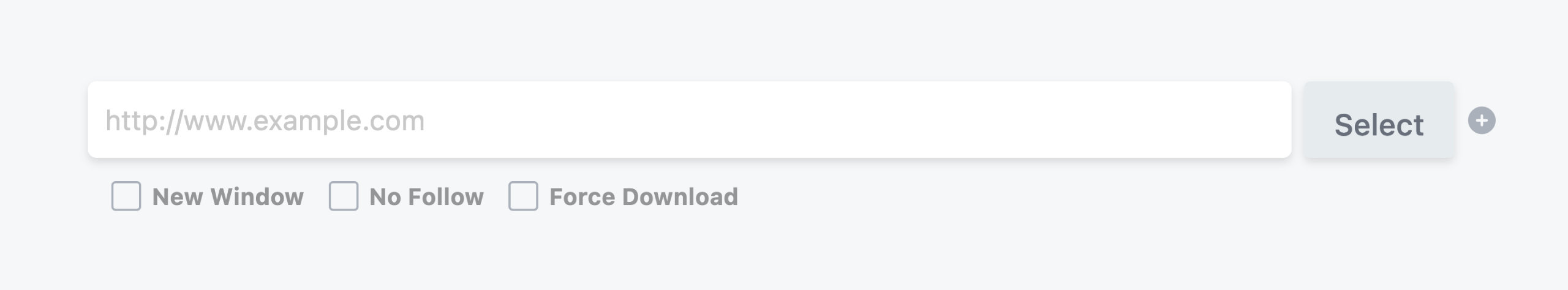
To enable these checkboxes, set the show_target, show_nofollow, or show_download values to true in your field config, as shown in the following code example.
'link' => array(
  'type'          => 'link',
  'label'         => 'Link',
  'placeholder'   => __( 'http://www.example.com', 'fl-builder' ),
  'show_target'   => true,
  'show_nofollow' => true,
  'show_download' => true,
),
Loop Settings fields
Loop settings aren't actually a single field but a collection of fields that make up a tab in the settings panel. That tab allows users to select things like Post Type, Order, Terms and more that you can use to create a WordPress loop using the FLBuilderLoop::query method.
Return value
All of the values for the loop settings will be stored in your module's settings object. You shouldn't need to access those settings directly (although you can if you want to). Instead, just pass them to the FLBuilderLoop::query method, as shown below, and it will take care of everything for you.
Usage
To use the loop settings, simply create a new tab array that links to the ui-loop-settings.php file instead of defining sections and fields like a standard tab array.
'my_loop_settings' => array(
  'title'     => __( 'Loop Settings', 'fl-builder' ),
  'file'      => FL_BUILDER_DIR . 'includes/ui-loop-settings.php',
)
When a user saves your module, you can create a loop in your frontend.php file, as follows:
$query = FLBuilderLoop::query( $settings );

if ( $query->have_posts() ) {
  while ( $query->have_posts() ) {
      $query->the_post();
  }
}

wp_reset_postdata();
You can also display pagination for your loop:
if ( $query->have_posts() ) {
    FLBuilderLoop::pagination( $query );
}
Multiple Audios field
The multiple audios field displays a WordPress media lightbox that allows users to select multiple audio files.
Return value
A JSON-encoded array of attachment IDs for each audio file selected.
'my_multiple_audios_field' => array(
  'type'          => 'multiple-audios',
  'label'         => __( 'Multiple Audios Field', 'fl-builder' )
),
Multiple Photos field
The multiple photos field displays a WordPress media lightbox that allows users to select multiple photos.
Return value
A JSON encoded array of attachment ids for each photo selected.
'my_multiple_photos_field' => array(
  'type'          => 'multiple-photos',
  'label'         => __( 'Multiple Photos Field', 'fl-builder' )
),
Photo field
The photo field displays a WordPress media lightbox that allows users to select a single photo.
Return value
The attachment ID for the selected photo. In addition to the attachment ID, the photo field also provides the photo URL as a separate variable in your module's settings object. That variable has the same name as your photo field with the suffix _src appended to it, such as my_photo_field_src.
This is useful if all you need is the URL and don't need to deal with the attachment ID or data. If show_remove is set to true, users will also be able to clear the photo which results in an empty value.
'my_photo_field' => array(
  'type'          => 'photo',
  'label'         => __('Photo Field', 'fl-builder'),
  'show_remove'   => false,
),
You can toggle other fields like the select field type using the show value. See the Icon field section for a code example.
Photo sizes field
The photo sizes field displays a select input containing the available WordPress photo sizes as values.
Return value
The photo size string that can be used in functions such as the_post_thumbnail($size) to retrieve a specific photo size.
'my_photo_sizes_field' => array(
  'type'          => 'photo-sizes',
  'label'         => __('Photo Sizes Field', 'fl-builder'),
  'default'       => 'medium'
),
Post Type field
The post type field displays a select input containing the available WordPress post types as values.
Return value
The post type slug, such as post or page.
'my_post_type_field' => array(
  'type'          => 'post-type',
  'label'         => __('Post Type', 'fl-builder'),
  'default'       => 'post'
),
You can also make a post type field that has the ability to select multiple values by setting the multi-select config value to true as shown below. If that is set, this field will return an array of selected values.
'my_post_type_field' => array(
  'type'          => 'post-type',
  'label'         => __('Post Type', 'fl-builder'),
  'default'       => 'post',
  'multi-select'  => true
),
Raw HTML field
The raw HTML field displays raw HTML specified using the content param. It does not return a value to your settings because it is only meant for output, not input.
Return value
This field does not return a value.
'my_date' => array(
    'type'    => 'raw',
    'label'   => 'My Raw Field',
    'content' => '<p>Lorem ipsum dolor sit amet, consectetur adipiscing elit.</p>',
),
Select field
The select field displays a standard HTML select input. Select fields can also be setup to show/hide other tabs, sections and fields within your settings by using the toggle array as shown in the example below. If the value selected by the user matches one defined in your toggle array, those tabs, sections and fields will be shown; otherwise, they will be hidden.
Return value
The value selected by the user.
'my_select_field' => array(
  'type'          => 'select',
  'label'         => __( 'Select Field', 'fl-builder' ),
  'default'       => 'option-1',
  'options'       => array(
    'option-1'      => __( 'Option 1', 'fl-builder' ),
    'option-2'      => __( 'Option 2', 'fl-builder' )
  ),
  'toggle'        => array(
    'option-1'      => array(
      'fields'        => array( 'my_field_1', 'my_field_2' ),
      'sections'      => array( 'my_section' ),
      'tabs'          => array( 'my_tab' )
    ),
    'option-2'      => array()
  )
),
You can also make a select field that has the ability to select multiple values by setting the multi-select config value to true as shown below. If that is set, this field will return an array of selected values.
'my_multi_select_field' => array(
  'type'          => 'select',
  'label'         => __( 'Multi Select Field', 'fl-builder' ),
  'default'       => 'option-1',
  'options'       => array(
    'option-1'      => __( 'Option 1', 'fl-builder' ),
    'option-2'      => __( 'Option 2', 'fl-builder' )
  ),
  'multi-select'  => true
),
Service fields
The service field isn't actually a single field but a collection of fields that make up a section in a settings form tab. These fields allow users to enter account information for a specific service (such as MailChimp) and save API connection data. You can then use the saved data in your modules to do things such as subscribe someone to a mailing list.
Return value
The values for the service fields will be stored in your module's settings object.
Usage
To use the service fields, simply create a new section array that links to the service-settings.php file instead of defining fields like a standard section array. You also need to define the type of services that you would like available in the services list. Beaver Builder currently supports the autoresponder type.
'service' => array(
  'title'         => __( 'Service Settings', 'fl-builder' ),
  'file'          => FL_BUILDER_DIR . 'includes/service-settings.php',
  'services'      => 'autoresponder'
),
Once your module is saved, you can access the service instance:
// Subscribe to an autoresponder service.
$instance = FLBuilderServices::get_service_instance( $settings->service );
$response = $instance->subscribe( $settings, $email, $name );
You can also access the saved account data by doing the following...
$instance = FLBuilderServices::get_service_instance( $settings->service );
$account_data = $instance->get_account_data( $settings->service_account );
Shadow field
The shadow field displays a compound field with inputs for constructing a shadow effect. Using our live preview system will take care of the complexities of previewing the shadow field for you.
Return value
An array of shadow data.
'my_shadow' => array(
    'type'        => 'shadow',
    'label'       => 'My Shadow',
    'show_spread' => true,
    'preview'     => array(
        'type'     => 'css',
        'selector' => '.my-selector',
        'property' => 'box-shadow',
    ),
),
To render the CSS for your shadow field, use the FLBuilderColor::shadow helper method in your frontend.css.php file as shown below.
box-shadow: <?php echo FLBuilderColor::shadow( $settings->my_shadow ); ?>
Suggest field
The suggest field displays a text input that returns a list of suggested results as the user types. It is currently designed to work with posts (of any type), terms (tags, categories, etc.), users and links (to a post of any type).
The action value of the config array currently accepts one of four values.
fl_as_posts- Search posts. The data value of the config array must be the slug of the post type you want to search. Returns an array of post IDs.fl_as_terms- Search terms. The data value of the config array must be the slug of the term you want to search. Returns an array of term IDs.fl_as_users- Search users. Returns an array of user IDs.fl_as_links- Search links. Returns an array of permalinks.
Return value
A string of comma-separated values that the user has selected.
// Search all pages.
'my_suggest_field' => array(
  'type'          => 'suggest',
  'label'         => __( 'Suggest Field', 'fl-builder' ),
  'action'        => 'fl_as_posts', // Search posts.
  'data'          => 'page', // Slug of the post type to search.
  'limit'         => 3, // Limits the number of selections that can be made.
),
Text field
The text field displays a standard HTML text input.
Return value
The text entered by the user.
'my_text_field' => array(
  'type'          => 'text',
  'label'         => __( 'Text Field', 'fl-builder' ),
  'default'       => '',
  'maxlength'     => '2',
  'size'          => '3',
  'placeholder'   => __( 'Placeholder text', 'fl-builder' ),
  'class'         => 'my-css-class',
  'description'   => __( 'Text displayed after the field', 'fl-builder' ),
  'help'          => __( 'Text displayed in the help tooltip', 'fl-builder' )
),
Textarea field
The textarea field displays a standard HTML textarea input. There is an optional maxlength key-value pair, shown in this example, and you can set any value you want. Beaver Builder has no maximum number of characters in its textareas, but you can use maxlength if you want to limit the number of characters that a user can enter.
Return value
The text entered by the user.
'my_textarea_field' => array(
  'type'          => 'textarea',
  'label'         => __( 'Textarea Field', 'fl-builder' ),
  'default'       => '',
  'placeholder'   => __( 'Placeholder Text', 'fl-builder' ),
  'maxlength'       => '255',
  'rows'          => '6'
),
Time field
The time field displays inputs for selecting the hour, minutes and period of the day (am/pm).
Return value
An array containing the hour, minutes and period.
'my_time_field' => array(
  'type'       => 'time',
  'label'      => __( 'Time', 'fl-builder' ),
  'default'     => array(
    'hours'     => '01',
    'minutes'   => '00',
    'day_period'    => 'am'
  )
),
Once your module is saved, you can access the values:
$settings->my_time_field['hour'];
$settings->my_time_field['minutes'];
$settings->my_time_field['day_period'];
Time Zone field
The time zone field displays an input for selecting a specific time zone.
Return value
The time zone string.
'my_timezone_field' => array(
  'type'          => 'timezone',
  'label'         => __( 'Time Zone', 'fl-builder' ),
  'default'       => 'UTC',
),
Typography field
The typography field displays a compound field with font, style, spacing, and shadow inputs for customizing the look of text.
Using our live preview system will take care of the complexities of previewing the typography field for you.
Return value
An array of typography data.
'my_typography' => array(
  'type'       => 'typography',
  'label'      => 'Typography',
  'responsive' => true,
  'preview'    => array(
    'type'      => 'css',
    'selector'  => '.my-selector',
  ),
),
To render the CSS for your typography field, use the FLBuilderCSS::typography_field_rule helper method in your frontend.css.php file as shown below.
FLBuilderCSS::typography_field_rule( array(
  'settings'    => $settings,
  'setting_name'    => 'my_typography',
  'selector'    => ".fl-node-$id .my-selector",
) );
Unit field
The unit field displays a text input for entering a number.
Return value
The number entered by the user.
'font_size' => array(
  'type'        => 'unit',
  'label'       => 'Font Size',
  'description' => 'px',
),
Custom Unit select
You can add a custom unit select (such as px, vh, %) to unit fields. These selects allow you to choose from a predefined list of values, as shown below. When using custom unit selects, you don't have to define the unit in your preview config, also shown below.
'width' => array(
  'type'         => 'unit',
  'label'        => 'Width',
  'units'          => array( 'px', 'vw', '%' ),
  'default_unit' => '%', // Optional
  'preview'    => array(
    'type'          => 'css',
    'selector'      => '.my-class',
    'property'      => 'width',
  ),
),
Settings with a custom unit select will receive a related setting with the _unit suffix, as shown in the example below. Together with the original setting, you can build the full value.
$value = $settings->width . $settings->width_unit
If you choose to set only one value for your custom unit select (such as px), it will still show up but won't be a selectable field.
Popup Value slider
You can enable a popup slider control for unit fields when they are focused. This lets users change the values using a slider instead of the keyboard.
To enable the popup slider for a field, simply set the slider value in your field config to true.
'width' => array(
  'type'   => 'unit',
  'label'  => 'Width',
  'slider' => true,
),
Examples of more advanced setups are shown below, allowing you to customize the min, max, and step values for the slider. If you are using custom units, you can customize the values for each unit as well.
'width' => array(
  'type'   => 'unit',
  'label'  => 'Width',
  'slider' => array(
    'min'   => 0,
    'max'   => 1000,
    'step'  => 10,
  ),
),
'width' => array(
  'type'   => 'unit',
  'label'  => 'Width',
  'units'  => array( 'px', 'vw', '%' ),
  'slider' => array(
    'px'    => array(
      'min' => 0,
      'max' => 1000,
      'step'    => 10,
    ),
  ),
),
Video field
The video field displays a WordPress media lightbox that allows users to select a single video.
Return value
The attachment id for the selected video.
'my_video_field' => array(
  'type'          => 'video',
  'label'         => __( 'Video Field', 'fl-builder' )
),
Field Modifiers
Toggle
The Toggle array can be used to show or hide other tabs, sections, or fields. If the value selected by the user matches one defined in your toggle array, those tabs, sections and fields will be shown; otherwise, they will be hidden.
The following field types support the toggle array:
- button group
- select
'my_select_field' => array(
  'type'          => 'select',
  'label'         => __( 'Select Field', 'fl-builder' ),
  'default'       => 'option-1',
  'options'       => array(
    'option-1'      => __( 'Option 1', 'fl-builder' ),
    'option-2'      => __( 'Option 2', 'fl-builder' )
  ),
  'toggle'        => array(
    'option-1'      => array(
      'fields'        => array( 'my_field_1', 'my_field_2' ),
      'sections'      => array( 'my_section' ),
      'tabs'          => array( 'my_tab' )
    ),
    'option-2'      => array()
  )
),
Set
The Set array can be used to set another field's value.
The following field types support the set array:
- button group
- select
 'my_set_field'   => array(
  'type'          => 'select',
  'label'         => __('Set Field', 'fl-builder'),
  'default'       => 'option-1',
  'description' => 'Choose Option 2 and see the Set Text get populated',
  'options'       => array(
   'option-1'      => __('Option 1', 'fl-builder'),
   'option-2'      => __('Option 2', 'fl-builder')
    ),
  'set' => [
    'option-2'    => [
     'set_text'     => 'Hello',
     ],
   ],
),