Change menu link and icon colors on small devices
If you use the Beaver Builder Theme, you can use a CSS rule to customize the color of the hamburger icon or MENU text on small devices. You can also add custom CSS to customize the link colors in the mobile menu, which expands when you click the hamburger icon or menu text.
See this article for a refresher on where the default menu colors come from. Depending on the header layout, you may be able to change the menu link colors with the standard settings on the Header tab.
To change the color of the small device menu icon or links:
- Paste in the following CSS code. See the article on where to put CSS code.
/* mobile menu color hamburger */
@media (max-width: 767px) {
/* Makes these changes only when screen sizes is 767 px or less */
.fl-page-nav-collapse ul.navbar-nav > li > a {
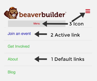
color: #f8bf7a; /* Rule 1: Sets color for default expanded menu links */
}
.fl-page-nav-collapse ul.navbar-nav > li.current-menu-item > a {
color: #d4dccd; /* Rule 2: Sets color for active page menu link */
}
.fl-page-nav .navbar-toggle * {
color: #c70919; /* Rule 3: Sets color for hamburger icon or MENU text */
}
}
- Change the colors in each rule to your custom colors.
Remove the first two
.fl-page-nav-collapserules if you don't want to customize the color of the expanded menu links.
If these rules don't change the appropriate menu items, try one of these ideas:
Add
!importantbetween the color hex number and the semicolon, such as:.fl-page-nav .navbar-toggle * {
color: #c70919 !important;
}Make sure the screen size you're viewing the result on is less than the
max-widthin the@mediawrapper in Line 2. In the example above, the rules only apply when the screen size is less than 767px. Adjust themax-widthin Line 2, or if you want the rules to apply at all screen sizes, remove the@mediawrapper by removing Lines 2 and 12. :::
With the three CSS rules used in this code example, the mobile menu now looks like this: