Set a full-width header with boxed content
At Customize > General > Layout > Width, you can choose a full-width or boxed layout, which controls the width of your web page in the browser. But what if you want the header to be full width but your content area to be boxed?
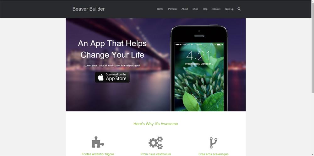
In the example shown in this screenshot, the full-width header layout in black is Nav Right, which displays the logo on the left and menu on the right. The content below it is a boxed layout.
The CSS code shown below includes both a min-width and a width value. In most cases, you probably want the two values to be equal. For example, if you set both values to 900px, then as the browser window is sized below 900px in width, the content appears to be full-width. In other words, the content width matches the header width at 900 px and under.
If the min-width value is larger than the width value, the behavior is more complicated. For example, suppose you set min-width to 900 px and width to 600 px. As long as your browser window is wider than 900 px, the content displays at 600 px. As the browser sizes down below 900 px, the content widens to 900px and the entire layout appears to be full-width. In other words, at 900 px width and smaller, the header and content are the same width.
To set the header at full width and the content at a boxed width:
- Go to Customize > General > Layout, then set the Layout to be Full width. Click Save & Publish.
- Add the following CSS code, adjusting the min-width and width values.
@media (min-width: 1200px) {
  /* Min-width preferably greater than or equal to width below */
  .fl-page .fl-page-content {
    width: 1100px; /* Can be adjusted to preferred width */
    margin: 0px auto;
  }
}