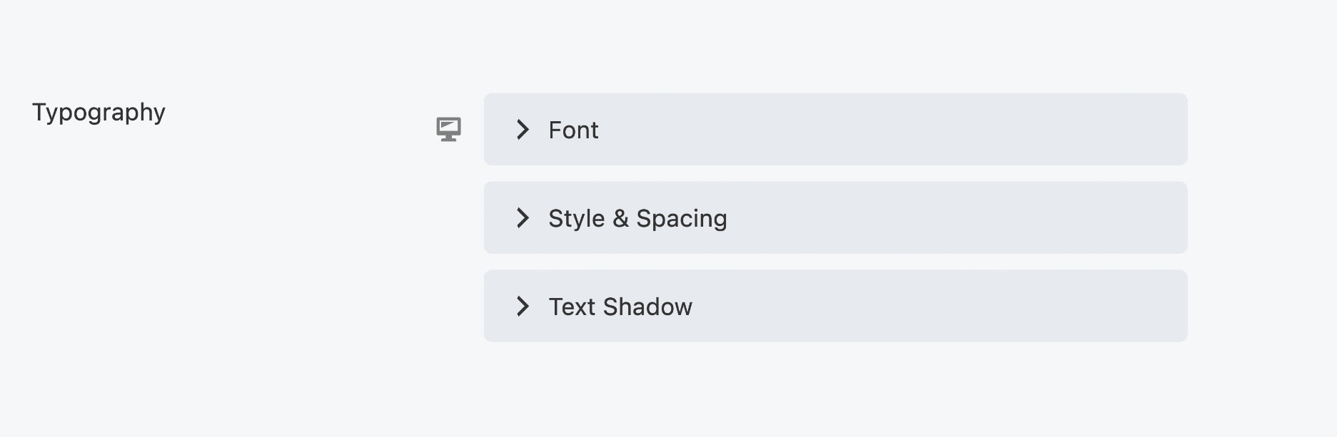
Typography
The Typography section is available for most modules that support custom text. Typography options can be used to format the text in a particular module, overriding the theme's default typography.
The Responsive Toggle can be used to adjust the Typography settings on a per-device basis.

You can only set the Family and Weight settings for extra large devices. These settings are not available for large, medium or small devices.
Font
The Font subsection has the following settings:
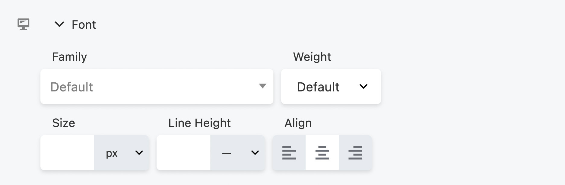
Family
Set the font family here: a system font or any of the Google fonts.
If you have a Google font that includes Latin Extended characters, you can add
that capability to your Beaver Builder layouts using the fl_builder_google_font_args and for the BB Theme use the fl_font_subset filter.
Weight
If you chose a system font in Family, you can choose Light, Normal, or Bold in the Weight field. If you choose a Google font, the Weight field lists any of the styles included with that font. For example, the Google Cabin font includes Normal, Medium, Semi-Bold, and Bold. The Google italic forms of the font family can be selected in the Style field of the Style & Spacing subsection. If you select a custom web font in Family, the Weight choices are limited to the weights you configured for your font.
Size
Choose the font size, with px, em, rem, or vw as the unit of measurement. If this field is empty, the default setting is used.
The vw unit refers to viewport width, where viewport is usually the browser window for purposes of Beaver Builder.
To use this vw unit, check the Base font size setting in Global Settings. Base font size must be set in pixels, and the default is 16px. As the tooltip for that setting explains, this global setting only applies when vw is used in the Typography section of modules.
When you set a font size in vw units in a module's Typography section, the actual font size in pixels is calculated using the CSS calc() function, with the formula calc( base-font-size + 1vw). If the global Base font size is 16px, the calculation is calc( 16px + 1vw ).
By using a base font size in this calculation, the font size scales more slowly as viewport width decreases, producing a better result at all device sizes.
Refer to this CSS-Tricks article for insights on creating responsive typography through the implementation of the calc() function and viewport units.
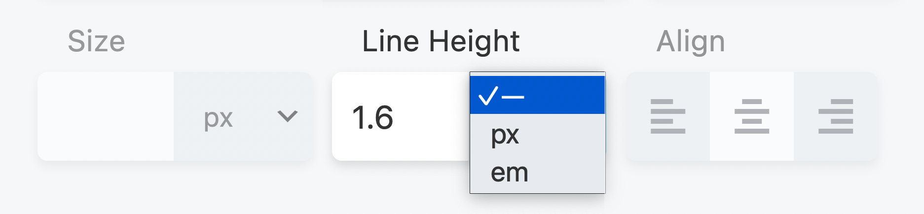
Line height
Set the amount of space used for lines of text. Specify a number value and a unit of measurement. The dash value in the units list, shown in the screenshot below, means a unit-less value, which means the number value is multiplied by the element's font size.
In most cases this is the preferred way to set line height, but you can also choose px or em. If this field is empty, the default line height is used.
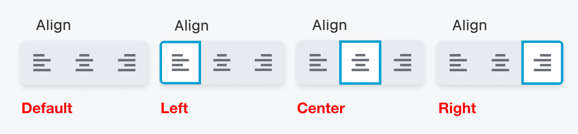
Align
Select one of the icons to align the text to the left, center or right. These alignment options are toggles, which can be turned on and off. If no option is selected (default), the alignment is set by the theme.
Style & Spacing
This subsection includes the following settings.
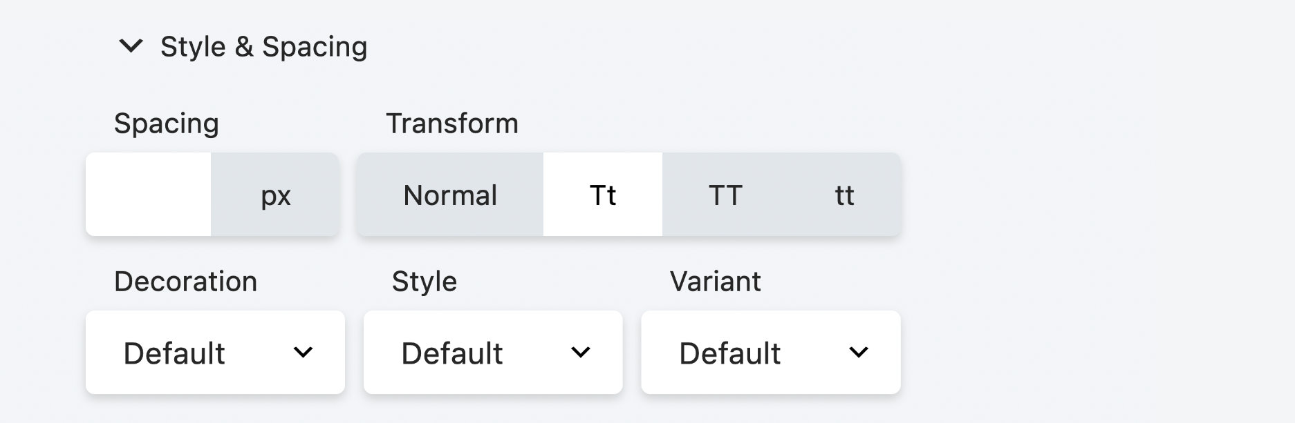
Spacing
Controls the horizontal spacing between letters, in pixels. It corresponds to the CSS letter-spacing property.
Transform
Allows you to change the case of the text string without retyping. It
corresponds to the CSS text-transform property.
The choices are, from left to right: Normal (as typed), capitalize the first letter of every word, convert all letters to uppercase, and convert all letters to lowercase.
Decoration
The choices are Default (whatever decoration is already set in the CSS for that element), None (which overrides any default decoration), Underline, Overline, and Line through.
Style
This setting corresponds to the font-style property and is used for italic and oblique settings. The Style field offers the choices of Default (whatever style is inherited), None (font is regular, meaning upright, not italic or oblique), Italic, or Oblique.
If you set Style to Italic, Beaver Builder loads the italic version of the font family you selected, if one exists. If not, the browser provides a computer-generated italic version of the font.
Here's a good article on the difference between italic and oblique fonts and the difference between glyphs designed by a typographer and computer-generated versions: TypeTalk: Italic vs. Oblique. :::
Variant
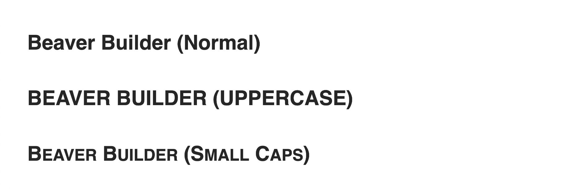
This field offers the choices of Default (whatever style is inherited), Normal (font is regular, meaning upright, overriding any inherited variant setting), or Small Caps.
The difference between Small Caps and the Transform field's Uppercase is that Small Caps uses larger letters for letters that are capitalized in the original text, whereas Uppercase uses capital letters of uniformly equal height. The Small Caps effect is shown in the screenshot below.
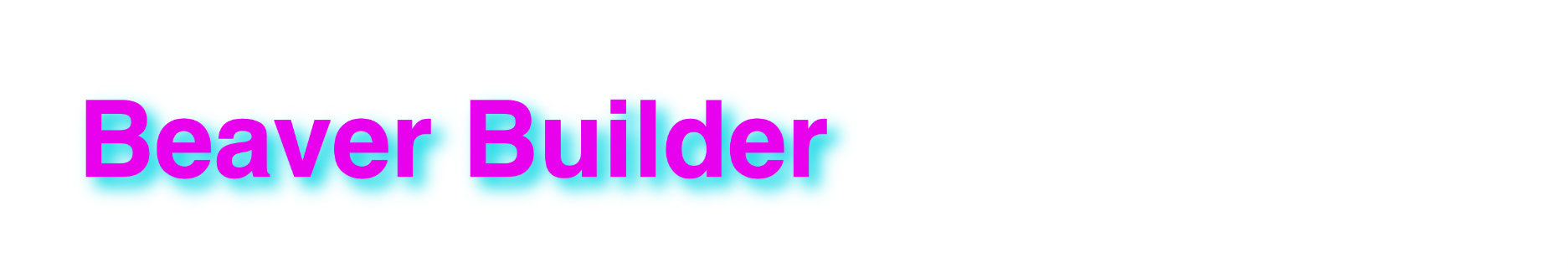
Text shadow
Adds a shadow effect behind the text, letting you control the shadow color, direction of offset ( X is horizontal, Y is vertical), and blur, as shown in the following screenshot.